9 Timeless 3 Column Layout Techniques
Our Target is find a Layout that have Total Layout Flexibility, Equal Height Columns and just works fine. Lets digg deep and see below a list of resources which offer gorgeous and valid 3 Column CSS-based Layouts- usually with full layout structure, such as headers, navigation bars, content containers, sidebars and footers.
Two Fixed and one Fluid
1) 3 Columns, The Holy Grail- Nice simple 3-column CSS layout to adapt.
#leftcontent {

    position: absolute;

    left:10px;

    top:50px;

    width:200px;

    }
#centercontent {
margin-left: 199px;
margin-right:199px;
margin-left: 201px;
margin-right:201px;
}
html>body #centercontent {
margin-left: 201px;
margin-right:201px;
}#rightcontent {
position: absolute;
right:10px;
top:50px;
width:200px;
}
2) 3 Column Fluid CSS Layout- With Faux Columns and 100% height
#left { float: left; width: 155px; padding: 5px; position: relative;/*** IE needs this ***/ }#right { float: right; width: 110px; padding: 5px; position: relative; /*** IE needs this ***/ margin-right: -120px; /** This negative margin-right value is the same as the right column width (width + padding). ***/ position: relative; /*** IE needs this ***/ }#content { float: right; margin-right: -165px;/*** Same length as .outer padding-left but with negative value ***/ width: 100%; position: relative;/*** IE needs this ***/ }
3) 3-col Layout Via CSS
No tables, no absolute positioning (no positioning at all), no hacks(!), same height of all columns.
#left { float:left; width:150px; margin:0; padding:0; background:url("corner.gif") top right no-repeat; font-size:80%; }#right { float:right; width:150px; margin:0; padding:0; background:url("corner.gif") top right no-repeat; font-size:80%; }#middle { margin:0 150px; background:yellow; font-size:80%; }
4) 3 Columns - Flanking Menus
Three columns, intelligent order of elements.
Fixed Fixed Fixed
5) Multi-Column Layouts Climb Out of the Box
This is part of the List Apart Article , This three-column layout takes a slightly different approach: the borders are applied directly to the container div.
#container{ background-color:#0ff; float:left; width:500px; border-left:150px solid #0f0; » /* The width and color of the left rail */ border-right:200px solid #f00; » /* The width and color of the right rail */ }#leftRail{ float:left; width:150px; margin-left:-150px; position:relative; }#center{ float:left; width:500px; margin-right:-500px; }#rightRail{ float:right; width:200px; margin-right:-200px; position:relative; }
6) LayoutGala's 3 Fixed Columns
div#container {width:700px;margin:0 auto}div#wrapper {float:left;width:100%}div#content {margin-right: 300px}div#navigation {float:left;width:150px;margin-left:-150px}div#extra {float:left;width:150px;margin-left:-300px}
7) 3 Col Fixed SEO
#page_margins {width: 980px; min-width: 980px; max-width:none }#main { float:left; width: 100%; background-color: transparent; background-image: url(../../images/bg_pattern.png); background-repeat:repeat-y; background-position:left; }#col1 { width: 480px; float:left; margin-left: 240px; }#col2 { width: 240px; float:left; margin-left: -720px; }#col3 { margin-left: -5px; margin-right: 0; width: 240px; float:right;}
Fluid
8 ) One True Layout
#block_1 { float: left; width: 34%; margin-left: 33%; }#block_2 { float: left; width: 33%; margin-left: -67%; }#block_3 { float: left; width: 33%; }
9) Max Design- Liquid insanity
A very good liquid example, could be used as a Newspaper like layout.
Must check Layout Banks
CSS Layouts - 950 pixels- Simplify your CSS designs with these easy Pure CSS Layouts
ThreeColumnLayouts- CSS-discuss has collected a ton of 3 column layouts and a quicky summary of each, i.e. fluid/fixed, header/footer!
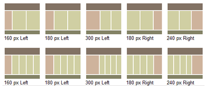
Little Boxes- 16 Layouts Examples
Layout Gala- A set of 40 layouts that we've thought worth sharing: on each of them you'll find also a download link (if you want, you can download the entire collection, 40 HTML pages in a single zip file).
Tutorials and Good Practices
The Perfect 3 Column Liquid Layout- No CSS hacks. SEO friendly. No Images. No JavaScript. Cross-browser & iPhone compatible.
Position Is Everything- Great site that explains some obtuse CSS bugs in modern browsers, provide demo examples of interesting CSS behaviors and show how to "make it work" without using tables for layout purposes.
Creating a CSS layout from scratch- A Step by step (12 pages worth) guide to developing a CSS based site, after all unless you understand the concepts you will never fully be satisified with the other articles. Its set at a good pace for intermediate coders with at least some CSS experience and is worth a read regardless of background or ability


Yep – I would agree with that.. Thanks for the line.
Will have to bookmark and use for future references…
Well thought out, excellent collection here. Bookmarked and put in my network for others too.
Thank you for your great summary about “3 Column Layout Techniques” for us webdesigner ;)
Ralph
The first three do not work in firefox or internet explorer.
have any of you even used these, the 2nd, 3rd and 4th, don’t work in ie or firefox.
I really appreciate this collection it really helps a lot most specially on for web design, having different column layout, such a great tips for this. Thank
thanx man
Damn! You guys rock. Now I have to figure out how to template all of this! Thanks a bunch for making my life easier!
I always struggle with CSS and fixing CSS issues, I havent left this cool blog in two days, resources are great, especially the ajax tabs, Nice!!!
good site for newbie