The Mobile Web: CSS Image Replacement for Retina Display Devices
I see more and more devices that have a pixel ratio bigger than 1.5, even 2. My Galaxy Nexus for example has a pixel ratio of 2 and so do the latest versions of the iPhone and iPad. Retina display seems to be the next evolution and next challenge for us as designers.
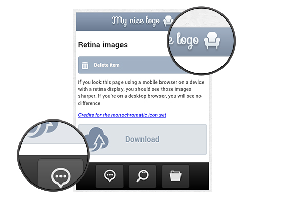 Native mobile app designers have already learned how to take advantage of those devices with high pixel ratios to display bigger images with better quality, so as to enhance user experience. They are used to creating the images in both normal and retina @2x sizes for the iPhone, and creating 4 sets of drawables in 4 different sizes for Android devices.
With the iPad 3 also having retina display, it is definitively something that will be harder to avoid from now on. In this article, you will see how to use some CSS3 tricks in the field of image replacement to serve images with better quality to those high resolution devices.
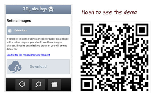 I re-created a fake application page similar to the iOS native style so you can see what is going on. Whether you have a retina device or not, you can test it here with your phone. You can see the demo here. You can also download the code here.
As I said, if you load the page on a non retina device, it will look good. If you load it on a retina device, the images get rasterized.
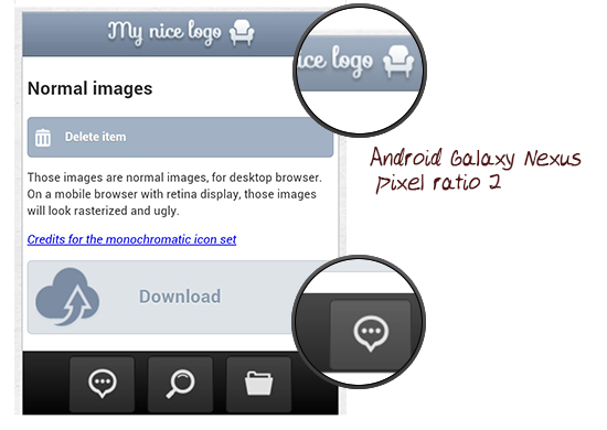
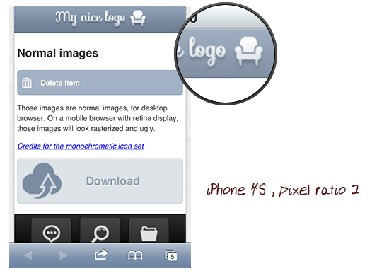
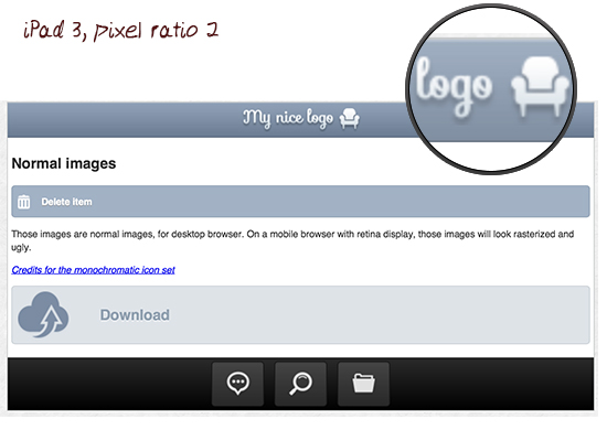
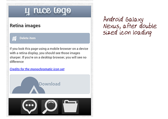
This is due to the pixel ratio being 2, so the image is multiplied by two and stretched by the device, creating this unclean rendering. Here are some screenshots of the demo on iPad 3, iPhone 4 and Galaxy Nexus with the images being rasterized:
Galaxy Nexus:
 iPhone 4:
 iPad 3:
 Native mobile app designers have already learned how to take advantage of those devices with high pixel ratios to display bigger images with better quality, so as to enhance user experience. They are used to creating the images in both normal and retina @2x sizes for the iPhone, and creating 4 sets of drawables in 4 different sizes for Android devices.
With the iPad 3 also having retina display, it is definitively something that will be harder to avoid from now on. In this article, you will see how to use some CSS3 tricks in the field of image replacement to serve images with better quality to those high resolution devices.
Story Behind the Code
It all began when I was creating a jQuery Mobile application for the iPhone. The idea was to make a full HTML5 jQueryMobile app, and to embed it in a “native shell”, using Phonegap. For this application, I created a bottom tab-bar that was imitating the native iOS tab-bar, and also a header with a logo image in it. Both the header and footer were HTML elements that used image replacement techniques to display the icons and logo. When I tested the application on the iPhone 4S, I saw that the logo and the icons were highly rasterized and looked pretty ugly.The Demo
 I re-created a fake application page similar to the iOS native style so you can see what is going on. Whether you have a retina device or not, you can test it here with your phone. You can see the demo here. You can also download the code here.
As I said, if you load the page on a non retina device, it will look good. If you load it on a retina device, the images get rasterized.
This is due to the pixel ratio being 2, so the image is multiplied by two and stretched by the device, creating this unclean rendering. Here are some screenshots of the demo on iPad 3, iPhone 4 and Galaxy Nexus with the images being rasterized:
Galaxy Nexus:
 iPhone 4:
 iPad 3:

CSS Image Replacement Techniques
In this demo, I used different techniques for replacing images that will have varying consequences when we will want to change for retina images. The first image we replace is in the logo, being sure to only set the height of the element. The HTML looks like this:<div class="ui-header"> <h1> My logo </h1></div>The CSS like this:
.ui-header h1{

color:#fff;

display: block;

outline: 0 none !important;

overflow: hidden;

margin:0;

text-align: center;

text-overflow: ellipsis;

white-space: nowrap;

text-indent:-9999px;

background:url(img/logo.png) no-repeat center center;

height:33px;

}
Again, what’s important here is that we give it height, but no width.
The second technique is to use the delete button. We want to keep the text for this one, so we will add the icon in the :before pseudo class. The HTML looks like this :
<p> <a href="#"> Delete item </a> </p>And the CSS code like this:
.delete:before{

content: " ";

display:block;

width:20px;

height:20px;

position:absolute;

left:6px;

background:url(img/delete.png) no-repeat;

}
Note that in this case, we gave the element both a width and a height but no padding.
The next element to which we want to add an icon is the download button. The HTML looks like this:
<p> <a href="#"> Download </a></p>And the CSS like this:
.download {

background:rgb(222, 227, 232) url(img/nuage.png) no-repeat 8px 6px;

border:1px solid rgb(199, 206, 212);

padding: 25px 0 25px 120px;

font-size:20px;

color:rgb(144, 160, 176);

text-shadow: 0 1px 1px rgb(239, 242, 245);

}
This is what we will call the third technique: assigning some padding, but no height or width. You will understand why below.
For the footer however, we also assign a width and height for the element, padding too. The HTML:
<a class="bubble button" href="#"> bubble </a>The CSS:
.ui-footer .button{

background-color:rgba(187, 185, 185, 0.2);

border:1px solid rgb(22, 22, 22);

box-shadow: 0px 1px 2px rgba(22, 22, 22, 0.5) inset ;

text-indent:-9999px;

padding:10px 15px;

width:40px;

height:40px;

background-position: center center;

background-repeat:no-repeat;

margin: 0 5px;

}

.bubble{

background-image:url(img/bubble.png);

}
At this point we have different case scenarios for the image replacement that will load non retina images for all devices, for now.
Media Queries Pixel-Ratio to the Rescue
The next idea was then to find a solution to make those devices load better quality images. I remembered the media query device-pixel-ratio (vendor prefix needed). I never used it before, and decided to give it a try. You will need some vendor prefixes here (Mozilla is the strangest one). The idea was pretty simple: I decided to try to serve those devices an image that would have twice the size of the desktop one. I chose a @2x notation for the retina image because I’m used to doing so when I create images for native iOS apps. I ended up doing something like this:@media only screen and (-webkit-min-device-pixel-ratio: 2),
only screen and (min--moz-device-pixel-ratio: 2),
only screen and (-o-min-device-pixel-ratio: 2/1),
only screen and (min-device-pixel-ratio: 2) {
#myelement{
background:url([email protected]) no-repeat;
}
}
You would think that this works good. True, the retina image is loaded, but the problem is that the image is now twice the size. Still not displaying properly. Here is what it looked like on my Galaxy: the icons are nice and sharp, but not quite right.

Background-Size Property Lends a Hand
Now that we have the high resolution images loading, we need to ensure they are the right size. To do this, we will use the super useful CSS3 background-size property that is actually able to resize backgrounds as needed. You can either use pixel properties for width first then height, use percentages, or set the value to “auto”. It’s simple to see it in the code. (Note that I used the id #retina for the demo purpose to only target the second part of the demo, but you can of course omit it in your code) For the header button you remember that we did set the height but not the width, to do the trick here, we will then set the background height to the same value (we can leave the width at auto).#retina .ui-header h1{
background:url(img/[email protected]) no-repeat center center;
-webkit-background-size: auto 33px ;
-moz-background-size: auto 33px ;
background-size: auto 33px ;
}
For the delete button technique it’s a bit easier, since we did set both width and height AND since it has no padding, we can set the value to 100% for each, meaning that the icon will use the whole container space:
#retina .delete:before{

background:url(img/[email protected]) no-repeat;

-webkit-background-size: 100%  100% ;

-moz-background-size: 100%  100% ;

background-size: 100%  100% ;

}
For the download button, it gets trickier. Since we did not give it any width or height, we will then have to set the exact sizes of the non retina image for this one:
#retina .download {

background:rgb(222, 227, 232) url(img/[email protected]) no-repeat 8px 6px;

-webkit-background-size: 70px 68px ;

-moz-background-size: 70px 68px ;

background-size: 70px 68px ;

}
For the footer icons, we did set width and height, but the element has some padding. So here we will have to set at least one of the two values to make it work:
#retina .bubble{

background-image:url(img/[email protected]);

}

#retina .loupe{

background-image:url(img/[email protected]);

}

#retina .folder{

background-image:url(img/[email protected]);

}

#retina .ui-footer .button{

-webkit-background-size: 40px auto ;

-moz-background-size: 40px auto ;

background-size: 40px auto ;

}
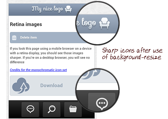
And this is what it now looks like:


THX, for the Tut!
That’s exactly what I was looking for, I will test it on my next page.
Nice work !
Would be even more awsome to use SVG base image for every browsers except ie8- and then use feature detection (or user agent detection) for ie6, 7, 8 just to replace the .SVG image by its .PNG version. I’m talking about using it as background image.
SVG is supported by almost every browsers : http://caniuse.com/#search=svg
I’m playing with it these days and it look promising, I have to test it out a bit more. Have you tried that approach ?
Regards
J
Last I checked text-indent: 100%; was better than -99999px; because the latter could cause some performance problems in iOS?
We are using wurfl to detect image sizes for phones. THe upside is that it includes phones like the nexus galaxy to serve them 360px images instead of 320px, the downside is that they dont have HD phones like the HTC One X yet causing those images to display in low quality and wrong size.
Having to design for multiple mobile phones is a pure throwback to having to hack up stylesheets to display properly in multiple browsers. People seem much more accepting this time around for some reason.
Wow, interesting, thank you!
and the first css has a typing error here “whitewhite-space: nowrap; “
Wow, very glad I found this article/post. I’ve been designing desktop sites for years but personally am not a smartphone user and am now beginning my first “mobile website” design project. I was seeing all this info. about ‘Retina Display’ compatibility and had no clue what the heck this meant. I can’t believe the iPhone and other devices have different pixel aspect ratis than a normal laptop or desktop…. ahh the terror and fear of this project!!! :-) I am a bit familiar with CSS media queries though so hopefully it will be a smooth transition for me to fix and learn. Much luck to all
Nice article, thanks! :)
You might consider changing the term “rasterized” to “pixelated”; I could be wrong, but I don’t think it’s possible for an image to become more rasterized.
Wikipedia: Rasterisation, Raster graphics and Pixellation.
One side note about using CSS backgrounds instead of images for things like logos, etc.. This is a very bad habit!
In IE and Safari default settings, backgrounds are not printed, so if user is not smart and willing enough to enable them (that excludes 99% of them) you will end up in a printed page with no logo at all. (That includes print to PDF too).
It is conceptually wrong, also for usability to exchange images with backgrounds. Images are content (and ALT=”” content too), like a logo, backgrounds are just decoration. Users with visibility problems often disable backgrounds on pages, but the page should be usable even without them, it should not hide the logo. And totally hiding images, or using a reader, will leave you with the ALTernate text that backgrounds don’t have.
—
About hi-res images, just an alternate idea… why, in some situations, not just use a 144DPI image resized to half height? Like this:
(ok, use css instead..)
This has the disadvantage of loading the bigger image for everyone, so it is not ideal in most cases, but has the advantage that it will show hi res on every hi-res media, including print. If it is a JPG, you can blur a little the bigger image (0.3px) and compress more (60% – JPG artifacts will be less visible at high res) and weight will decrease. Will have to tell ie to resize images in a smooth way with img { -ms-interpolation-mode: bicubic; } and your logo will be perfect on every device and sheet (at the expense of few KB).
Sorry html was “eaten up”. Hope it gets through now:
<img src=”banner_1456x180px.jpg” width=”728″ height=”90″ />
(ok, use css instead..)
Hi!
Thanks for a great article!
You actually can use css to give an alternative src for an image tag. Although I have only tested with webkit browsers.
You can do something like:
@media only screen and (-webkit-min-device-pixel-ratio: 2),
only screen and (min–moz-device-pixel-ratio: 2),
only screen and (-o-min-device-pixel-ratio: 2/1),
only screen and (min-device-pixel-ratio: 2) {
#logo img {
content: url(../images/logo-hires300x60.png);
width: 150px;
height: 30px;
}
}
Here you have to set the width and height properties to keep the original image size.
Using a SASS mixin would work great with this technique.
I found your guide very useful this morning, especially in knowing about the background-size neccesity as well as the media queries. Thank you.
I use one image at twice the size of the image as I want it displayed, with a jpeg compression of 45. Then I set the width of it to 1/2 the size of the image (that is I start with a 1800 pixel wide image, and display it at 900px wide, with a height of auto). The compression is very low (my 1800 px image is 135kb) but not so low as to create artifacts in the image when resized.
Tested this on Android, iPhone 5, tablets, and screens…the image looks very good.
By the way, if you use a media query to display a different image, you have to download two images, eating up bandwidth.