Scalable Full Body Backgrounds in Web Design
By Mike Takahashi
It is reasonable to assume that most users have a display resolution higher than or equal 1024x768 pixels. As display resolutions continue to increase, there has been a steady trend of websites that have employed full body backgrounds using large images.
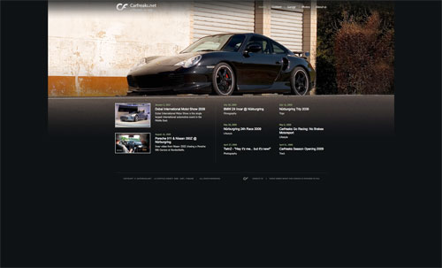
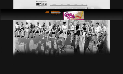
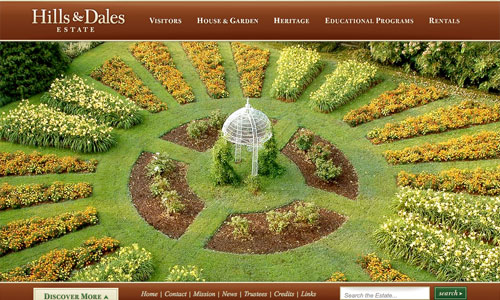
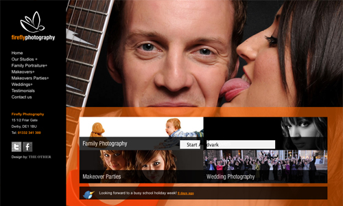
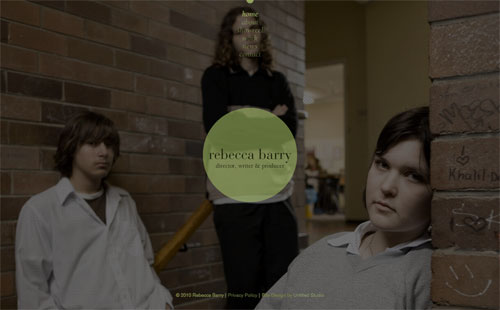
However, many of these designs use images that have a set resolution for its width and height. Once the resolution is exceeded by users who have larger a display resolution, the design fails to scale properly. The following are two examples of websites viewed on a display resolution 2560x1440 pixels.
Carfreaks
Flash
Flash-based websites have continued to improve since its early days of adoption. Its support is now wide-spread across all browsers. However with the emergence of mobile phones such as the iPhone, compatibility can still be an issue. While still not the ideal solution for usability and accessibility, many of today's websites designed in Flash are slowly improving. Google has also greatly improved their ability to index Flash-based websites. HBO HBO is a 24/7 pay-television service that has been able to successfully integrate captivating images from its movies and shows into the design of their website. The use of large images helps complement the site and create a voice and identity for each of its movies and programs. Even though the website is Flash-based, most of the sections also contain unique URLs, which can be bookmarked.

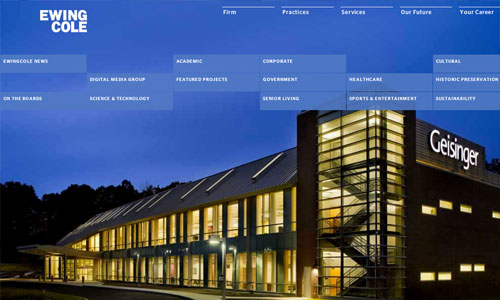
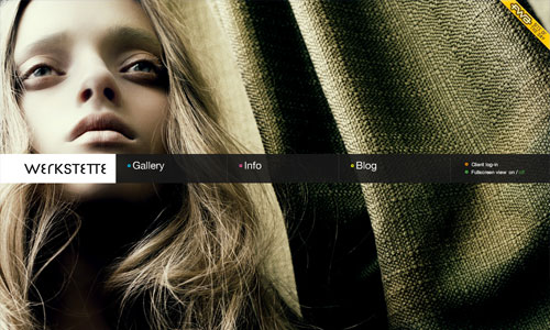












CSS and JavaScript
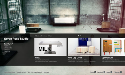
CSS and JavaScript compared to Flash-based websites are much more user friendly in terms of usability and accessibility. By using a combination of CSS and JavaScript, websites can be made to look and behave very similar to Flash-based websites. Aedas The Aedas global network provides consultancy services in architecture, interior design, master planning, landscape, urban design and building consultancy in Asia, the Middle East, Europe and the Americas. Another website that looks Flash-based, but once you look into the source code you won't find any. The design and layout of this website incorporates several layers and multiple navigation points to create a design that complements its use of heavy imagery.










Cool collection..I’m proud of it – simple&modern…
Nice series and thanks for the links. The Flash based websites do my head in though! HBO even made my Mac Pro and Safari crash! Thanks HBO!
Time to throw out your Mac dude. Mac is for high school cheerleaders.
And obviously you have the intelligence of one.
Sure will do right away and run to the shops for a clone that runs on Windows 7.
…troll?
..is… is that you?
I’d rather be a cheerleader on a Mac than a dork on a PC.
Sounds like you have a problem with your Mac. It looks great on my PC.
It looks fine on my Mac too. Could be Safari, could be a lot of things.
A great post, I have no idea why people don’t do this more often. There is no excuse for badly cropped images!
I wrote the code for Aedas over a year ago and used it again on fleurofengland.com. You can guess which is my favourite ; )
hey man, did you write a tutorial for that code? i’d love to learn, thanks!
Hmmm, you’re male?
I have absolutely no idea…
A full screen scaling background does not mean the image isn’t cropped. Cropping images, badly or not, has nothing to do with scalable background images.
Maybe, this one too : http://www.patrikervell.com/
Another good example of a scalable background is the very simple site of http://www.abens.se
I’ve seen a lot of these inspirational “lists” and too many times they’re retreads. This feels like a short spring rain — the kind that comes through while the sun is still shining.
Full body background images are something I really love in a webpage design and hope to see increase in popularity in the future when appropriate.
Comprehensive and attractive collection! The sections regarding the underlying technology are helpful!
We’re also using a full body bg at http://rocketpack.fi/ . It was very easy to implement – first drop something like this just before the ending body tag:
…and this in the css:
#bg {
width: 100%;
height: 100%;
position: fixed;
left: 0;
top: 0;
z-index: -1;
}
…and voilà. :)
I want to have the same effect for the background. The method that you’re using, are there any problems with the older browsers?
El problema se presenta si el monitor tiene una resolución mas pequeña de la que tiene la imagen.
really good list thanks
The users who have a screen resolution greater than 1900 x 1200 is in the minority.
However, if you want to cater to even more viewers, focus on screen resolutions of the MOST SOLD smart phones such as the iPhone and Android based phones.
With these BG, the whole characteristic of a web page changes. Loved it.
Thanks for share, but in our country, use very background image will make a site very slow and maybe couldn’t be opened.
It depends how it was implemented. Bckg image can be a gif, so it wouldn’t be so heavy then…or you can use smaller image, and blur it on edges and fill the rest with plain color. There is many techniques to efficiently handle big bckg images.
:)
I would add http://www.rossohelmets.com/index.php?langue=fr for the html / css part
Cool Sites.
Great use of scaled backgrounds is this http://www.seventytwo.nl but it never got mentioned
Wow! Awesome collection, really inspiring… thanks for sharing
Nice – I love the Carlos Alonso Bodas :-)
Most of them looks nice, but the Signal7 I like the most.
Still prefer Flash to do the Full Background website, ajax is an option but i felt it’s bit laggy…
any good tutorials, or resources on how to do this with css/javascript
very good stuff here
i second that!!!
Here are a few helpful links to help you get started:
A very popular site is GOTOCHINA (http://www.ringvemedia.com) which uses MooTools:
http://css-tricks.com/perfect-full-page-background-image/
On my site for Mike Takahashi Photography (http://takadesigns.com/mtphoto) I use a customized version of Supersized which uses jQuery:
http://buildinternet.com/2009/02/supersized-full-screen-backgroundslideshow-jquery-plugin/
Mike
With these BG, the whole characteristic of a web page changes. Loved it.
Another good example for the HTML+CSS part:
http://mazatlaninteractivo.com.mx/sif/2010/
It’s just superb & inspirational collection.
Thanks.
Amazing post! Madonna is the best, I totally worship her and want to become more like her.
Great collection. I used a similar technique recently for http://www.amapolafilms.es/
In our case, the background is a “img” with position: fixed and z-index: -1
Initially, it’s a low-res small image, which is replaced for a bigger one when it’s loaded, or if the user resizes the browser.
Very nice way to present websites!!!
Because I’m a newbie, I just would like to know what is the way of doing it? Do you just need a large size picture as background or there is other things to do?
Thanks for all!
Considerably, the article is really the sweetest on this noteworthy topic. I harmonise with your conclusions and will thirstily look forward to your approaching updates. Just saying thanks will not just be sufficient, for the wonderful clarity in your writing. I will instantly grab your rss feed to stay informed of any updates.!
this website is very good. i found it at google
Hey man I think this is pretty decent. This web site is worth viewing all over again! : )!
This is one of my absolute favourite galleries. I find it so inspiring. I even used some of the css + jquery techniques on my website, bravadoweb.com.au
Thanks heaps for putting this collection together. I have it safely bookmarked :)
any good tutorials css/javascript??
Very nice information!
Thanks
wow
To scale your entire website, see this tutorial.
http://www.peecho.com/blog/scalable-websites-with-css3-and-javascript.html
I like the helpful info you provide in your articles. I’ll bookmark your weblog and check again here regularly. I’m quite sure I’ll learn a lot of new stuff right here! Good luck for the next!