Print Tutorial: Creating A Magazine Cover
Graphic design in a print environment can be a nice change for someone who normally does web design. It's a slightly different skillset, but still incorporates a lot of the same concepts. Print projects can be an exciting new challenge, something that lets a designer stretch their creativity a bit and even recharge if they're getting stressed out by too many web design projects.
[fblike]
Designing magazine covers can be one of the most fun and challenging print design projects out there. Covers are so visible; it's something everyone who sees the magazine will definitely see. The same goes for designing covers for brochures, catalogs, or other print pieces.
The tutorial here will show you the basics of creating a cover for a fictitious free travel magazine. You can create a magazine using an online digital magazine maker. It's meant to be a technical tutorial more than a design tutorial, but the finished product is serviceable and of professional quality. Take what you learn here about print layout and Adobe InDesign and apply it to your own projects. The basic techniques can even be applied to something like a full-page display ad.
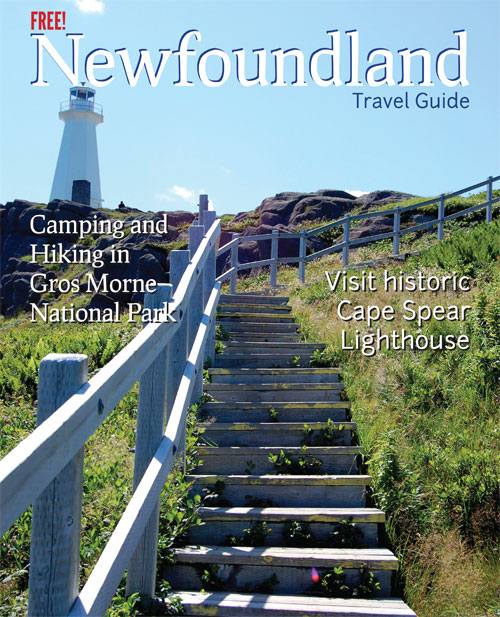
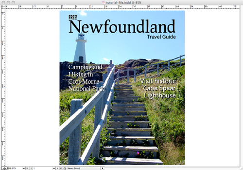
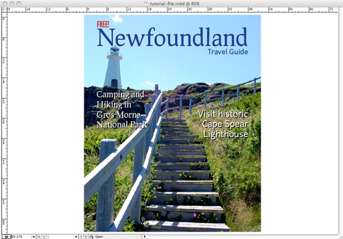
Here's the final cover we'll be creating:
 We've also used freely-available typefaces, all from The League of Moveable Type. Download and install these fonts if you don't already have them.
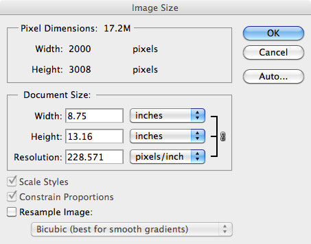 We're just going to resize this to 8.75" wide (which makes it just under 230dpi). If the item you're designing is going to be printed on something like newsprint, then you can get away with a lower resolution. Some photos will come out looking fine at resolutions like this on glossy paper, while others won't. Again, it's a risk if you want to use an image less than 300dpi for any printed material.
The other thing we need to do is convert the image to CMYK. Go to Image > Mode > CMYK Color. I usually opt not to flatten images if prompted, but with something like this, it doesn't matter, as it's only one layer.
Then, save your image as a .TIF file with no compression. If you save it as a JPEG, you're likely to get artifacts in your final, printed piece. Saving in an uncompressed format eliminates this.
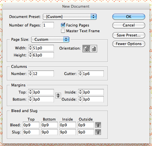 You'll notice we've set this up with 12 columns. This is to give us more guidelines to work with, even though our cover design will really only have more like two columns. Anything more than 12 columns tends to get too close together to work with effectively.
You'll also notice we have a .125" bleed all the way around our document. This is so that if the printer is slightly off, we don't end up with blank white space along any of the edges of our cover. A bleed is vital in print design when anything but white space is going to meet the edge of your page.
Your document should look like this:
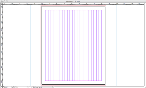 At this point, I always save the document. I also save frequently throughout the design process (using ?S makes it faster). I can't count the number of times I've been nearly finished with a project only to have the power go out or my computer freeze up, costing me hours of work. Saving every few minutes means you'll only ever lose a few minutes' worth of work.
The first thing we'll do is place your cover image. Create a graphic frame using the Rectangle Frame Tool (F) that follows the red bleed guidelines just outside the page outline. The Rectangle Frame Tool usually defaults to create a graphic frame, but right click in the frame when it's done, click on "Content", and verify that there's a check mark next to "Graphic".
Place your image in the box next. Make sure the box is selected and then either go to File and then Place, or just use ?D (all the shortcuts given correspond to the Mac shortcuts). Then browse to the correct image and click on "Open".
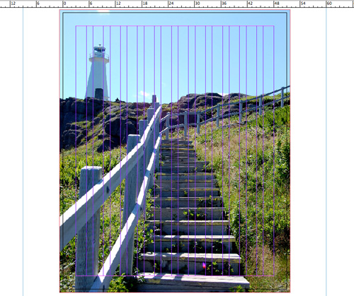 You may want to adjust the position of your image within the graphic frame (since it defaults to aligning the upper right corners). To do this, use the Direct Selection Tool (A) and then drag the image (you can also use your arrow keys to nudge it around once you've clicked on it).
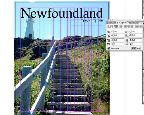 Let's nudge our background image down a bit, so the top of the lighthouse is below the title.
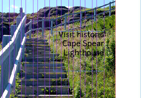
Now we'll add in some teasers for the content inside the magazine. Create a text frame in the grassy area to the right of the staircase, aligned with the right margin. Type "Visit historic Cape Spear Lighthouse" here, and change the font to Junction, 30pt, and white. Go back to the Paragraph options box and right-align this text.
 Create another frame on the other side, in the rocks below the lighthouse, and add the text "Camping and Hiking in Gros Morne National Park". Set this to Prociono, 30pt, and left-align it. Let's make it white, too.
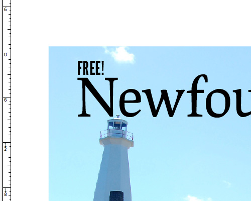
 We also need to add a "FREE!" message just over our title, so vacationers know the magazine is, well, free. Turn your guides back on for this one (?;), and then create a text frame just above our top margin, but lined up with the left margin. Type "FREE!" in that frame, and set the font to League Gothic (we're using a different font here so it will stand out a bit more), 30pt. Then nudge it down until the bottom of the text sits right on the top margin guide.
 You might wonder why we're creating a drop shadow in this manner, when InDesign has built-in shadow capabilities. The short answer is: the built-in shadows suck. They look horrible. You can spend a ton of time trying to fine-tune them to look good, but for the most part, it's very limiting. And if you want to create a nice, sharp drop shadow (which looks a lot better in this kind of design than a blurry, shaded drop shadow), this method is much quicker. If you still want to experiment with InDesign's drop shadow function, you can find it under the "Object" menu.
Recreate the same effect under your other teaser text box.
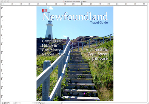
 Our title isn't standing out very much. Let's add a white overlay, rather than a drop shadow. Copy and paste in place your title text frame and then change the color to white. Nudge it down two and right two (like you would for a drop shadow), but then leave it on top. This makes it stand out more while adding more visual interest than our standard drop shadows for the teaser text.
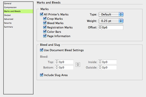
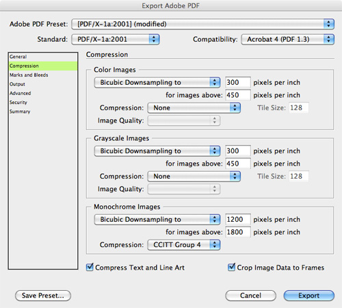 The other thing you'll want to adjust is the Marks and Bleeds settings. Unless otherwise instructed by your printer, make sure you specify that the PDF includes the bleed and slug settings from the document, and that it includes printer's marks.
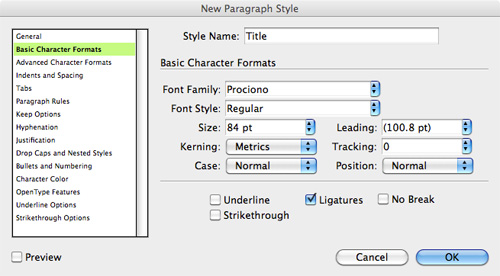
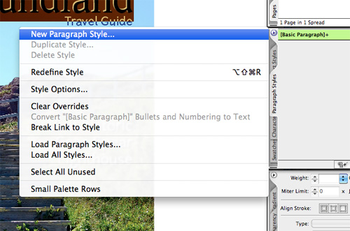 Then verify that your selected style is already set, and choose a name for the style (use descriptive names to make them easier to identify. Do this for each unique text style you have on your cover.
 The other thing you can do is save this document as a template. Because covers involve so much custom work each issue, I've found it unnecessary to set up master pages within my cover templates. Just got to Save As, and then change the file type to template. Then it's ready for you each issue.

Before You Begin
Like website design, there are certain things you need to know before designing any kind of print layout. While not complicated, there are many things that we rarely take into consideration when designing a website that are vital to the success of a print project. Key among these is image quality and margins (including bleeds). When choosing images for a print layout (or when provided with images), you have to make sure they're both sharp enough and have a high enough resolution. What looks great onscreen may be blurry or pixelated when printed on an offset printer (or even an inkjet). Any images used in a print layout need to be at least 300 dpi in order to look good. Any lower than that and they run the risk of being blurry or pixelated. When resizing images for print layouts, remember to turn off resampling in your Photoshop settings (or whatever program you're using to resize them). With very high quality images, you can sometimes get away with using images that are slightly lower resolution (as low as 250dpi at times), but check with your printer to see what they recommend based on your paper and other choices. If you're unsure of how an image is going to look, print it out on photo paper. While this won't give you an exact replica of how it will look when offset or digitally printed, it will at least give you a good idea of how sharp the image will look. Another key difference between web design and print design is the units of measure used. In web design, we generally use either pixels or em units (and sometimes percentages). In print design, you'll be using inches, centimeters, or points and picas. Points and picas are the traditional layout terms used in typography and print design. Traditionally, there are six picas in an inch (so each pica is 1/6th of an inch) and twelve points in each pica (so each point is 1/72nd of an inch). The default unit of measure in InDesign is points and picas.Materials You'll Need
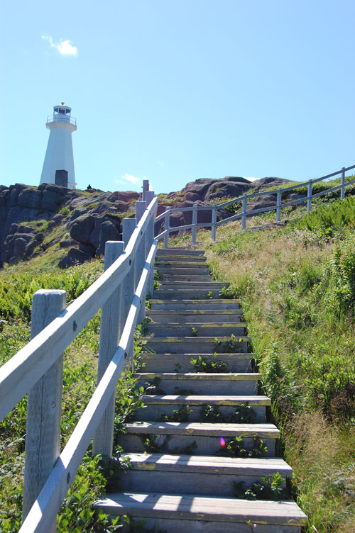
We're going to use Photoshop for resizing and reformatting our cover image, but you could use any photo editing program that will allow you to resize and change the color space of an image. We'll also be using Adobe InDesign CS2 (you can use newer or older versions and most of the techniques and keyboard shortcuts should carry over) for our layout. The principles here can be applied to any layout program, though the exact steps would be different. For this tutorial, we're using only freely available resources. You'll need to download a Creative Commons image from Flickr (the one here is the Cape Spear Lighthouse, taken by Jeremy Hetzel). Make sure you download it in the largest size possible. Here's the image: We've also used freely-available typefaces, all from The League of Moveable Type. Download and install these fonts if you don't already have them.
Preparing Your Cover Image
You'll need to do a couple of things after you download the cover image from Flickr. First, you need to make sure the image is large enough and that the resolution is at 300dpi. We need our cover image to be at least 8.75" x 11.125" (roughly 2,625 x 3,340 pixels) to account for the bleed in our document. This image, unfortunately, isn't 300dpi at the required size. We're going to use it anyway for this tutorial, but realize that if printed on an offset or digital printer, it wouldn't come out looking as sharp as we want. We're just going to resize this to 8.75" wide (which makes it just under 230dpi). If the item you're designing is going to be printed on something like newsprint, then you can get away with a lower resolution. Some photos will come out looking fine at resolutions like this on glossy paper, while others won't. Again, it's a risk if you want to use an image less than 300dpi for any printed material.
The other thing we need to do is convert the image to CMYK. Go to Image > Mode > CMYK Color. I usually opt not to flatten images if prompted, but with something like this, it doesn't matter, as it's only one layer.
Then, save your image as a .TIF file with no compression. If you save it as a JPEG, you're likely to get artifacts in your final, printed piece. Saving in an uncompressed format eliminates this.
The Basic Layout
We're going to set up a basic layout first, and then focus on styles, colors, and other design elements. This workflow tends to work well for beginners, though more advanced users may do their layout and styling at the same time. It's also common to need to tweak things a bit as you go on. Nudging images, text, headlines and other elements around a bit as you work is just as normal in print design as it is in web design, even when we use a grid-based layout. First, you'll need to set up a new document in InDesign. It's easier to just show the settings rather than spelling all of them out. Your new document dialogue box should look like this: You'll notice we've set this up with 12 columns. This is to give us more guidelines to work with, even though our cover design will really only have more like two columns. Anything more than 12 columns tends to get too close together to work with effectively.
You'll also notice we have a .125" bleed all the way around our document. This is so that if the printer is slightly off, we don't end up with blank white space along any of the edges of our cover. A bleed is vital in print design when anything but white space is going to meet the edge of your page.
Your document should look like this:
 At this point, I always save the document. I also save frequently throughout the design process (using ?S makes it faster). I can't count the number of times I've been nearly finished with a project only to have the power go out or my computer freeze up, costing me hours of work. Saving every few minutes means you'll only ever lose a few minutes' worth of work.
The first thing we'll do is place your cover image. Create a graphic frame using the Rectangle Frame Tool (F) that follows the red bleed guidelines just outside the page outline. The Rectangle Frame Tool usually defaults to create a graphic frame, but right click in the frame when it's done, click on "Content", and verify that there's a check mark next to "Graphic".
Place your image in the box next. Make sure the box is selected and then either go to File and then Place, or just use ?D (all the shortcuts given correspond to the Mac shortcuts). Then browse to the correct image and click on "Open".
 You may want to adjust the position of your image within the graphic frame (since it defaults to aligning the upper right corners). To do this, use the Direct Selection Tool (A) and then drag the image (you can also use your arrow keys to nudge it around once you've clicked on it).
Add Some Text
Next, draw a text frame using the Type Tool (T). Use the top, left, and right margins as a guide. Then type "Newfoundland" in the frame. Set the font to Prociono, 84 pt. For now, we'll leave it black. Since it's only one line, you won't need to adjust the leading. For the most part, the fonts we've selected have excellent leading, and won't need to be adjusted for this tutorial. To the lower right of the title, add another text frame aligned with the right margin. In this, type "Travel Guide". The font should be changed to Junction and the size should be 24 pt. Again, leave it black for now. We want this "Travel Guide" text to be right aligned, so let's open the Paragraph options box. To do this go to Window, then Type & Tables, and then Paragraph (or use Shift+?+T). Select the right align option here. Leave the options open so we can go back to it later. Let's nudge our background image down a bit, so the top of the lighthouse is below the title.
Now we'll add in some teasers for the content inside the magazine. Create a text frame in the grassy area to the right of the staircase, aligned with the right margin. Type "Visit historic Cape Spear Lighthouse" here, and change the font to Junction, 30pt, and white. Go back to the Paragraph options box and right-align this text.
 Create another frame on the other side, in the rocks below the lighthouse, and add the text "Camping and Hiking in Gros Morne National Park". Set this to Prociono, 30pt, and left-align it. Let's make it white, too.
 We also need to add a "FREE!" message just over our title, so vacationers know the magazine is, well, free. Turn your guides back on for this one (?;), and then create a text frame just above our top margin, but lined up with the left margin. Type "FREE!" in that frame, and set the font to League Gothic (we're using a different font here so it will stand out a bit more), 30pt. Then nudge it down until the bottom of the text sits right on the top margin guide.

Adding Some Style
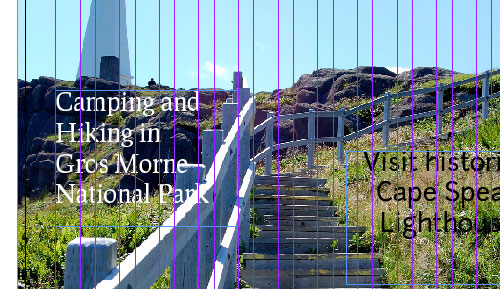
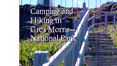
Now we want to add in some style to our text, and make it stand out a bit. I'm sure you've noticed that parts of our teasers aren't legible, due to the background image. Let's change that. First, hide your guides (?;) and frame edges (?H), both of which are located under the "View" menu. This gives us a better idea of what's visible, without a bunch of extra stuff clogging up our screen. Use the Selection Tool (V) and click on the "Camping and Hiking" text frame. Copy it and then use paste in place (under the Edit menu) to paste it in the exact spot of the original. Then use your arrow keys to nudge it down twice and right twice. Change the text color to black, and then send it backward (?[) until it's just behind the original text frame. This now serves as a drop shadow, which adds definition to the text. You might wonder why we're creating a drop shadow in this manner, when InDesign has built-in shadow capabilities. The short answer is: the built-in shadows suck. They look horrible. You can spend a ton of time trying to fine-tune them to look good, but for the most part, it's very limiting. And if you want to create a nice, sharp drop shadow (which looks a lot better in this kind of design than a blurry, shaded drop shadow), this method is much quicker. If you still want to experiment with InDesign's drop shadow function, you can find it under the "Object" menu.
Recreate the same effect under your other teaser text box.

Color
So now we have a mostly black-and-white layout, as far as text is concerned. Let's change the title color to a dark blue, to evoke the ocean, which we know is just out of view in this photo. Go to your swatches option box (which should be a tab in the same tool box that your paragraph styles are showing up in). Make sure it's set for the text to be affected, rather than the container, and then click on the appropriate color among your swatches. The color we're using is: C=100, M=90, Y=10, and K=0. Set the "Travel Guide" text to the same color. Let's make the "FREE!" bit red, so it stands out more. The color we'll use for that is C=15, M=100, Y=100, and K=0. If you need to add a color swatch, just click on the arrow at the top of the swatch box and then click on "New Color Swatch". Our title isn't standing out very much. Let's add a white overlay, rather than a drop shadow. Copy and paste in place your title text frame and then change the color to white. Nudge it down two and right two (like you would for a drop shadow), but then leave it on top. This makes it stand out more while adding more visual interest than our standard drop shadows for the teaser text.

Prepare the File for Your Printer
You'll probably get instructions from the printer who's going to take care of printing your magazine that detail exactly how they want the files. But sometimes they're not so helpful, or your client hasn't decided on a printer yet. In either case, you'll likely want to export your cover to a PDF, rather than sending the original files. There's less chance things will get screwed up this way, and it makes it possible for your client to view the final file without special software. Go to File, then Export. A dialogue will pop up to save the file. Choose your file name and location, and then click Save. A PDF-specific dialogue box will then pop up. I generally use the PDF/X-1a:2001 standards, though I make a couple of adjustments, mainly to the compression settings. Rather than the stock JPEG compression, I change the compression to "none". Again, if your printer has sent instructions, follow those rather than these. They may even send you a preset to use, which makes exporting much simpler. The other thing you'll want to adjust is the Marks and Bleeds settings. Unless otherwise instructed by your printer, make sure you specify that the PDF includes the bleed and slug settings from the document, and that it includes printer's marks.

Preparing for Future Documents
If this is a cover design for a regular magazine, you'll probably want to set up some styles for your title and teasers, so that you can quickly either apply changes in the future or so you can easily add more text without having to restyle it from scratch. To create a paragraph style from what we've already done, just highlight some text and then go to your Paragraph Styles pane and then click on the arrow at the top. Select "New Paragraph Style": Then verify that your selected style is already set, and choose a name for the style (use descriptive names to make them easier to identify. Do this for each unique text style you have on your cover.
 The other thing you can do is save this document as a template. Because covers involve so much custom work each issue, I've found it unnecessary to set up master pages within my cover templates. Just got to Save As, and then change the file type to template. Then it's ready for you each issue.

Aaaaaaand usually it’s not that way.
Hi,
Nice tutorial for beginners into this field. One point I thought I could add was to always check with your printer with regards to ink limits. Especially with colours like black. A lot of printers have set maximum ink limits with regards to how much ink goes onto the page when you make up colours with CMYK.
For black I would suggest NEVER making it up out of
C=100 M=100 Y=100 K=100.
Alot of printers I have worked with have an ink limit 250% – 300% the above black is obviously 400%. Correct me if I am wrong but I think this is down to drying times of the paper when at press, and also ink spread on the paper.
Depending on what stock paper used in the print might lead to different ink limits. So as a precaution just use
K=100
or to add a nice rich black use
C=40 M=0 Y=0 K=100.
Also be aware when creating jobs for print if you use PANTONE colours. When these are printed in CMYK they may come back different to how they looked on screen and when printed using your inkjet or whatever. Best to convert to CMYK before you send the proof to the client to avoid conflict with the client once printed.
More tutorials on print would be great to see.
Dan
Nice tutorial. I’ve been trying to branch out into this field myself and it’s kinda hard, this is really quite helpful! I’m currently training myself thru emulation, with this magazine as my guideline – I like the style.
Nice tutorial..
Seems far too complex for such simple results.
Try a PS/AI combo next time, rather than ID.
For that particular design maybe.. but designing for magazines etc, generally is a lot quicker and easier using ID or Quark. Setting up margins, gutter width etc and then preparing for print in PS / AI is not worth the effort.
Yup. It drives me crazy when people suggest this. ID is a LAYOUT program. PS and AI are not. If you’re doing print layout, then use the program that is designed for that!
As a magazine designer myself I must say: keep doing web design, that cover is terrible!… and I’m saying this in the most positive way
Keep doing your magazines and go
You need to be able to take critisism in this industry. I also did not think it was a good design.
really constructive comment there! To be fair the design is pretty terrible but as pointed out the design is irrelevant, the article is about the techniques used.
As he pointed out numerous times in the article, the design is irrelevant, it is about the techniques used to create it.
LOL@Alfredo! ahaha
First I must say, the design looks very good to me!
I love the sharpness and brightness! It reminds me of a better home magazine cover.
Great tutorial! Just what i am looking for.
I agree with Alfredo.
It’s a good tutorial for a beginner, but the cover really looks too “homemade”.
The font, the shadow applied to the font: I think that only a beginner could use such a combination.
In my opinion, this cover isn’t ” serviceable and of professional quality” at all, it’s only a good starting point to get a method.
Hi there! I agree with Alfredo and Eleonora. The Cover looks terrible and unprofessional. Sorry for that, but it´s true. For beginner ok, but it´s not worth for a tutorial. No magazine you buy in a shop looks like that. But don´t give up, you will become better soon, it´s a hard work.
very useful ! I will try ~
Can be tried by beginners to focalize their skills.
The only thing somewhat useful in this article is the “Prepare the File for Your Printer”-part. The end result looks kinda “meh”.
Hi there! I agree with Alfredo, Eleonora and Peter. The picture itself is nice, but the title is hard to read. Usually there are more headlines and common things like the barcode, prizes, webaddress (Even if it is just a beginners tutorial they should be integrated). Besides that one issue is always part of a concept and not an artwork
Great tutorial, thank you!
I have to agree with Alfredo here. I opened this from a tweet hoping to get some inspiration. Maybe the title should be “Printing Guidelines for a Magazine Cover” versus “Creating a Magazine Cover” which implies you will be creating something that is worth while.
The guidelines for dealing with the final output and the printer are helpful. What the tutorial is lacking is the creation or design aspect.
Just my two cents and yes I have designed magazine covers before.
A very useful Tut.
from a technical point of view it’s pretty bad, no use of baseline grids, no mention of route2 rectangles to create a composite grid, no detailed typographic instructions on how and why to use various weights and where to place them.
There are a huge number of detailed elements which go into a cover and none of them are really mentioned here.
Can you explain why you are using the term DPI instead of PPI?
I would not believe I have ever noticed a website on this several responses onto it!
Keep up the good work. Everyone is opened to there opinion. Excellent blog here, i am still reading
Thanks for this tutorial :)
Magazine Covers Design: http://smashingwall.com/inspiration/30-awesome-magazine-covers-design-inspiration/
Good afternoon to all the readers. As a proud editor of a community magazine I would love to subscribe the newsletter. Which one is the direct link? Thank you very much, Marta.
Youre so cool! I dont suppose Ive learn something like this before. So nice to search out someone with some unique ideas on this subject. realy thanks for starting this up. this web site is one thing that’s wanted on the net, somebody with a little originality. useful job for bringing something new to the web!
Great tutorial for beginners…a few items are missing to make it a real cover magazine though. And basically yes, workable on CS5….
Thanks for the tutorial….. Really good for beginners…