Key Takeaways From the Most Successful Rebranding Campaigns

People outgrow themselves. So many things can make you, if not better, so different from what you used to be.
You could love kayaking in your younger years but would love the indoors once you turn 30. You could be a house person, then become a mountaineer as you get older.
And if people change, so do companies. Brands can grow and shrink too. Companies that consistently reinvent themselves will ultimately grow in size, number, and power. On the other hand, companies that are not inventive and sensible enough shrink in resources and customer base. Both cases tell it’s time for a rebrand.
Because when companies change, they must change how they present their identity.
Here in this article, we’ll take a look at some of the best cases of rebranding. True, rebranding is not always successful. Some companies failed after trying to change people’s perceptions of them. But as we will see in the following cases, companies can follow calculated strategies to make a rebrand work to their advantage.
So buckle up and follow along.
But first, what is a rebrand?
A rebrand is a marketing strategy that aims to change the company’s brand identity. This identity can be completely new or a slightly altered version of the old.
A rebranding process mainly changes the following: logo, slogan, website, typography, name, term, symbols, marketing, advertising strategies, and more.
Sure, the ultimate goal of rebranding is generally positive, for example, to improve customer retention and increase brand following. But some rebranding is still bound to fail. That could be because they failed to listen to customers’ suggestions or misunderstood and disregarded their core values along the process.
The good news is there are success stories. Some companies have managed to rebrand well enough that they became successful over the next decades. Some brands became more inclusive and poised to take over a bigger market share. So how did these companies do it? Take a look at the examples below:
1. Walmart
Old perception:
During its early years, shoppers considered Walmart as the destination for cheap goods. At that time, inexpensive products are what matters to shoppers. So this brand identity was very successful.
But over time, people became more sophisticated and began to search for pricier goods because they can afford them. Also, cheaper goods equaled substandard quality. So Walmart had lost its appeal. Their tagline “Always low prices” wasn’t working anymore.
Moreover, by the early 2000s, Walmart had been facing legal issues. Their shady corporate practices became the subjects of news. From then on, the public perception of Walmart continued to spiral out of control.
Rebranding efforts:

Photo by Luis Zambrano: https://www.pexels.com/photo/man-and-woman-smiling-at-walmart-car-park-10948490/
They redesigned their logo. From the previous Wal*Mart to Walmart with a starburst on the right. The typeface also features a vibrant and thinner design.
More than that, Walmart overhauled its stores. They restructured the ceilings and widened the spaces. From the dark blue, they replaced the color palettes with light blue, green, yellow, and orange.
They rewrote the old slogan “Always low prices” to “Save Money. Live Better”. They take the focus away from the price and more on the benefits of their products. It’s cheap, yes, but it also saves money and helps you live better.
Results:
People started rushing into Walmart to see if there was something new. And indeed, customers perceive the new Walmart positively with the refurbished logo and slogan and the overhaul of the stores’ interior design.
The company started hearing reviews of how clean, fast, and friendly the stores are. Finally, the rebrand was successful enough that Walmart would become America’s number one retail store in the coming decades.
This rebrand is also partly the reason why they can compete with Amazon. The eCommerce giant’s sheer size has prompted the closure of some small stores around the world. But not for Walmart. America’s retail giant is still relevant in the age of eCommerce.
Lesson:
Do some customer research. Find out if your tagline and logo still work with your target audience. If not anymore, then it’s OK to change these brand features as long as a result still communicates the brand’s core.
Change wordings and emphasize emotions. All this can make the brand more customer-centric.
While visual identity is very important, a great rebranding campaign extends to the actual space, the products, and the services. A successful rebrand must reimagine everything there is to improve about the company.
2. Apple
Old perception:
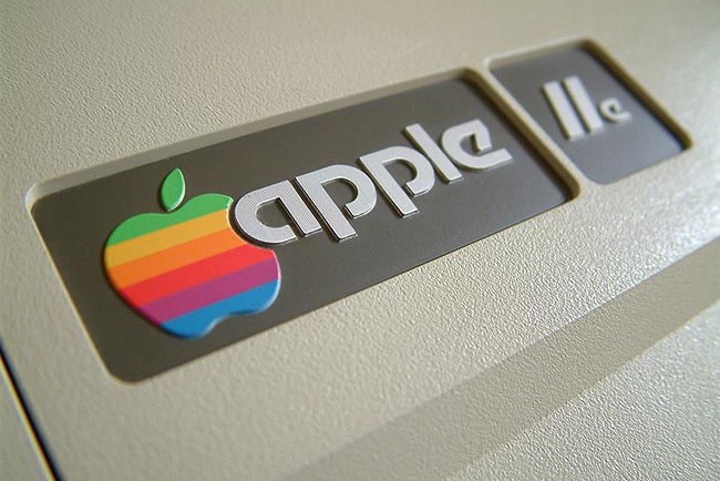
In 1997, Apple was nearing bankruptcy. It had just 90 days of going broke. Microsoft and other competitors eclipsed their market share. So they had cut off a third of their workforce.
When Steve Jobs founded the company in 1976, the goal was to make bulky and complicated personal computers more marketable. But when Jobs left, Apple was struck in a desiccate rut with zero innovative ideas and emerging competitors. On top of that, Apple was plagued with leadership turmoil and failed product launches.
When Steve Jobs came back to the boardroom after a coup, Apple was in terrible shape. By the end of that year, Apple had lost $867 million, and the total value of its shares was less than $3 billion.
Rebranding efforts:
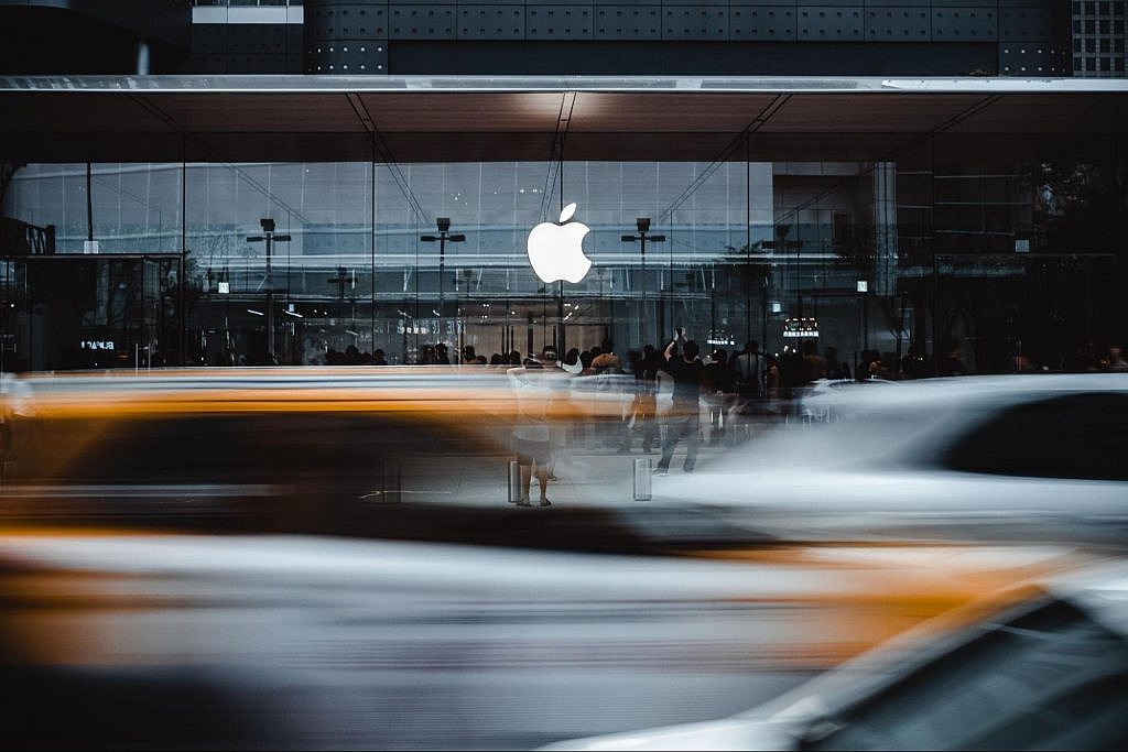
Apple underwent a series of rebranding efforts. The first thing they did was to change the most visible aspect of the brand — their logo. The rainbow-colored Apple with a bite redesigned it to a minimalistic, futuristic, metallic, and shiny apple.
They also changed the name of the company from Apple Computers Inc. to just Apple. Their goal was to include more products and not just personal computers.
Apple was aiming for simplicity. Their succeeding products — the iPad, iPod, and iPhones — had simple outside designs. The retail stores’ interior designs were minimalist too. Steve Jobs himself had carried simplicity well with his choice of turtle neck tops and basic jeans in every conference.
Their TV advertisement “Think Different” was considered one of the ad campaigns. It suggested that Apple is a pioneer, and it pushed the boundaries of the status quo.
Results:
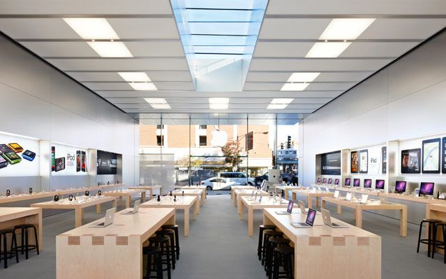
The success of their following products, namely the iPod and the iPhone, on top of their rebranding made Apple the company that it is today. As a result, the tech giant has the highest valuation of more than a trillion dollars.
The apple-with-a-bite logo is one of the most recognizable logos in the world. And because they cut off the name computers, everyone welcomed their non-computer products such as the IPhones, IPods, iWatch, iPad, Apple TVs, gaming, and many other tech innovations and digital services.
They have the most loyal brand following in the world. People rush into the stores and gorge on any information they can get every time Apple announces a product launch.
Even today, when the smartphone market is very saturated, Apple still claims one of the largest market shares and dominates every part of the globe.
Lesson:
Rebranding is more than just the visuals. It includes the quality and innovativeness of the products. The good thing with Apple is they cracked both factors. Visual-wise, a lot of people loved the minimalistic approach to everything — from physical stores to websites. With their products, people believed that their life would be better using them.
So in trying to rebrand, it’s vital to assess what lacks in both the visuals and products. And make sure that you intertwine them in the process. For the visuals, it has to be unique that most people will love. For the products, they have to be beneficial enough.
3. Instagram

Old perception:
On the 26th of October in 2010, another social media company entered the market. In the following years, Instagram would become a social media giant, with users amounting to 1 billion in 2021. Now, Instagram is the destination of companies that are aiming to penetrate a vast market.
However, Instagram in its early years was just a simple photo-sharing platform. Users choose filters, and they can post them for their followers to like and share. There was no existence of online selling of some sorts, not even influencers or many professional creators.
As the social media company enjoyed tremendous success, it grew in size. Creators and celebrities proliferated on the app. By then, almost all types of companies and brands joined the platform. As a result, Instagram is now a hotbed of many other things.
So the old perception of Instagram as a photo-sharing platform alone doesn’t do it anymore. They had to evolve in some way.
Rebranding efforts:
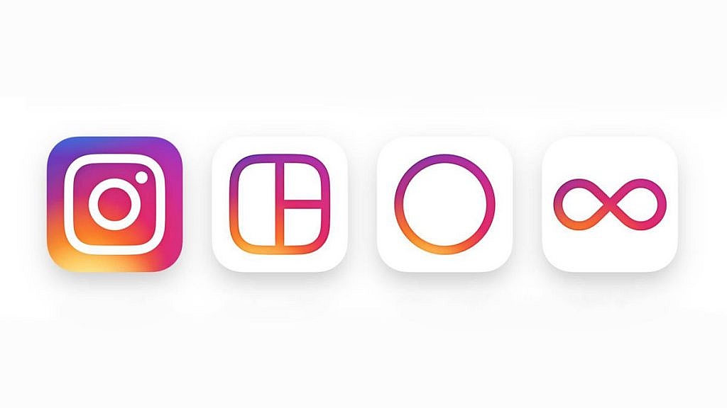
Instagram focused its rebranding efforts on its visual presence. Instagram used to have an incoherent design. For example, the brown colors of its logo cannot be seen anywhere on the app. Plus, the old logo — a retro camera — resembles Instagram’s antiquated features.
So when Instagram developed into a multi-faceted social media, not just a photo-sharing platform, the previous logo had to go. Designers replaced it with a flat-designed neon camera. The many colors resemble the diverse community of creators, professionals, celebrities, government, and companies who have used the platform.
They also changed the design of its companion apps such as Hyperlapse, Boomerang, and Layout. The new look mimics that of the logo, with different shades of light pink and yellow.
Results:
From then on, Instagram grew to a billion users. What was supposed to have been achieved in 2020, the app has gained a billion users in just 2018. It may not be because of its rebranding alone. Instagram has made significant innovations in the past few years. Things like IG stores, stories, IGTV, etc.
But because of its rebranding, the company has eradicated its limitations. So do the customers used to view IG as an old photo-sharing app. Not anymore.
Instagram is now the leading force to shape brand awareness and social issues. And it continues to become a top social media app after ten years, only behind Facebook, its parent company.
Lesson:
Companies mostly focus on themselves when trying to craft their branding or rebranding. For example, they want to emphasize the computers on logos because they provide computing services. Or they want to pick a green color because they’re a sustainable company.
And it’s not inherently wrong. In fact, it’s always the first step when creating a brand—looking inwards. But sometimes, it’s a good idea to look outwards, see the customers, and define their definition when viewed as a whole.
Instagram did it right when they first looked into their customers, and second, they defined them. Whether it’s the design of the logo or the colors, it has manifested well.
4. Airbnb
Old perception:
The original idea behind Airbnb is for people to book hotels, motels, and rooms or houses in the comfort of their mobile phones. And indeed, it has lived up to its promise. Upon its launch, thousands of people book stays through Airbnb.
But after several years, Airbnb’s services began to diversify. From just the booking service, it started to include experiences, like glamping, camping, surfing, lake fishing, etc. In addition, many people were interested in staying in host families and hostels where they soak in the unfamiliarity of the language and foreign culture.
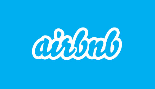
The company brand, however, does not reflect those customers’ growing interests. Instead, the logo and other visual identities were the same as when the company was founded years ago.
Rebranding efforts:
To assess the Airbnb experience, designers stayed on many hosts across 13 cities and four continents. As a result, the designers understand what mattered the most to Airbnb users through this journey — a sense of belonging.
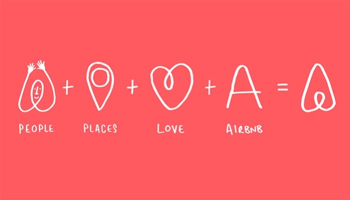
Because of this revelation, they rewrote the script logotype with a simple sans serif typeface. And then they created a new logomark which is what they called the Bélo. It’s an inverted heart that talks about people, love, places, and Airbnb. They also transferred this new typography, photography, and color palette to other visual assets like websites, apps, and other areas.
As is with any rebrand, it’s most effective when carried over to a much deeper level. Airbnb provided their employees some day-offs and free community outreach programs, so they, too, experience Airbnb’s value of belonging.

Results:
The company’s rebranding was a significant success. Although not all people initially love the idea, they eventually get the point. As a result, Airbnb won an award as Meaningful Brand of the Year 2016 from The Drum Marketing Awards.
Airbnb has never been successful. It has grown to a valuation of more than 30 billion dollars, with more than six million listings in 200 countries and 2 million people staying every night. The message to investors and customers was clear-cut, that wherever community they are in, they belong.
Lesson:
Do your research. Ask your consumers what makes your services unique. Why do they continue to patronize your company despite several others in the market? What is the emotion involved?
Better yet, experience the services yourself. If you’re the one to design the logo or direct the rebranding, you must have experienced everything about the products and the services.
Like the Airbnb designers, they made sure they themselves know what makes the customers continue loving the company. And once they figured it out, which is that sense of belonging, it just gradually poured over every aspect of their campaign.
5. Dunkin

Old perception:
Everyone knows Dunkin’ sells doughnuts. Their old name says so. The company used to sell doughnuts and coffee. Now they offer breakfast meals, sandwiches, milk teas, and more. So while Dunking got famous by selling doughnuts, they’re not the only product that makes up their huge sales.
Moreover, Dunkin’ is often associated with those cobblestone stores and antiquated physical shops. So the company had to deal with these people’s perceptions of their stores. Also, more and more coffee shops are sprouting everywhere with advanced technological services that Dunkin Donuts lack.
Rebranding efforts:
The company has enjoyed great success since its founding. But since their services have diversified, their old brand image no longer works.
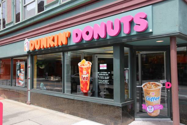
The first thing they did was cut off “Doughnuts” in their name. So what was left was Dunkin’. But, of course, their customers mostly call the brand Dunkin’ even before they slash Doughnuts off, so it’s not a big deal.
Plus, Dunkin’ wants people to pay attention to its coffee products, who happen to be big sellers too. The designers did not change all aspects of the logo. They retained the familiar store colors of pink, purple, and orange.
In addressing their antiquated stores, the company also rebranded as a tech-friendly business. They invested 100 million dollars in reinventing their stores. The company bought new equipment for faster drive-through lanes should people order on their phones.
Results:
It’s too early to tell the aftermath of the company’s rebrand. But so far, the company has enjoyed a positive perception. Dunkin’ was able to expand its territory too. With more products and services to offer, the company has driven more sales. But more than that, they repositioned their brand now as a competitor to the ever-growing beverage industry.
Leveling up the technological game is not something any brand can go wrong with. More companies are technologically efficient. And more people love to buy things from their phones. So Dunkin’ did just right when they rebranded as someone who loves technology.
Lesson:
A company can outgrow its previous image. It’s better to undergo rebranding in this case. Two positive effects can happen. First, the brand could include more services, entice a bigger market share, and challenge different industries. Second, the company can outgrow some of its unpleasant sides while staying true to what makes it unique and great in the first place.
In the case of Dunkin, they are still a doughnut shop, but not exclusively. They now offer many products. And their investments in tech have enticed millennial and techie consumers.
Final Thoughts
Rebranding is more than just the visual identity. True, as the most visible part of the brand, logos are what most people see when companies undergo a rebrand. You can do so in a free logo maker tool or have your logo professionally designed as most big companies do.
The next things people notice are the choice of typefaces, colors, stores, and more. Yes, changing visuals are so vital to rebranding. But it’s supposed to be just a conduit of something bigger. A good rebranding strategy involves more than just visuals. There has to be corporate and customer values, future perspectives, the importance of the brand to the customers, unique selling points, storytelling, etc.
Not including them can result in a short-lived rebranding success. On the other hand, if brands carefully consider these factors, decades of success await. So what are you waiting for? Is it time for your company to rebrand? If so, what are the factors you’re considering? Share in the comments.
Featured Image by Patrik Michalicka on Unsplash

GREAT