How to improve your website’s user experience with a few quick changes
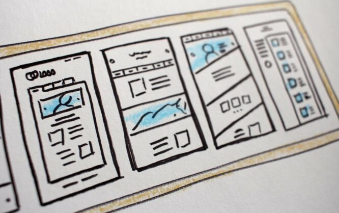
Considering a large number of websites existent on the Internet, you can tell how complicated it is to stand out from the rest and make users remember their experience with your site in particular.
Most modern websites choose simple visuals and interactive elements to generate a response from users.
Web designers are currently putting more attention on how a website is built instead of how it looks. The user experience is the one detail that can entirely influence the bounce rate on a website.
Good user experience will lead to a smaller exit rate and a visible increase in conversion rates or recurrent users. Achieving a user experience that is as close as possible to perfection represents a competitive advantage that everyone should strive for at the moment.
So, what exactly is user experience?
It’s not the easiest thing to define user experience because it includes so many factors that its limits are uncertain. User experience often referred to as UX, is the behavior that a user displays when he interacts with a certain website. UX includes both website design and form design.
To make it clearer, UX has to do with how the user perceives a website and how easy utilizing this website is. When user experience is improved, people will return to spend more time on this site, thus encouraging brand interaction.
What are the expectations of today’s users?
Now that you understand what user experience is, it’s time to figure out how you can improve it. In order to make a website better in terms of UX, you need to know what users expect in the first place. Here are some elements to consider:
The website’s speed
Speed is a critical factor when discussing user experience. No one would enjoy a slow website, no matter how well it is built visually wise. Even though encountering a website that is too slow to use is quite a rare situation, it’s best to adopt speed improvement approaches whenever you have the chance.
If a user notices that the website doesn’t load at all within a few seconds from accessing it, his first reaction would be to choose another one instead. The result? A huge bounce rate that will affect your conversion rate.
The navigation menu
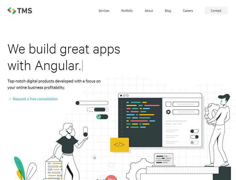
People must be able to find what they are looking for rapidly. A complicated navigation menu won’t lead anywhere.
On the other hand, a clear menu that offers users relevant information will increase the chance to convert users. Pay attention to how you built your website’s navigation.
Design elements
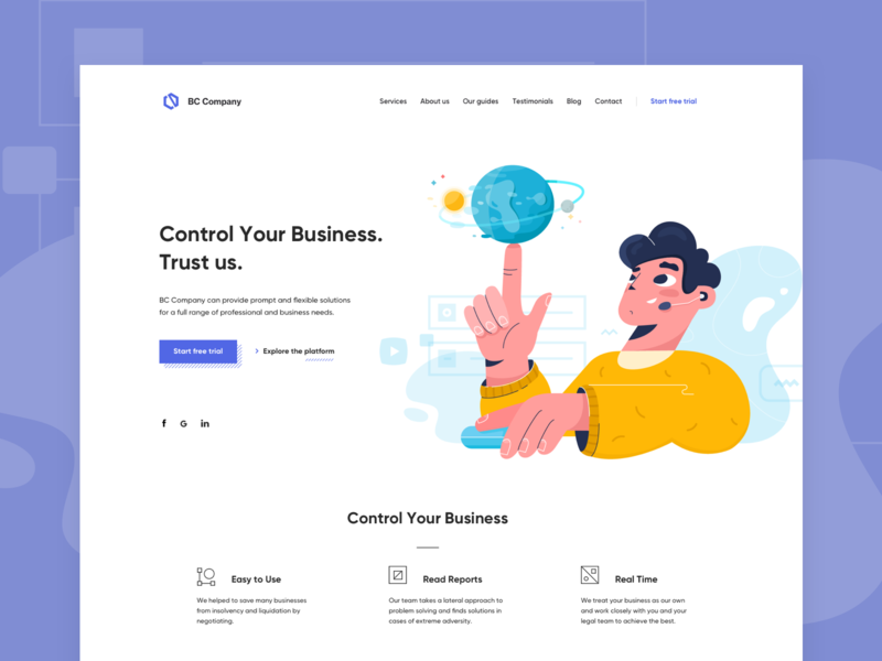
Visuals do have an important role in user experience, but it is not the most important. A website that has been designed by following the latest trends and that is overall eye-pleasing will definitely return positive results.
A website that features low-quality visuals won’t be appreciated and users might never come back, even though your website was relevant for their searches. As in any other case, the first impression matters.
Responsiveness
Another factor that you can’t ignore is responsiveness. Keeping in mind that there are millions of phone-only users in the world, you should make your website mobile-friendly.
Your website should be accessible from all sorts of devices, regardless of their size. Non-responsive websites are often left within a couple of seconds.
How can you improve your website’s user experience?
Now that you know what expectations people have, see what you can do to improve your website’s user experience:
Keep it clean
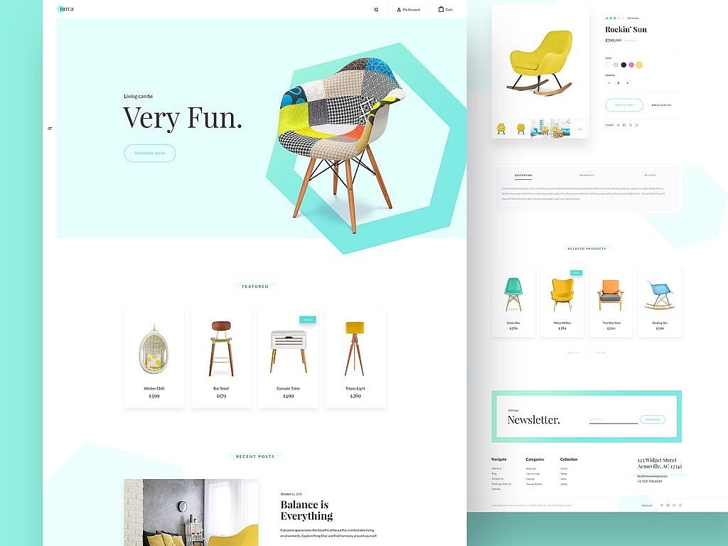
Simple designs are much more appreciated than complex ones. The main purpose of a website is to help the user find what he is looking for. Smooth user experience is based on keeping the website’s structure clean. Crowding the website with all sorts of elements will only slow it down and confuse the user, which is exactly what you want to avoid.
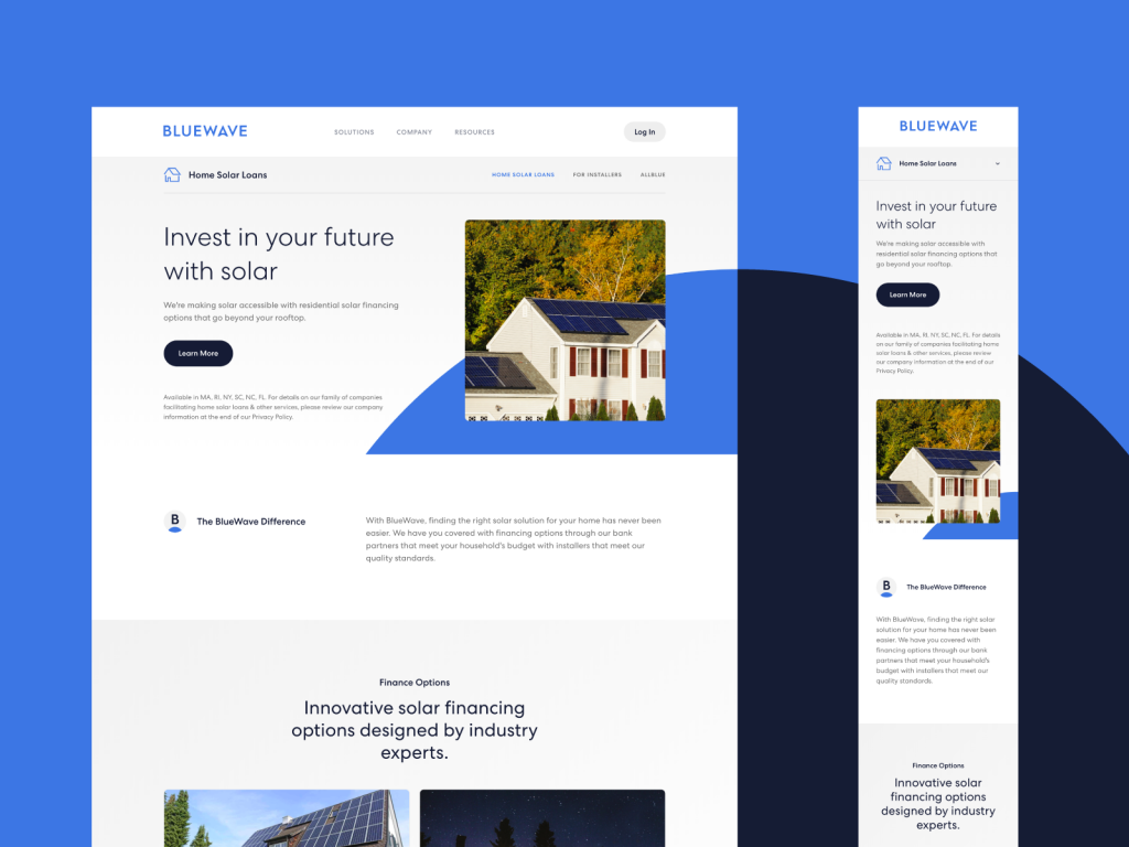
The website’s usability is deeply related to how simple it is. The navigation menu should be intuitive and responsive. A navigation menu that is impossible to use will lead to bad user experience, thus making the website unnecessary to visitors. Using familiar web design elements and simple navigation systems, such as tabbed or header navigation should do the job just fine.
Use CTAs
Remember that the purpose of good user experience design is to make people return to the website. This won’t happen if they don’t find the website relevant for their needs. To help users find exactly what they want, you should use Call-To-Action elements (CTAs).
These elements will give users some directions so that they can reach the location they expect to find on the website much easier and faster. When creating CTAs, make sure to get informed about color psychology and hierarchy design.
These small details can make a huge difference in the long run. Placing the CTAs strategically will determine whether they will be effective or not. As the name says it, you need to make use of action verbs that encourage users to do something. Try to generate an emotional response through the message that you incorporate through the CTAs.
White space is appreciated
White space is often overlooked, even though it can be very helpful. Some blank space offers users a moment to process the information they see while giving the website an airy look. As many web designers stated, white space can make a tremendous difference in terms of user experience.
It can boost the conversion rate, simply by delimitating content better and giving users the chance to find what they want in an easier manner. White space can also be used to highlight something to make it pop up in the user’s eyes when he first enters the website.
Deal with errors
Considering the latest advancements in terms of search engine algorithms, you might be surprised to hear that soft 404 errors are now one reason why your website will go down the drain.
If your website works, but some links or options on it send users to 404 error pages, you need to solve the issue as quickly as possible. There is nothing worse than a frustrated visitor who is eager to find something on your website and he ends up staring at a blank page.
Fix the errors to provide users with an undisrupted journey on your site. Soft errors are not worth the consequences, which means you should take your time to check out each option on your website and fix any error that appears along the way.
Use headings
Using headings makes the content easier to skim through. As mentioned before, time is a very precious resource of people who browse the web, so there is no wonder why they won’t read your whole content word by word. Just make sure to deliver the key points and make the user assimilate them as fast as possible. One method to do that is through well-designed headings.
Use animations
Animations can slow down a website if they are not optimized properly, but they can also change the entire game. Interaction is an important part of UX design, and you can’t skip it just because it might be inconvenient.
Animations are micro-interactions that help people become more familiar with a website in a shorter period of time. Furthermore, animations stir curiosity, especially if they are changed once in a while. This could contribute to a user’s desire to come back to a website in the future. Give your website the proper feel by choosing an animation-based UX design.
Use hyperlink differentiation
Adding links to content is a great way to make it feel genuine and informed. As a publisher, your main goal is to make people click the links you’ve inserted into the text.
To encourage this behavior, use hyperlink differentiation. This means that the links you use should stand out from the rest of the text. Use other colors, underlining, italic, bold or whatever option may look good for your website.
Use images
Using your own high-quality images instead of using stock photos has a great impact on users. Because most people surf the Internet quite often, they can all recognize a stock photo when they see it. Such images simply do not express professionalism or uniqueness.
Find your personal style and use your own images when building a website. Generic images won’t contribute to good user experience, but personal images will so make your choice wisely.
Be consistent
Keeping consistent with your content publishing and website choices is another matter that contributes to the user experience. Your website’s visitors will get used with a certain tone, style, and information quality. In order to provide visitors with the quality they expect, stay consistent and try to maintain your website on the same line. Otherwise, users can get confused and lose their trust in the website.
Photo by Hal Gatewood on Unsplash

Thanks for your good information
I like your tips and I will apply it on my blog. Thanks for Sharing.
Hi Sir, Adding videos in content. Does it improves the user experience
great article on website & user experiences. thanks for sharing.
Excellent post you shared here on “how to improve website user experience with a few quick changes”.
I really enjoyed this post.
You explanations of this stuff are the best on the web. Simple, clear, tested by a real person! Thanks so much
Thanks for sharing this post. Helpful and Informative.
i read your posts regularly to enhance my skills , thanks for sharing such informative post
nice article..
thank you sharing such information..
awesome blog post .This is a great information to blog i have read from nice blog i am happy your topics website tips very nice post.thank so much your post.
User experience is such an important topic for seo and website ranking in general. Thanks for the articel! :)
Nice blog thanks for sharing nice information
Thank you for sharing this post, this article is really helpful.