How to Create a Cute Piggy Bank in Perspective with Adobe Illustrator
Many people have difficulty in drawing objects in perspective. Most of the time it helps if you have that particular object in front of you, but we still need our imagination.The most important aspects of perspective are size and distance. If you increase the distance between you and the object you are observing, you need to decrease the size of that object. That way you can achieve a nice depth effect in your illustrations.
[fblike]
In this post we'll be learning how to create a cute pink piggy bank in perspective with the help of Adobe Illustrator CS4. Enjoy!
This is how the result will look like:

 Rotate the eyes a bit and place them on the Piggy Bank. You can see how the smaller eye makes the impression of the perspective. We will have to do that with other parts of the Piggy Bank as well.
 Let's continue with the eyes. Since our imaginary source of the light is above the Piggy Bank we need to make a highlight on the eyes. Let's copy-and-paste in front of the eyes. You can do that by selecting the eyes and then hitting
  Change the Fill color of the new shape to light pink:
 Now we are going to make another copy of the eyes. Don't forget the magic shortcuts
  Repeat the previous step. Scale the new copy of the eyes a little bit more and add a radial gradient:
 Now we need two white circles for creating a pupil. But be careful, one of the circles needs to be smaller because it's further away from us. Select both circles, right click and select Group (
 Lets copy (
 Repeat the previous step but for the Fill color use a radial gradient:
 Select the circles with radial gradient from the previous step and under
  Now make two small ellipses, set the Fill color to white and place them as shown in the picture below. Make sure that one ellipse is a bit smaller then the one closer to us (since that eye is smaller):

 Copy (
 Repeat the copy (
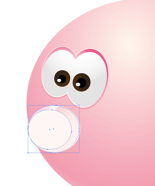 Make the copy of the white ellipse. Grab the middle handle of the selection box on the right and move it to the left for one pixel. Set the Fill color of the new ellipse to darker pink. Now we have achieved another highlight on the nose:
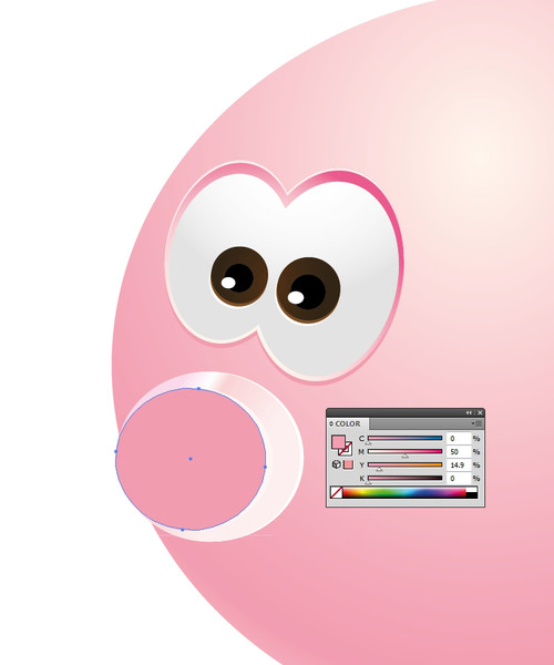 Now, let's make a light reflection. Grab the Ellipse Tool
 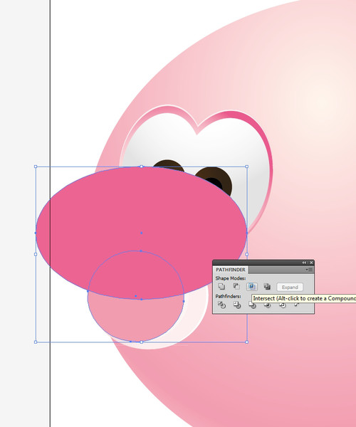 Change the Fill color of the new shape to something lighter than the color of the nose:
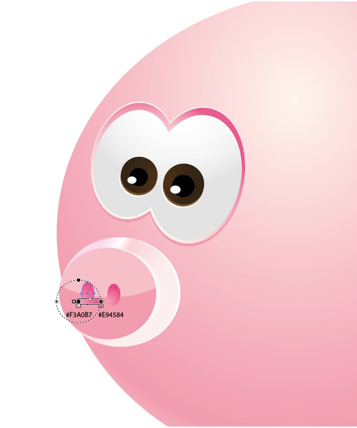
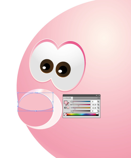 We are just a few steps away from finishing the Piggy Bank's snout. Now, we need to create the nostrils. For that we will need two ellipses. One more time, the ellipse that is farther from you will have to be smaller. Use the Ellipse Tool (
 Select both ellipses and group them (

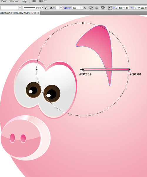 For the outer part of the ear we will need lighter colors. We will use a Linear gradient as shown in the picture below:
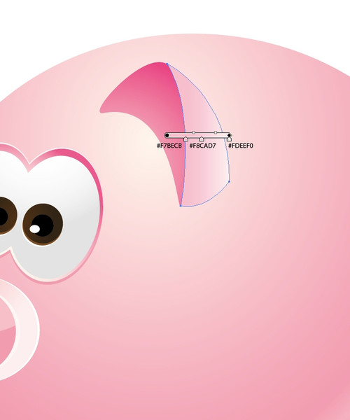 Yet again, we'll need highlights and shadows. First, select the outer part of the ear and make two copies. Nudge one copy one pixel to the left using the arrow key on the keyboard. Now select both copies and hit the Minus front option in the Pathfinder Panel. Do the same thing for the inner part of the ear. You will end up with a nice edge on the ear which will look like a highlight from the light. Don't forget to change the Fill color of the highlight to light pink (almost white):
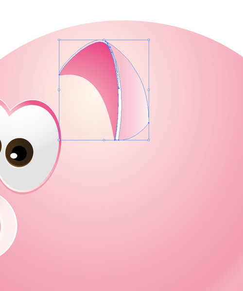 If we add an ear shadow it will make our Piggy Bank more realistic. Just select the Pen Tool (
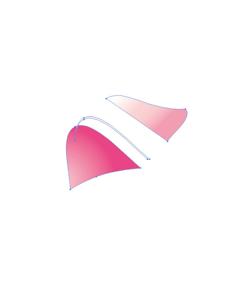
 The other ear should be smaller, it should be behind the Piggy Bank because we are not able to see that part of the body. It should also contain darker and lighter parts. Lets break the ear down into pieces. The steps are quite similar to the steps for the first ear. Just take the Pen Tool (
 This is the path we will be using to complete our window reflection:
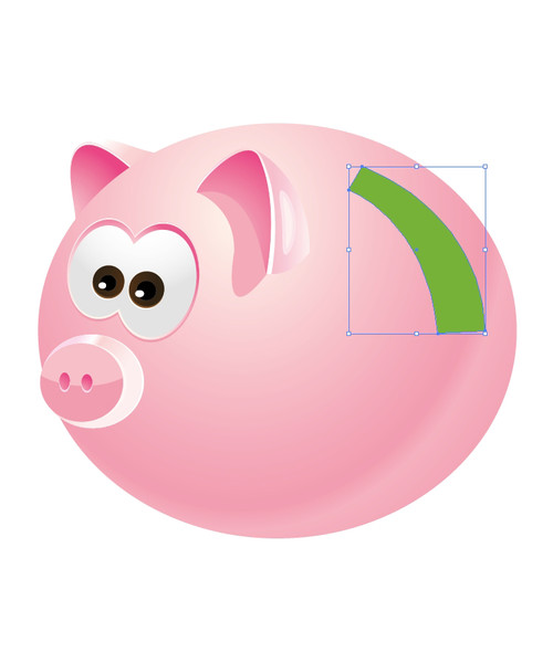 Deselect the new object we've just made and grab the Pen Tool (
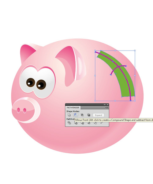
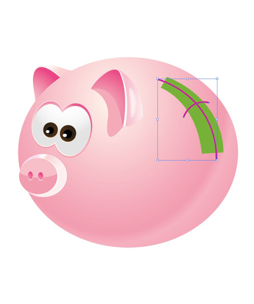 We need to expand those strokes. With both paths selected under Object select Expand. Now, holding down the Shift key, select the shape of the window reflection and under the Pathfinder Panel hit Minus Front:
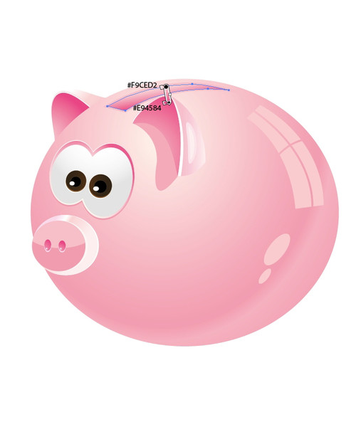
 Change the Fill color of the window reflection to lighter pink:

 To make the legs, we'll need the Pen Tool (
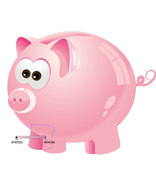 You can add highlights to the parts exposed to light. For other parts, just create shadows. Oh, and don't forget the mouth:
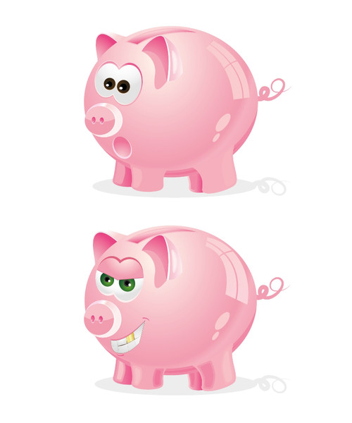
 Use your imagination and make different faces for the Piggy Bank. It can be fun. Here are some of my results!
 I really hope you enjoyed this tutorial. Using all these techniques we've used here, you can create pretty much anything. Just don't be afraid to experiment with colors, gradients and shadows. Use them wisely and you'll be able to achieve great realistic looks for your illustrations. Keep in mind to follow all the rules for perspective drawing. If you happen to have any questions feel free to post it in the comment section below. Thank you for reading!
[fblike]

Body of the Piggy Bank
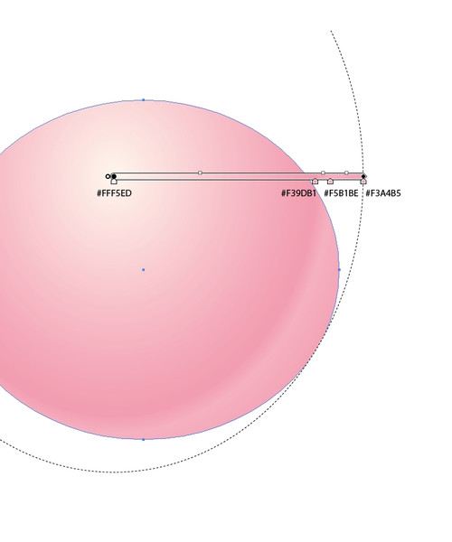
First, we'll start with the body of the piggy bank. Select the Ellipse Tool (L) from the Tool panel and create an ellipse for our Piggy Bank. Let us add a gradient to achieve a round look. At this point we need to imagine a source of light above our Piggy Bank. According to that light, some parts of the ellipse need to be lighter and some darker, because light causes highlights and shadows:

Creating the Eyes
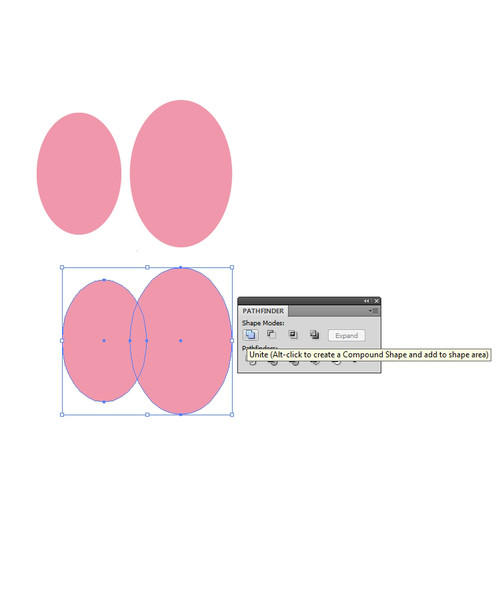
Now we are going to create the eyes of the Piggy Bank. With the help of the Ellipse Tool (L) create two ellipses, one bigger and one smaller (set the Fill color to dark pink). Make them overlap and choose Unite in the Pathfinder Panel:
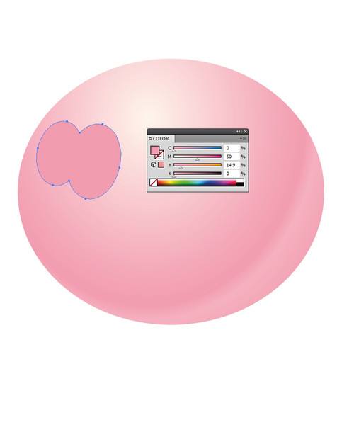
 Rotate the eyes a bit and place them on the Piggy Bank. You can see how the smaller eye makes the impression of the perspective. We will have to do that with other parts of the Piggy Bank as well.
 Let's continue with the eyes. Since our imaginary source of the light is above the Piggy Bank we need to make a highlight on the eyes. Let's copy-and-paste in front of the eyes. You can do that by selecting the eyes and then hitting
 Ctrl+C for copy and Ctrl+F for paste-in-front on your keyboard. That way, you've made a copy of the eyes.
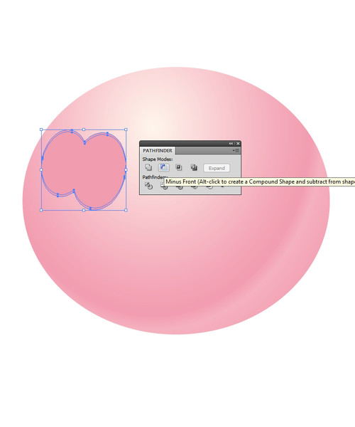
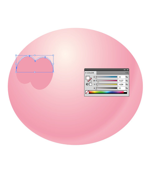
Repeat that step to create another copy. With the upper copy, still selected, hit the arrow key on your keyboard and nudge the eyes a pixel or two downwards. Now holding the Shift key, select another copy of the eyes right below, and with both copies selected, hit the Minus Front in the Pathfinder Panel:
 Change the Fill color of the new shape to light pink:
 Now we are going to make another copy of the eyes. Don't forget the magic shortcuts
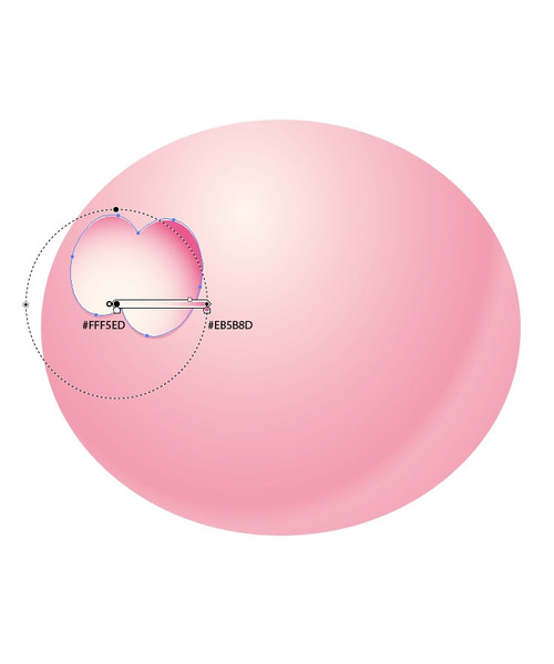
 Ctrl+C and Ctrl+F (to copy-and-paste infront). We will be using them a lot in this tutorial. Scale down a new copy a bit using a non-uniform scale. Just grab the middle handle on the upper side of the selection box and move it downwards. Do the same with the lower side of the selection box. Add a radial gradient as shown in the picture below:
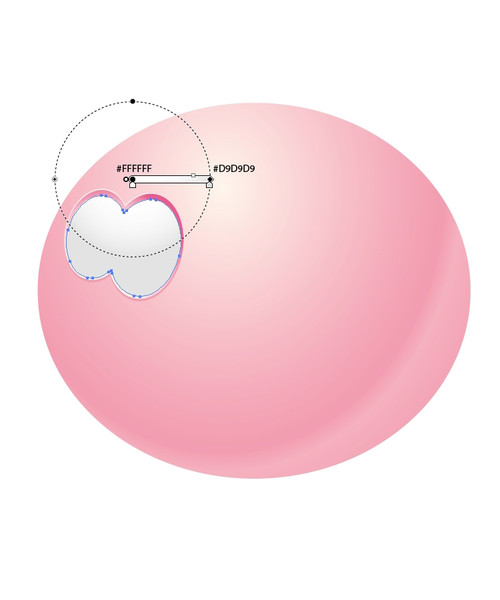
 Repeat the previous step. Scale the new copy of the eyes a little bit more and add a radial gradient:
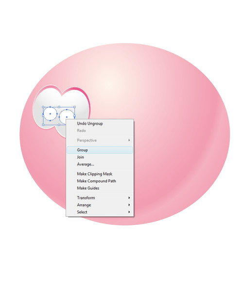
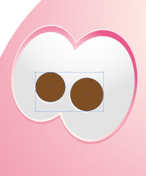
 Now we need two white circles for creating a pupil. But be careful, one of the circles needs to be smaller because it's further away from us. Select both circles, right click and select Group (
Ctrl+G):
 Lets copy (
Ctrl+C) and paste-in-front (Ctrl+F) those two circles. For the Fill color, choose brown and with the arrow key on your keyboard nudge them upwards one pixel:
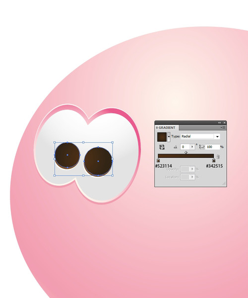
 Repeat the previous step but for the Fill color use a radial gradient:
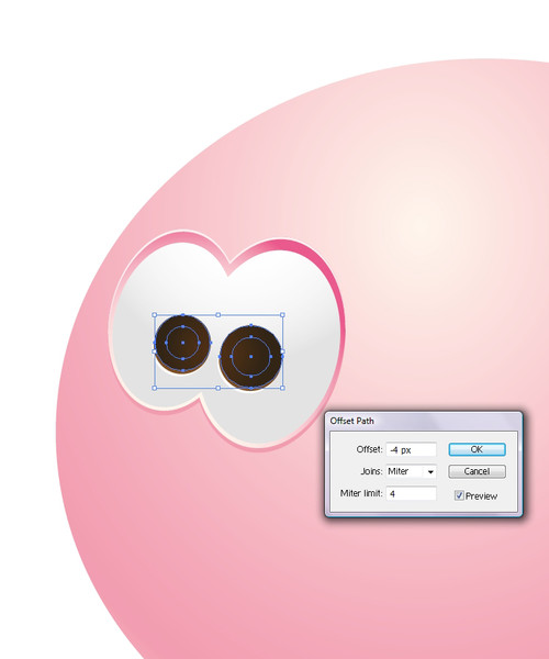
 Select the circles with radial gradient from the previous step and under
 Object > Path > Offset path set the value for Offset to -4. Set the Fill color to black:
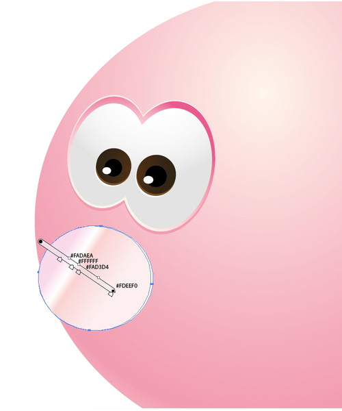
 Now make two small ellipses, set the Fill color to white and place them as shown in the picture below. Make sure that one ellipse is a bit smaller then the one closer to us (since that eye is smaller):

Creating the Snout
Once you are happy with the eyes you've created, we can move on to the next step. To create the piggy's snout, choose the Ellipse Tool(L) once again to create an ellipse, setting the Fill color to white and placing it below the eyes we have just made. This will be a small highlight on the side:
 Copy (
Ctrl+C) and paste-in-front (Ctrl+F) the ellipse, nudge it one pixel to the left and add a linear gradient as shown in the picture below:
 Repeat the copy (
Ctrl+C) and paste-in-front (Ctrl+F) action to make another copy of the ellipse. Make the new ellipse a bit smaller and align it to the left with the ellipse right below. The Linear gradient from the previous step gives us the impression of the highlight. Gradients, shadows and highlights are very important aspects:
 Make the copy of the white ellipse. Grab the middle handle of the selection box on the right and move it to the left for one pixel. Set the Fill color of the new ellipse to darker pink. Now we have achieved another highlight on the nose:
 Now, let's make a light reflection. Grab the Ellipse Tool
 (L) and create a bigger ellipse. Cover the upper half of the nose of the Piggy Bank with it. Also, we need a copy of the ellipse we created in the previous step (Ctrl+C and Ctrl+F). Now select both of the new ellipses, the small one as well as the big one, and under the Pathfinder Panel hit the Intersect button. This is how we will create a shape which will turn into a reflection:
 Change the Fill color of the new shape to something lighter than the color of the nose:
 We are just a few steps away from finishing the Piggy Bank's snout. Now, we need to create the nostrils. For that we will need two ellipses. One more time, the ellipse that is farther from you will have to be smaller. Use the Ellipse Tool (
L) to create them. Add a radial gradient to both ellipses. The darker side of the gradient gives us a feeling of depth. Check out the picture below:
 Select both ellipses and group them (
Ctrl+G). Now we need two copies from them. Copy (Ctrl+C) and paste-in-front (Ctrl+F) will make those two copies. Select one copy and nudge it upwards one pixel. Holding down the Shift key on your keyboard, select another copy (placed underneath the nudged copy) and hit the Minus Front in the Pathfinder Panel. You can change the Fill color of the new shape to light pink (almost white):

Creating the Ears
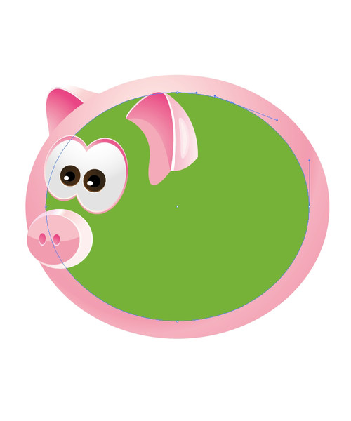
I think we are on the right track to make a very cute Piggy Bank! Now let us create its ears with some shadows and reflections. Don't forget, the Piggy Bank is usually made of plastic or clay, which means that we have to try to simulate that look. With the Pen Tool (P) selected, try to draw the inner part of the ear. You may have some difficulty with this part, if you are unsure how the Piggy's ear should look. If you have that problem, try to find a picture of a pig, or maybe you have a Piggy Bank at home. The thing is, we cannot draw the whole ear at once. We need to break the drawing down to a few steps — drawing the inner part of the ear, the outer part, the edge and the shadow. So, the first part will be the inner ear. You can use the same radial gradient from the previous step:
 For the outer part of the ear we will need lighter colors. We will use a Linear gradient as shown in the picture below:
 Yet again, we'll need highlights and shadows. First, select the outer part of the ear and make two copies. Nudge one copy one pixel to the left using the arrow key on the keyboard. Now select both copies and hit the Minus front option in the Pathfinder Panel. Do the same thing for the inner part of the ear. You will end up with a nice edge on the ear which will look like a highlight from the light. Don't forget to change the Fill color of the highlight to light pink (almost white):
 If we add an ear shadow it will make our Piggy Bank more realistic. Just select the Pen Tool (
P) again and try to draw a shadow of the ear. Once you are satisfied with the shadow, select all parts of the Piggy Bank's ear, group them (Ctrl+G) and under right click, choose Arrange and select Bring to Front. The color of the shadow should be a bit darker then the color of the Piggy Bank's body. You can add a small light area to the outer part of the ear, just to add an accent of the highlight:
 The other ear should be smaller, it should be behind the Piggy Bank because we are not able to see that part of the body. It should also contain darker and lighter parts. Lets break the ear down into pieces. The steps are quite similar to the steps for the first ear. Just take the Pen Tool (
P) and draw the inner and outer part of the ear, create an edge of the ear, rotate it a bit if you have to, make it slightly smaller then our first ear and make sure it's behind the Piggy Bank:

Adding Details
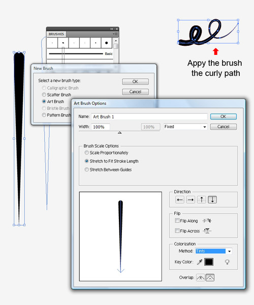
Now we can make a few details for the Piggy Bank. One of them is the cute curly tail. Take the Pen Tool (P) again and draw the swirl path. Now we need a small black circle. Choose the Direct Selection Tool (A), select the bottom anchor of that circle and while holding down the Shift key, pull it downwards. Grab the new shape we've just made and drag and drop it into the Brush Panel. Choose New Art Brush under the brush types. In the Art Brush Option Panel, make sure to set Tints for Colorization Method. Change the Stroke color of the curly tail to pink (same as the back part of Piggy Bank's body):

Creating a Reflection
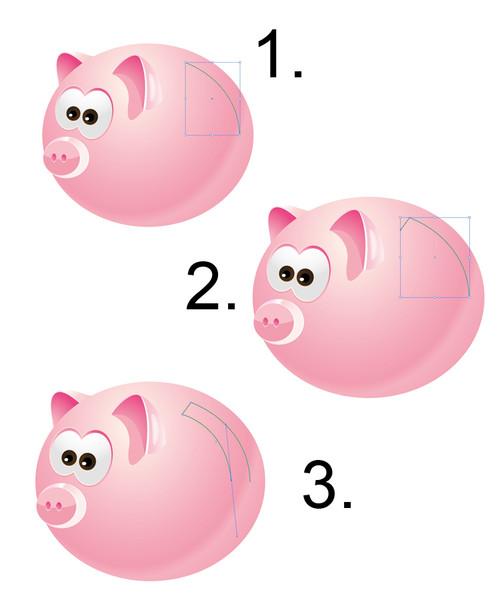
We can also make a reflection of the window on the Piggy Bank. Select the body of the Piggy Bank. Make a copy of it (Ctrl+C, Ctrl+F) and scale it down a little bit. Now we need to add some anchor points and to delete others in order to get the path which we'll be using to draw the rest of the window reflection. Using the Pen Tool (P) we can add anchors and with the Direct Selection Tool (A) we can select the anchor points we need to remove and hit the Delete key on the keyboard.
 This is the path we will be using to complete our window reflection:

 Deselect the new object we've just made and grab the Pen Tool (
P) again. Let's make two paths like in the picture below. Set the Stroke to 2:
 We need to expand those strokes. With both paths selected under Object select Expand. Now, holding down the Shift key, select the shape of the window reflection and under the Pathfinder Panel hit Minus Front:
 Change the Fill color of the window reflection to lighter pink:

Final Touches
Using the same techniques, we can draw the shape of the slot where are the goody coins come in on the Piggy Bank's back. Using a linear gradient should be a good way to achieve the depth effect required: To make the legs, we'll need the Pen Tool (
P) once again. Draw four legs. Two of them need to be sent behind the Piggy Bank (right click > Arrange > Send to Back). For those two legs use linear gradients. The darker part of the gradient will simulate the shadow of the Piggy Bank's body:
 You can add highlights to the parts exposed to light. For other parts, just create shadows. Oh, and don't forget the mouth:
 Use your imagination and make different faces for the Piggy Bank. It can be fun. Here are some of my results!
 I really hope you enjoyed this tutorial. Using all these techniques we've used here, you can create pretty much anything. Just don't be afraid to experiment with colors, gradients and shadows. Use them wisely and you'll be able to achieve great realistic looks for your illustrations. Keep in mind to follow all the rules for perspective drawing. If you happen to have any questions feel free to post it in the comment section below. Thank you for reading!
[fblike]

Kewl! Love this very much!!
Wonderful steps. I am on this website after a long time, missed your posts. :)
haha it’s a very cute pig great work and a helpful tutorial
Thank you very much! I’m glad you like it!
Thanks for the tutorial, it was fun and helpful. I had just a little problem with using pathfinder and groups at the same time.
Thank you David,
when you are using a Pathfinder Panel just make sure to ungroup the shapes you are using. Those shapes should be in the same Layer.
Is very hard to work in illustrator.. but i want learn.
Hi Barbara,
Illustrator is a specific software, and it has it own “rules” for creating illustrations. Once you get to know all the Illustrator features you will love everything about it.
Some tips are very difficult, but I’m trying again and again. I hope, I can do this. Thanks for your tutorial.
Thank you for the comment. If there is something I could explain better just let me know.
you did excellent work. thanks
It looks great, I will try to do one myself in Photoshop
Thank you for sharing!
hey i did that pig and i understood all the steps,i never used the illustrator so much but with this tutorial i enjoy it a lot… i hope you can post more.. congrats..:D!
amazing ! very very helpful for me thanks you.
Very cute piggy bank
:)
I hate to complain, but it’s so typical that you just put in a direction without explanation and the whole thing is set back. I can’t make the gradient look the way you made it look and I’m fed up trying. Why it has to be different than Photoshop, I don’t know.
what an adorable piggypoopoo! I’m a raster digital artist learning vector, and this will really help. and I love pigs!
Thanks for finalkly writing about >How to Create a Cute Piggy Bank in
Perspective with Adobe Illuystrator – noupe <Loved it!