Good Sliders, Bad Sliders: Things to Consider Using Them

The way websites are developed and are being visited changed drastically over the past years. Mobile usage is growing, and technologies such as HTML5 and CSS3 make things possible that were impossible or difficult to achieve before. But one thing has proven its value for years: good ole content sliders. They have two major advantages. For one, content can be placed in an efficient way so that they are visible without scrolling. Second, they stick out from the rest of a page due to their animated transitions. But content sliders are not always right - especially from a visitor's perspective.

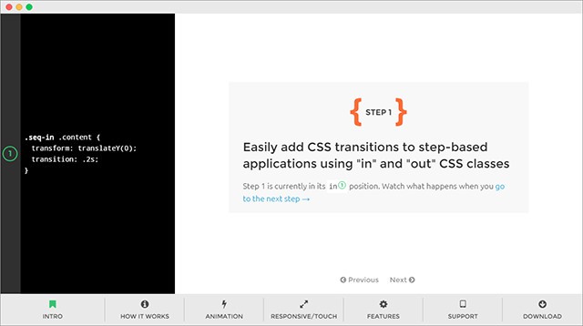 JavaScript Library „sequence.js“ for Content Sliders
Those who prefer programming their own solutions should stay away from the old „siteTimeout()“ or „setInterval()“ approach.
 Fontshop: Clear Content Slider With Generous Images and Little Text
The text in a slider should be kept short - a teaser or a clever image title at best. Ideally, the duration of display is enough to be able to read the whole text. When the user is hovering over the content slider with the mouse, you should make sure that the animation stops, and the currently displayed content stays so nobody will complain that the slider is faster than the eye can read.
Once the visitor has taken over control of the slider manually by scrolling a page back or forth, you should prevent the animation from continuing as you can assume that the user prefers steering the slider himself.
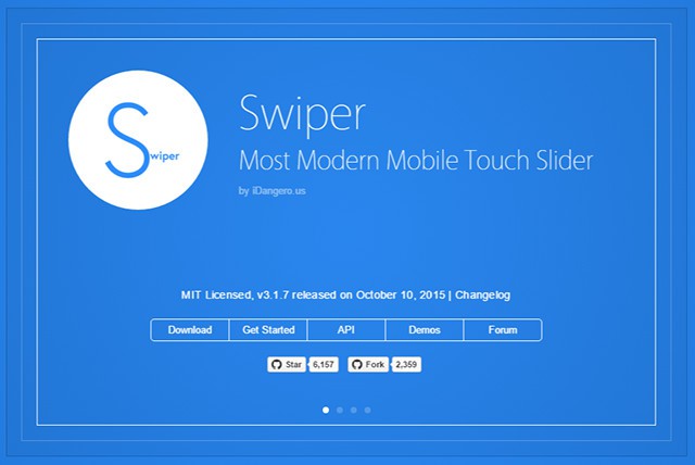 Content Slider Swiper
Here, you should offer the opportunity to use the common swipe gesture to use the slider. Pay attention to this feature when choosing one out of the many slider libraries. Keep in mind that right after responsivity, gesture controls are a crucial aspect.
Content sliders like Swiper, for example, forgo arrow buttons entirely. In return, a gesture control is emulated via the mouse on desktop PCs. This means that you do the simple swipe gesture with a pressed mouse button to scroll through the pages of a slider.
The FlexSlider is also responsive as well as suitable for mobile devices with gesture controls.

Photo by Drew Patrick Miller on Unsplash
Creating Sliders With CSS3 Animations
Even before CSS3, there were content sliders. Due to the lack of animation possibilities, the content was realised via JavaScript and the „setTimeout()“ method. The slider's content was newly placed every round. This approach still works today, but it is not optimal because the repetitions via „setTimeout()“ are fixed. But an animation should much rather be controlled depending on the framerate of the browser. That's why animations should always be defined via „requestAnimationFrame()“ or via CSS3 animations in combination with JavaScript. This enhances the performance especially on mobile devices with reduced power. Many recent sliders like Sequence.js are using modern technology and are responsive as well. JavaScript Library „sequence.js“ for Content Sliders
Those who prefer programming their own solutions should stay away from the old „siteTimeout()“ or „setInterval()“ approach.
Using Sliders Depending on Content and Use
The use of a slider is just as important as the technological aspect - especially for the visitors of the website. It is understandable that the host of a website wants to display as much content and draw as much attention as possible. Yet, this is not always in the interest of the visitor. While sliders that exclusively show images work without any issues (most of the time), the ones containing text are always a little problematic because the content often disappears before the user is done reading. This is why you should consider a few things when using sliders with text. Fontshop: Clear Content Slider With Generous Images and Little Text
The text in a slider should be kept short - a teaser or a clever image title at best. Ideally, the duration of display is enough to be able to read the whole text. When the user is hovering over the content slider with the mouse, you should make sure that the animation stops, and the currently displayed content stays so nobody will complain that the slider is faster than the eye can read.
Once the visitor has taken over control of the slider manually by scrolling a page back or forth, you should prevent the animation from continuing as you can assume that the user prefers steering the slider himself.
Keeping the Overview
While you can store a lot of content in a slider and that sure does save a lot of space, this happens at the expense of clarity for the user. When the content is placed above, below or next to each other, the user can see all the content. In a slider, however, the user only sees one area at the same time which means that the other content is hidden. A slider with three different contents is rather clear. Everything above that can cause the problem that the visitor is likely to miss out on interesting content in the slider.Not Enough Attention For Other Content
As much as a slider draws attention towards itself, as much does it cause other content to be moved into the background of a page. Even when a visitor takes a look at the links outside of the slider, the constant animation can be distracting. This is why you should generally use sliders carefully. They aren't as distracting on overview pages made solely to give previews on content. However, on pages that contain actual content, they are a disturbance and should not be used. If you don't want to forgo sliders on these pages, you should at least disable the automatic animation and only allow animation upon user interaction.Optimising Sliders For Mobile Devices
Websites are visited from mobile devices more and more often. For this growing audience, not only a responsive layout but also adapted controls for mobile devices should be implemented when using content sliders. While the mouse and arrow buttons are used on desktop PCs, the smartphone is handled exclusively with the fingers. Content Slider Swiper
Here, you should offer the opportunity to use the common swipe gesture to use the slider. Pay attention to this feature when choosing one out of the many slider libraries. Keep in mind that right after responsivity, gesture controls are a crucial aspect.
Content sliders like Swiper, for example, forgo arrow buttons entirely. In return, a gesture control is emulated via the mouse on desktop PCs. This means that you do the simple swipe gesture with a pressed mouse button to scroll through the pages of a slider.
The FlexSlider is also responsive as well as suitable for mobile devices with gesture controls.

Interesting read on sliders. If you get the sliders right, it can make a great impact.
Thanks for sharing…