Focusing on Good Design, Not (Just) Good Decoration
Time and time again, we mistake good decoration for good design. When we are looking for inspiration, we go to the same websites and the same showcases trying to get that added push necessary to create something we love. Now this isn't a huge deal (especially if we are looking for a creative kick), but if we aren't careful, we can end up focusing mainly on the decoration and beautification of a web site.
Designers must keep in mind that true graphic design is less of an art and more of a theory. Graphic design is simply a means to solve problems, but once you have solved your problem, you are free to dress it any way you like. The best way to design your web sites (as well as any other thing), is to first figure out what the goal of your site is to be. For example, do you want people to come to your site to become informed about your product, or do you want them to purchase your product? And if you want them to purchase your product, how are you going to make it more important than anything else on the site--of course, without over doing it or compromising its intuitiveness?
You need to be focused on the goals of your site first and worry about the beautification last. With that being said, in no way should you completely ditch great decoration for good design. It can sometimes be hard to find a nice balance of the two but it is more than possible. Of course, for some sites, the amount of decor will contribute to the goals of your site, so it's imperative that one sits down and figures out what it is they are trying to achieve.
 This is a great start to our examples. There are so many boring ways to draw attention to the fact that someone is a designer as well as a developer. Some folks just state it, but this guy has an easy to understand visual tactic that makes sense and there is a blurb about each 'part' of him, which takes you to work dedicated to that part. A pretty simple and smart idea.
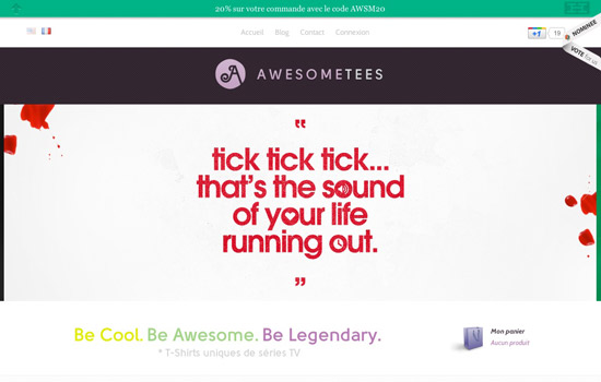 Obviously here, they are selling shirts. The use of the green bar at the very top that lets visitors know there is a sale going on is a very simple design solution. It doesn't stand way out which is smart; because the branding here is that of a quality line of shirts, not a bunch of cheap shirts that go on and off sale.
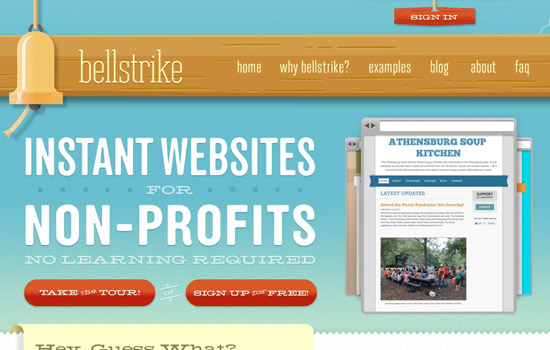 Headlines are extremely useful (though they tend to get a bit over used) in web design. Here, the name 'Bellstrike' tells most nothing, so the headline is used to pretty much fill in this major blank. Then right under the large headline we have the option to do one of the two things we would more than likely do anyway--find out more info or sign up.
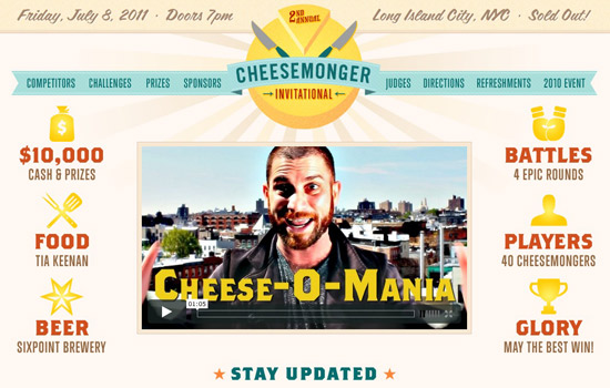 This website is a good example of following the 'Google it' rule. Let's assume you just heard folks talking about the 'Cheesemonger Invitational' while you're on the street or a friend mentioned they were going. You have no clue what it is so you Google it, and this site comes up. All of this information is above the fold with a handy video--what else could you ask for?
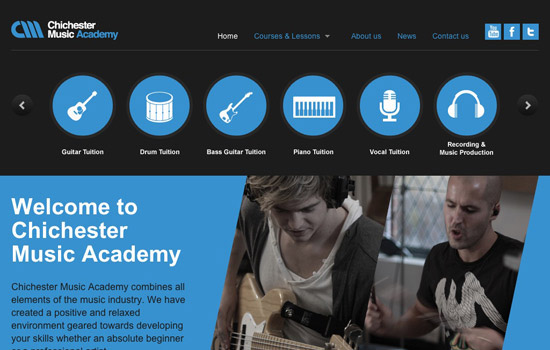 Another great example of headlines and blurbs, but what really stood out here was the sub-navigation. With this, Chichester made it obvious that their focus is on their music lessons and have made it absolutely important that you check out the information and tuitions for the programs.
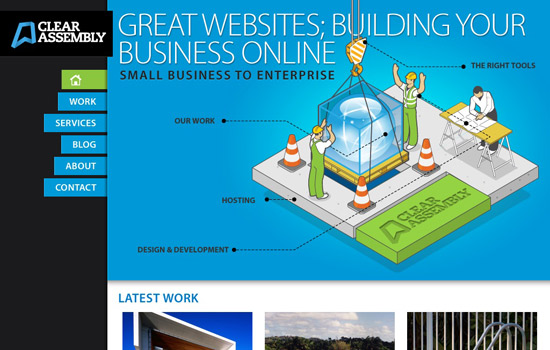 This site showcases a nice blend of decoration and design--see what happens when you scroll down or hover over a part of the illustration. In the mean time, the static sidebar is very useful, and it's made pretty clear what this company does.
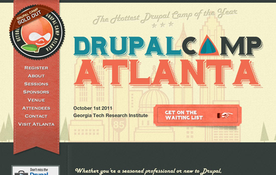 While not a huge fan of the side bar, it really makes sense that the 'Get On The Waiting List' button is so visible, and you can assume before this event was sold out, it was probably the button to purchase tickets. Everything is clear and the illustration and techniques are extremely attractive. This is a good blend.
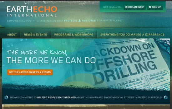 This seems to be a pretty standard layout that puts the focus on donating and signing up in the top left corner. The purpose of showcasing this site, is to show how you can decorate some standard (yet useful) layouts.
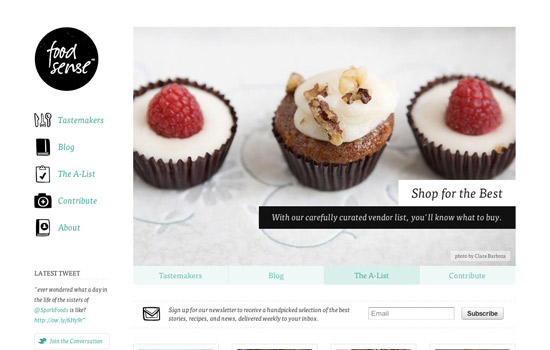 This is an example of a nicely put together website that decided to keep the decoration to a minimum, and it's completely reflective of the idea behind this site--they seem to focus on cooking, mainly with veggies in their simplest form.
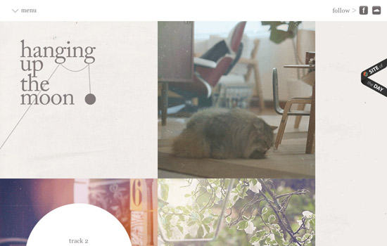 This website isn't necessarily clear on what you are doing, but it intuitively makes you want to click on the pictures and figure out what exactly is going on. This is an AWESOME way of presenting this kind of project (we want you to go figure out what's going on here. It's super neat!)
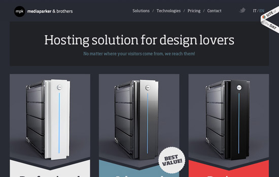 If we were told to make a site for 'Hosting Solutions for Design Lovers' it would probably look exactly like this. First, the prices and features aren't hidden and have to be searched for (like many hosts), and it is very attractive to anyone who has a thing for design. This is also a great example of a single page website.
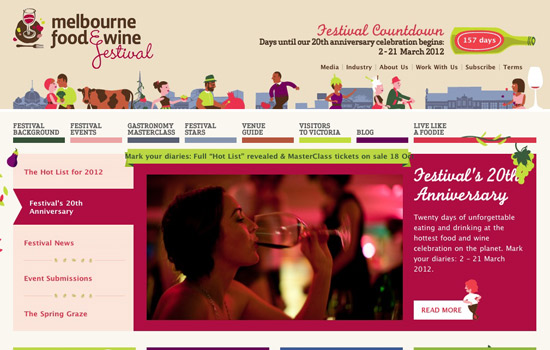 Much like the 'Cheesemonger' website, the 'Google it' rule is exemplified here. All the information is clearly visible and is organized very well, for the large amount that there is. This is an example of another great balance between problem solving and decoration.
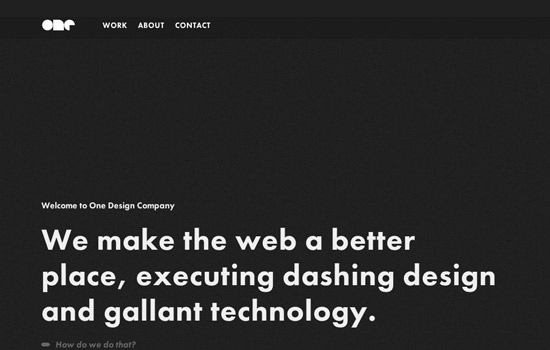 This website took a bit of a different approach to navigating around it. Each screen there's an arrow and intuitively, you would push the arrow keys to see if anything happened. Lo, and behold--movement! A nice added touch to a company that claims to use 'gallant technology.'
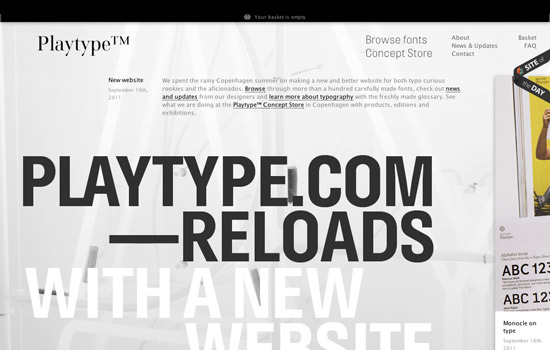 This is very progressive design, but it stays true to the idea of presenting folks with fonts. There is sideways navigation that allows the top portion of the site to remain static--and you always have the opportunity to browse the fonts. This makes sense.
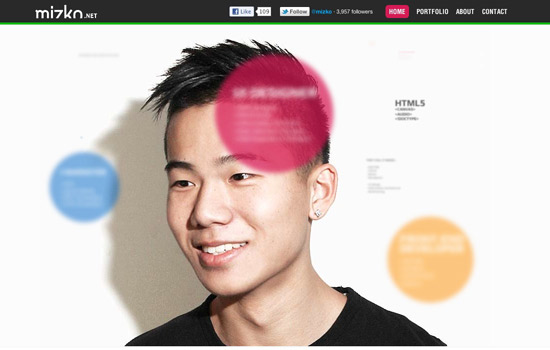 This is an example of good clean design and excellent coding all working well together. It's pretty evident what he does without creating an overused headline blurb. It's a great, progressive idea at work here.
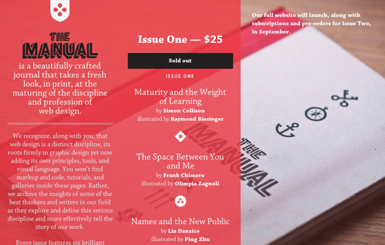 This is another great example of a single page website--there isn't a ton of decoration here but the design makes sense. We know exactly what the product is, and though the product is sold out, the area where it can be purchased is visible. Information is visible and everything is right where it needs to be. Unfortunately, it's a temporary site, but hopefully they don't lose the structure they have.
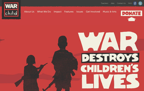 Once again, a site that does great at mixing some excellent illustration with just as excellent design. We understand first, the purpose of this site, then we are called on to donate to the cause. It's very clear what they are attempting to achieve.
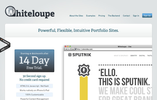 This is another site we can use the 'Google it' rule for. You may have no clue what a 'Whiteloupe' is but it becomes more than evident once you get to the site. They're obviously attempting to get customers, but not without showing you the work they've been a part of. Consider finding this site and just seeing prices first rather than seeing their portfolio--how would you feel and what would you think?
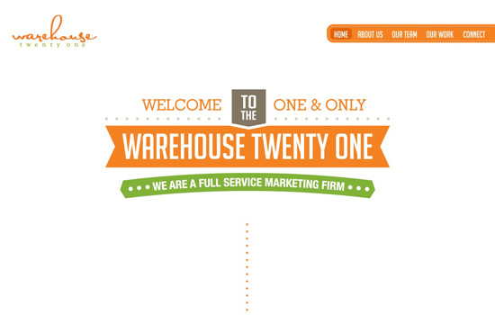 This website makes it easy for their audience to know what's going on. Basically all the important information is given it's own space and makes for a very clean and focused web site. The simplicity alone makes for easy decoration--everything here was achieved very well.
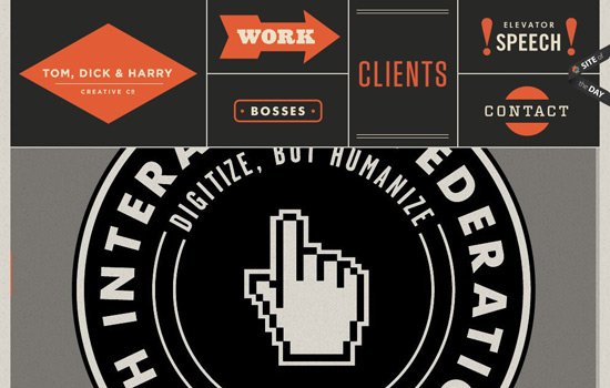 The great thing about this site is that it doesn't use your typical text navigation bar, it uses illustrations to let you know where to go, which promotes a nice bounce rate. What is also important to take note of, is that the 'Clients' button is bigger than the others, which probably means they really want you to know who they have worked for, and who matters most.
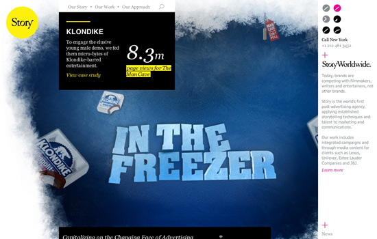 This is a very forward thinking website and while it may take a minute to actually understand the purpose of the site, you will soon notice that this agency once to put a large amount of focus on the work they have done. Not on the services they offer and who does what. This is a very attractive website that makes sense.
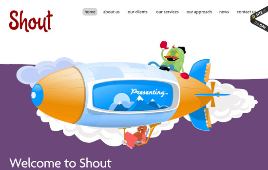 As some web designers still attest, what you want to do is pay attention to what you put above the fold because it's not always guaranteed that someone will scroll down and bounce around your pages. The thing we like about this page is, aside from the wonderful illustration, there isn't a bunch of clutter up top and that makes users tend to want to navigate.
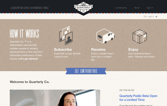 Aside from great and eye-catching headlines, good diagrams can really help you get your point across to your audience. Most times after we figure out what a product or service is, we want to know (as simply and quickly as possible) how it works. This diagram is right above the fold, and once you are finished, you have the option to hide it.
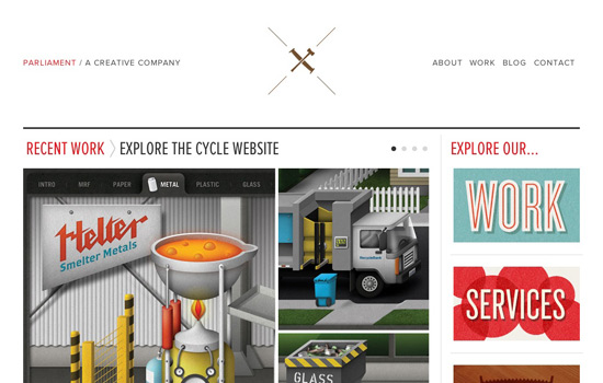 With most websites, everyone decides to put all their links at the top of the page along with everything else, and sometimes the stuff that's important can end up getting overlooked. Here, on the right side they decided to take the most important pages and make them more attractive than any other page. Your eye may also be drawn to the 'work' and 'services' graphics before they go elsewhere.
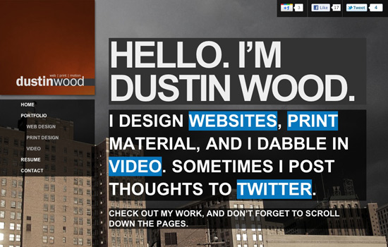 Another great headline here from Dustin Wood. The wonderful thing about this headline is that it's interactive and allows you to follow the linked words. This makes sense because of course, you're going to get attention and focus with a huge headline like this, so why not make it useful.
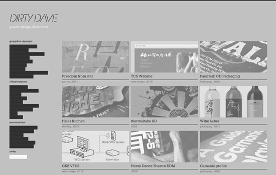 Though this is a pretty typical portfolio layout, what's best about this site is what happens when you decide to hover over the grayed boxes--it obviously turns color. This is pretty amazing because the whole site is gray and neutral, so when you hover, you get a pop of color and a focus. It's a clever little trick.
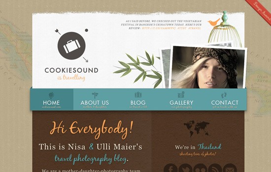 This is another great example of design and decoration living well together. Everything has it's own untouched place. Also, your eye is kind of drawn to the top right where there's a Twitter message, which probably means the owners are interested in gaining followers and engaging with their audience.
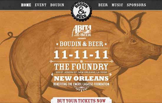 If you ascribe to that wonderful 'Google it' rule, this is a stellar website. An added bonus to this site, though, is that the ticket purchasing button is sticky and is always at the bottom of the screen wherever you go. Obviously, they are focused on selling their tickets, without making it overbearing.
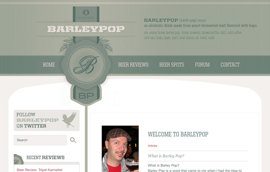 This is a super clean website that explains the product above the fold (top right) and continues to introduce and explain it as you look around the site. The focus is not just selling the product, but establishing the purpose and the brand.
Web Design Examples
Below is a list of some sites that we think have a decent balance of design and decoration. Of course we feel like there is no perfect site (or at least we haven't seen it), but these sites are pretty close. When looking at the showcase we tried to determine whether it was clear who or what was being presented, how easy and intuitive the navigation was and the way in which everything interacts with the decoration. See how they fare:Adham Dannaway
 This is a great start to our examples. There are so many boring ways to draw attention to the fact that someone is a designer as well as a developer. Some folks just state it, but this guy has an easy to understand visual tactic that makes sense and there is a blurb about each 'part' of him, which takes you to work dedicated to that part. A pretty simple and smart idea.
AwesomeTees
 Obviously here, they are selling shirts. The use of the green bar at the very top that lets visitors know there is a sale going on is a very simple design solution. It doesn't stand way out which is smart; because the branding here is that of a quality line of shirts, not a bunch of cheap shirts that go on and off sale.
BellStrike
 Headlines are extremely useful (though they tend to get a bit over used) in web design. Here, the name 'Bellstrike' tells most nothing, so the headline is used to pretty much fill in this major blank. Then right under the large headline we have the option to do one of the two things we would more than likely do anyway--find out more info or sign up.
Cheesemonger Invitation
 This website is a good example of following the 'Google it' rule. Let's assume you just heard folks talking about the 'Cheesemonger Invitational' while you're on the street or a friend mentioned they were going. You have no clue what it is so you Google it, and this site comes up. All of this information is above the fold with a handy video--what else could you ask for?
Chichester Music Academy
 Another great example of headlines and blurbs, but what really stood out here was the sub-navigation. With this, Chichester made it obvious that their focus is on their music lessons and have made it absolutely important that you check out the information and tuitions for the programs.
Clear Assembly
 This site showcases a nice blend of decoration and design--see what happens when you scroll down or hover over a part of the illustration. In the mean time, the static sidebar is very useful, and it's made pretty clear what this company does.
Drupal Camp Atlanta
 While not a huge fan of the side bar, it really makes sense that the 'Get On The Waiting List' button is so visible, and you can assume before this event was sold out, it was probably the button to purchase tickets. Everything is clear and the illustration and techniques are extremely attractive. This is a good blend.
Earth Echo
 This seems to be a pretty standard layout that puts the focus on donating and signing up in the top left corner. The purpose of showcasing this site, is to show how you can decorate some standard (yet useful) layouts.
Food Sense
 This is an example of a nicely put together website that decided to keep the decoration to a minimum, and it's completely reflective of the idea behind this site--they seem to focus on cooking, mainly with veggies in their simplest form.
Hanging Up The Moon
 This website isn't necessarily clear on what you are doing, but it intuitively makes you want to click on the pictures and figure out what exactly is going on. This is an AWESOME way of presenting this kind of project (we want you to go figure out what's going on here. It's super neat!)
MediaParker
 If we were told to make a site for 'Hosting Solutions for Design Lovers' it would probably look exactly like this. First, the prices and features aren't hidden and have to be searched for (like many hosts), and it is very attractive to anyone who has a thing for design. This is also a great example of a single page website.
Melbourne Food & Wine Festival
 Much like the 'Cheesemonger' website, the 'Google it' rule is exemplified here. All the information is clearly visible and is organized very well, for the large amount that there is. This is an example of another great balance between problem solving and decoration.
One Design Company
 This website took a bit of a different approach to navigating around it. Each screen there's an arrow and intuitively, you would push the arrow keys to see if anything happened. Lo, and behold--movement! A nice added touch to a company that claims to use 'gallant technology.'
Playtype
 This is very progressive design, but it stays true to the idea of presenting folks with fonts. There is sideways navigation that allows the top portion of the site to remain static--and you always have the opportunity to browse the fonts. This makes sense.
Michael Wong (Mizko)
 This is an example of good clean design and excellent coding all working well together. It's pretty evident what he does without creating an overused headline blurb. It's a great, progressive idea at work here.
The Manual
 This is another great example of a single page website--there isn't a ton of decoration here but the design makes sense. We know exactly what the product is, and though the product is sold out, the area where it can be purchased is visible. Information is visible and everything is right where it needs to be. Unfortunately, it's a temporary site, but hopefully they don't lose the structure they have.
War Child
 Once again, a site that does great at mixing some excellent illustration with just as excellent design. We understand first, the purpose of this site, then we are called on to donate to the cause. It's very clear what they are attempting to achieve.
Whiteloupe
 This is another site we can use the 'Google it' rule for. You may have no clue what a 'Whiteloupe' is but it becomes more than evident once you get to the site. They're obviously attempting to get customers, but not without showing you the work they've been a part of. Consider finding this site and just seeing prices first rather than seeing their portfolio--how would you feel and what would you think?
Warehouse Twenty-One
 This website makes it easy for their audience to know what's going on. Basically all the important information is given it's own space and makes for a very clean and focused web site. The simplicity alone makes for easy decoration--everything here was achieved very well.
Tom, Dick & Harry Creative Co.
 The great thing about this site is that it doesn't use your typical text navigation bar, it uses illustrations to let you know where to go, which promotes a nice bounce rate. What is also important to take note of, is that the 'Clients' button is bigger than the others, which probably means they really want you to know who they have worked for, and who matters most.
StoryWorldwide
 This is a very forward thinking website and while it may take a minute to actually understand the purpose of the site, you will soon notice that this agency once to put a large amount of focus on the work they have done. Not on the services they offer and who does what. This is a very attractive website that makes sense.
Shout Digital
 As some web designers still attest, what you want to do is pay attention to what you put above the fold because it's not always guaranteed that someone will scroll down and bounce around your pages. The thing we like about this page is, aside from the wonderful illustration, there isn't a bunch of clutter up top and that makes users tend to want to navigate.
Quarterly Co.
 Aside from great and eye-catching headlines, good diagrams can really help you get your point across to your audience. Most times after we figure out what a product or service is, we want to know (as simply and quickly as possible) how it works. This diagram is right above the fold, and once you are finished, you have the option to hide it.
Parliament
 With most websites, everyone decides to put all their links at the top of the page along with everything else, and sometimes the stuff that's important can end up getting overlooked. Here, on the right side they decided to take the most important pages and make them more attractive than any other page. Your eye may also be drawn to the 'work' and 'services' graphics before they go elsewhere.
Dustin Wood
 Another great headline here from Dustin Wood. The wonderful thing about this headline is that it's interactive and allows you to follow the linked words. This makes sense because of course, you're going to get attention and focus with a huge headline like this, so why not make it useful.
Dirty Dave
 Though this is a pretty typical portfolio layout, what's best about this site is what happens when you decide to hover over the grayed boxes--it obviously turns color. This is pretty amazing because the whole site is gray and neutral, so when you hover, you get a pop of color and a focus. It's a clever little trick.
Cookie Sound
 This is another great example of design and decoration living well together. Everything has it's own untouched place. Also, your eye is kind of drawn to the top right where there's a Twitter message, which probably means the owners are interested in gaining followers and engaging with their audience.
Abita Presents: Boudin & Beer
 If you ascribe to that wonderful 'Google it' rule, this is a stellar website. An added bonus to this site, though, is that the ticket purchasing button is sticky and is always at the bottom of the screen wherever you go. Obviously, they are focused on selling their tickets, without making it overbearing.
BarleyPop
 This is a super clean website that explains the product above the fold (top right) and continues to introduce and explain it as you look around the site. The focus is not just selling the product, but establishing the purpose and the brand.

It’s so common for people to confuse design and decoration, I’ve worked with/for plenty of professional designers who have a hard time making this distinction. It’s crazy the amount of people who’ve been in the industry for years who will base fundamental design decisions on what they think looks cool. I wrote a similar piece a while back that has a similar angle to your piece, see http://www.twizzlebird.co.uk/designing-your-success/design-or-decoration/
Dope ass sites…makes me want to be more creative
You nailed it! Design serves a purpose to meet your goals, and sell. Make it interesting but don’t lose sight of getting visitors to DO something.
I could post a comment here about the new Noupe design, but I won’t.
Or…maybe I just did ;)
great posting bringing it to thte point b great examling,,, :-) will use it in my lectures
Some people just don’t get that design isn’t just decoration.
Design has more to do with communication and delivery the right message, than making the things prettier
Thanks for the mention Kendra! I agree with the point you’re trying to make. It really comes down to prioritizing UI/UX design over aesthetics. Every website has a purpose and we need to fulfill that purpose first. Good aesthetics should always be there anyway.
Exactly. Purpose first is always the best approach. Why are people visiting your website and what is it that you want them to do when they get there?
I like so much this post and the descent balance of design and decoration described. I talk about graphics and my preferite are “cookiesound.com”, “adhamdannaway.com”. Thanks for sharing.
Some really great websites in here, really enjoyed checking these out. Great inspiration and just good looking designs all around. Thanks for taking the time to put this together!
Some great sites there, and they really drive home your main message – thanks for encouraging me and the remainder of the web to get creative and design for the user, not the designer.
Thanks so much for the feature Kendra! It’s Mizko here.
I totally agree, sometimes people become too carried away with aesthetics of a design and really forget what the purpose of the website is, too communicate a message to the user.
realy very creative templates
War child is pretty cool looking.
Those are very creative websites, by the way, what happened to the old design of Noupe.com? Why the jungle graphics? Is great but I think the old design was very neat and more professional. :)
I love how the new design of the web is turning out. Its fresh and clean and usually easy to use!
Awesome round up.. I like almost each n every web. great examples. Thanks
that first one is awesome, thanks for the gallery
Design is is information communication after all. It’s not art.
Yup. A website is a means to communicate your ideas or motives.
There should be a good balance between design & structure.
But it also depends on the subject of the site too. Really great collection.
Thanks a lot.
Earth Echo & Chichester Music Academy are great sites
Some quite nice sites, not the best, but nice.
I consider myself both a designer and end user. I have to say I disagree with quite a few of the points made about the sites within the article. I don’t think many of these sites combine good design with good decoration. The first example just doesn’t work for me at all! In fact, some sites are what I would consider ‘overly designed’ as well as being ‘overly decorated’.
But each to their own!