E-commerce: Fundamentals of a Successful Re-Design
By Peter Crawfurd and Michael Yang
Ecommerce re-designs can double your sales over night…permanently, but they can also cut them in half. In this miniseries we’ll be looking at what elements are especially important and whether you should be doing an ecommerce re-design.
For the sake of clarity, re-design for this post means when at least the site has a new look, this can include product photography, usability, copywriting, and obviously the layout. It involves changing several main areas of the site in one go.
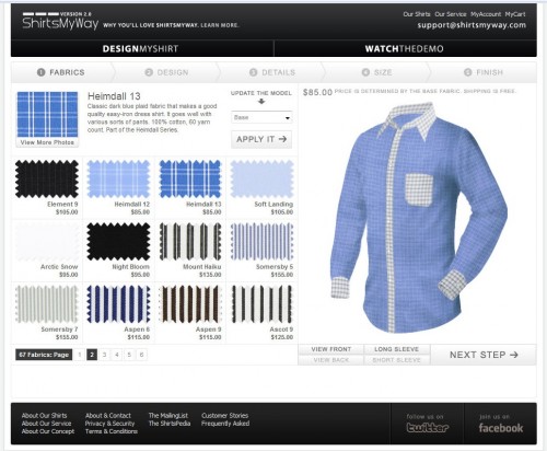

Should you be doing a re-design?
As cofounder of an ecommerce store we have experienced first hand how a re-design can double sales consistently from the day the new site is launched. That said, the darker side of the story is that a re-design usually involves either months of work and/or a lot of expenses depending on the depth of the re-design. It is important to figure out whether these costs will outweigh the profits of the increase in conversion rate. Despite conversion rates being tricky to predict, there are some significant determinants that can help determine whether you’ll achieve a sizeable increase in conversion rate. If your store is experiencing one or more of the following symptoms you should consider a re-design:- Your current design is the first version. It is usually easiest to improve your conversion rate and overall sales with the first re-design. There may be obvious and not too development heavy elements that were not ideally developed in the first version due to time or financial restraints that would improve the site significantly.
- Your original layout was based primarily on creativity. In many cases web designers out weigh what will look best over what will be easiest to use. If your site layout is non-traditional in many cases shoppers will have to learn how to use your layout, although most users will learn it, it’s not exactly what you want them to think about when they should be focused on your product.
- You have very few or mediocre product photos. Product photos have a profound effect on conversion rates. If you decide to take great product photos then in 9 out of 10 cases you’ll need to match the graphical elements on your site with the level of your photos to get most out of them.
- Your store’s conversion rate is less than 0.5%. When a conversion rate is at this level there are most likely some fundamental problems regarding your site. Doing a complete and intelligent makeover of your site at this level is likely to double your conversion rate. This is assuming that you have targeted traffic.
- The action shot – the product is seen together with other products, in a different angle, or in use.
- The overall shot – the product should be seen as a whole
- The zoomed shot – a photo showing the intricate details of the product
- Keep it simple. Eliminate unnecessary clicks or functions on your site. This is easier said then done. Often first marketers/designers want to make something that can do more than any competitor out there, yet all you need to be is two steps ahead of the competitor in the most important areas to significantly outperform them. Outperforming you competitor means that more of your SEO traffic will convert better especially for large keywords.
- Horizontal navigation: If you have vertical navigation on your site now, try using horizontal navigation for your re-design. Heat maps have shown that it’s quite common that store users skip vertical bars of information that is not in the center of the screen. If you really need it try using vertical hover over drop down menus instead.
- Email opt in: Many ecommerce stores don’t realize that a freightening percentage of visitors to your site may find it great, but just aren’t ready to buy and never come back. Try holding on to more of these potential buyers by encouraging them to give you your email. Try using methods such as save 10% on your next order or offering them free information. This way there is a better chance that they’ll remember your shop when they are ready to buy.
- Your layout shouldn’t clash with your product photography: As mentioned before it’s important your photos and layout don’t clash.
Design – Making The Right Improvements
Within the first few seconds, visitors need to understand where to find things on your site. The least bit confusion of where to find certain information on a site can lead to quick exits, higher bounce rates, and most importantly a loss of potential customers. The key here is keeping things as simple as possible. It’s important to let the product(s) get the attention of the visitor, not the design of the website. Designing a bold and eye catching first version of a site is not an uncommon mistake, meaning that a move toward a more toned down version for the redesign would usually improve conversion. That said it is important that the site remains professional and sleek looking for gaining trust. The following are examples of ecommerce sites you shouldn’t follow for your re-design: Lingscars.com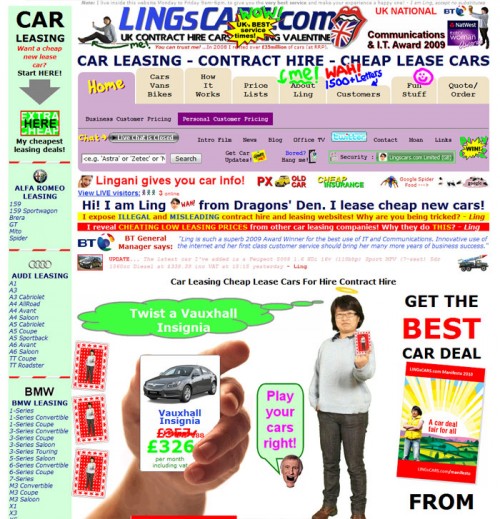 Satellite01.com
A good example of creativity taking over functionality. Usability of the site is quite tricky and not to mention flash is quite prohibitive when it comes to the SEO of your site.
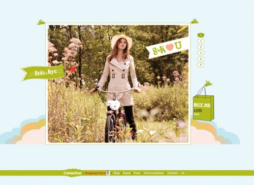
 Soiakyo.com
An attempt to create something unique, but the navigation of the shop is distracting some potential customers from buying.
Testing it
In general, re-design is a tricky beast and making changes to the usability may actually decrease conversion rates. That’s why if you have the resources for it, then doing a so called A/B split test on conversion rates of your new design can avoid surprises after a re-launch. This would typically be done with an A/B split test, which is when you send half of your visitors to each version of the site. Google’s Website Optimizer is a free tool that can be used for this test. Once you’re past the re-design and have the fundamentals of the site fixed, you’ll see that testing different parts of your site such as the shopping cart, opt in rate, and home page can give you concrete results and a clear path to further improvements. Abtests.com give some insightful conversion results and what you could consider improving.Product Photography
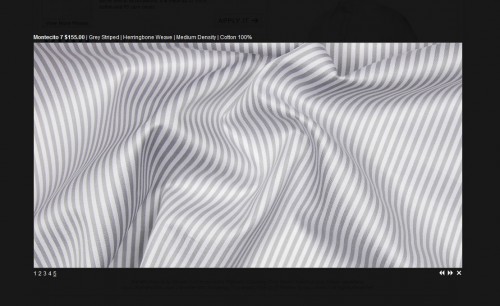
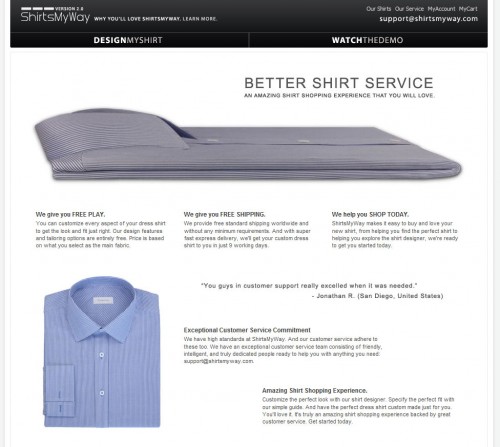
Product photos should be a priority in re-design as they can have a profound effect on the conversion rate and ideally they should match the new design of the site. Sharp and simple photos are often what will do the trick, but this can be easier said than done. Keeping the shots really simple are important as most good product photography have very subtle backgrounds if any at all to keep the focus on the product itself. It can look deceitfully simple to take attractive photos, but with a basic lighting set up and a good camera wonders can be achieved if you already have some photography experience. However, the difficulty of product photography varies a lot from product to product. Getting a great shot of a mug can be a simple five minute job while clothing can take hours. Hire a product photographer to skip time consuming learning curves, choosing a photographer that has experience with your type of product will help save you time. Be sure that the photographer understands what kind of photo needs to be taken. It can quickly become a really expensive project if it drags out. If possible agree on a set price for the project and not an hourly based model, this will leave room for a few inevitable re-takes. Ideally there are three different types of photos you’ll want on the site: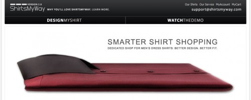
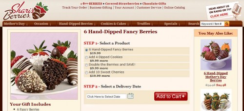
 Berries.com
Layout
In most cases, the easier it is for the visitor to do what they want on the site, the higher the conversion rate will be. Do not try to reinvent the wheel when it comes to the layout. The layout will highly depend on what you are selling. Here is what to think of for your new layout: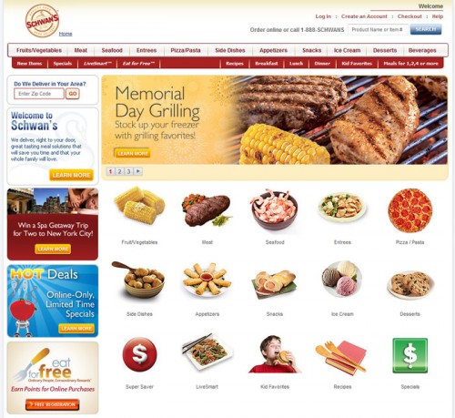 Proflowers
Although flowers are a hot selling product and have a lot of spontaneous purchases, Proflowers does a great job with their simple layout while still offering a large selection of flowers. They have an impressive 24.4% conversion rate and run ongoing conversion tests.
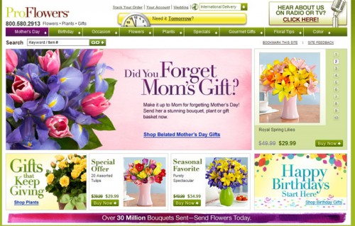 Roamans
Big and clear photos right on their home page with space for text that emphasizes an offer or message together with their simple horizontal navigation menu goes a long way. They hit an overall 18.4% conversion rate.
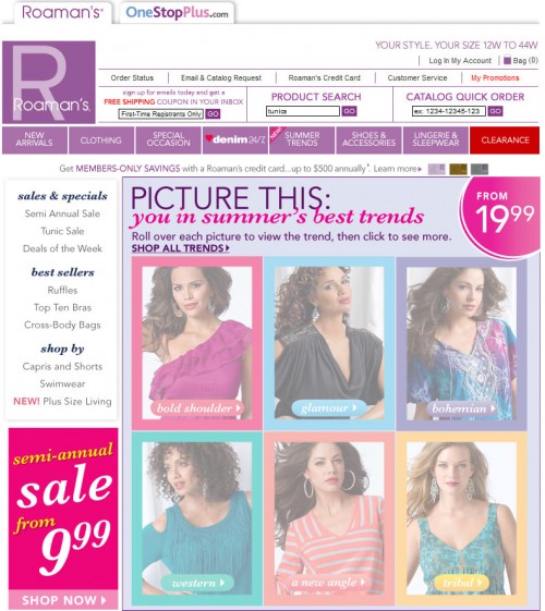 VitaCost
This discount online drugstore is not beautiful, but has great prices and marketing tactics that work. This all results in a 23.7% conversion rate. If a smaller company made a website like this chances are they would have a hard time building trust. This is more an example that following any high converting website won’t necessarily work.
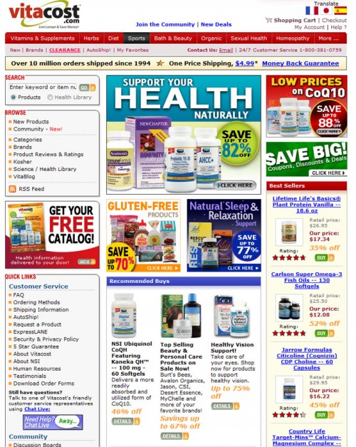 Most of the examples above mainly deploy horizontal navigational menus and large areas below displaying their product photography and offers, this leads to a clean look that is easy to navigate.
 The above conversion rates are sourced from Marketingcharts.com and I-newswire.com.
Most of the examples above mainly deploy horizontal navigational menus and large areas below displaying their product photography and offers, this leads to a clean look that is easy to navigate.
Most of the examples above mainly deploy horizontal navigational menus and large areas below displaying their product photography and offers, this leads to a clean look that is easy to navigate. The above conversion rates are sourced from Marketingcharts.com and I-newswire.com.

Hi..
great article..
but on complain. Why there is no RETWEET button on your blog ?
Its really painful to bookmark and then tweet it. Wastes time .
Can you please add the retweet button, so its easy for sharing your great articles ?
Thanks.
Nice and elaborate post. Didn’t you post a tweet about Lingscars.com the other day? Funny website.
Great article about the success eCommerce sites have had with an essential redesign.
Nice to see this article and the attention given to quality photography. In efforts to cut costs, a lot of online retailers skimp here. Not to toot my own horn, but I’ve been dedicating myself to better online product representation for quite some time now, and wrote about it just recently on my blog.
BTW, I love Ling. Her website looks like the sort of thing that could happen if an insane marketing exec with absolutely no taste ran the creative dept. But she gets a LOT of attention, so this “purple cow” is working for her.
Well, definitely there are some works I would not go for.. you get the idea while posting those examples, so thanks =)
Good article but you’ve omitted an important element. Video. For any ecommerce site video is almost essential for showing your products.
Video is OK for You Tube but usually makes a site too messy. Put the product videos on YouTube
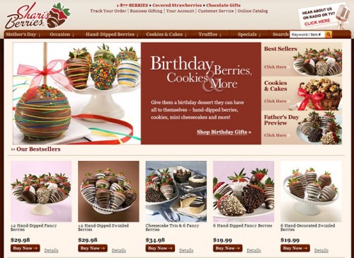
Shari’s Berries has a nice color scheme and photography, but there are WAY too many featured products on the home page. Instead, they should have some special graphical callouts under the main hero image, then maybe two rows of featured products. Guide the visitor where you want them to go or they will be overwhelmed!
Excellent article, just at the right time when I myself am going through this process.
A e-commerce with good design will give a great experience to the costumer.. :)
Peter Crawfurd and Michael Yang should be careful! My website LINGsCARS moves over £35 million of new cars per year at retail value. Gross income from my website is £350,000 a year (near $500,000). Now, far be it from me to tell you all that they don’t know what they are talking about, BUT, you should ask them how much they transact before they comment on others. Depends what your goal is, to look pretty and make the critics happy, or to be effective? You decide. If you say “to do both”, hahaha, you dreaming, big boy – post me an example of YOUR effort.
You can all slavishly follow the “advice” or you can do it your own way and make a difference. Strange how my site is an example of what you shouldn’t do, yet it won the NatWest BT Business IT and Communications award last year.
Think “polarisation”. Better that a smaller number of a massive market LOVE your site, than everyone finds it …OK. Don’t kid yourself you will grab the whole market, but effectively grab a small part of it, and you will do VERY well. Dare to be different.
Get a grip, stop looking to people for same-again advice and stop agreeing with each other (yet what has anyone achieved) and go out there and rock someone’s boat. If you “tick all the boxes” you will simply be as average and inoffensive and uninspiring as everyone else you compete with.
Ling
LINGsCARS (one of the “bad” examples above)
It’s pretty clear you’re successful at what you do but your site is awful and it’s rightly included in this article.
Yes you might sell a lot of cars but who’s to say that’s not just down to your very competitive pricing and that you might sell £50m of cars if you had a decent website.
Still, kudos for making such an awful site work for your particular business.
nice design, so cool :D
inspirative.
Great post, very useful. My current e-commerce project will be examined against some of these points, and will also be forwarded to the client, as you’ve outlined some excellent design and usability points.
Great article about the success,and very useful.
I redesign for 2 things. First and foremost is speed, second is conveying trust (if you’re not already an established brand). If you want a third, make the homepage convey motion… the customer wants to know something is happening.. that people are shopping, that you are there to assist in anyway the customer may need it.
Great post thx for sharing :D