Cloudinary: How to Optimize the Loading Time of Your Images
Everyone wants faster Internet access. But the speed has more to do with the bandwidth delivered by ISPs, cable companies and mobile operators. Web developers and designers also play a role in ensuring that there is minimal lag time when someone visits their websites. The growing number of images, videos and graphics on today’s websites are the biggest factors contributing to slow web load times. And, since developers are using more of these types of media, it’s important that they learn how to effectively manage images and videos to improve performance and the user experience. The Cloudinary image management and optimization solution alleviates these problems, helping developers create and deliver images as efficiently as possible, optimizing website load time. In this article, we’ll examine ways you can leverage Cloudinary to speed your sites performance.
 Image Cloud Service Cloudinary
 Fast Choice of Image Formats
Cloudinary enables you to quickly transform uploaded images into any format. You can convert images to the WebP and JPEG-XR modern formats, while also adjusting compression quality to balance between the formats. Cloudinary also helps detect the specific browser that accesses each image and deliver the optimal version of the image to the each browser, so you can achieve optimum visual quality with a minimal file size.
 Simple Scaling Via URL
Thanks to the “
Simple Scaling Via URL
Thanks to the “” element, and the “srcset” attribute, HTML5 gives you the option to address different layouts, or display and window sizes, as well as to distribute individual files. Cloudinary then helps by easily scaling your images to fit any device size or resolution.
 Defining Double Pixel Density via the URL Parameter "dpr_2.0."
The combination of responsive web layout and different pixel densities often results in a rather large amount of different image files that need to be provided. Cloudinary enables you to create different resolutions for each DPR value, then automatically detect the DPR value of the web page in the current user’s browser. This feature will enable you to deliver regular images to users with regular displays and 2x resolution images to users with retina display devices.
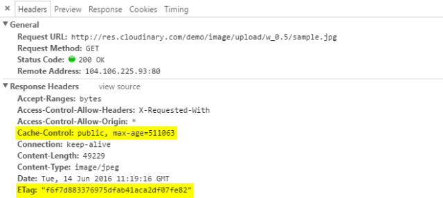 "Cache-Control" and "ETag" Header
 Fast Creation of Sprites
With Cloudinary, creating CSS sprites is quick and easy. You can simply upload all logos or image files that you want to combine in one sprite, and assign an identical tag, such as “logo,” to each of them. Then you can call up the URL – “http://res.cloudinary.com/demo/image/sprite/logo.png.” The assigned tag will be used as the filename, and the file ending will be your chosen image format. Cloudinary automatically creates an image file that contains all the uploaded files with the same tag. With the URL, you can receive the suitable CSS file in which the respective image crop is defined for all logos.
 Image Cloud Service Cloudinary
Choose an Efficient Image Format
One of the first decisions you will have to make is which image format is best suited for your site design. Aside from JPEG, PNG and GIF, you can choose from formats like WebP (supported by Google for Chrome browsers), and JPEG-XR (leveraged by Microsoft for Internet Explorer and Edge browsers) as well. Generally, developers are using JPEG for large-format, photographic images, while PNG or GIF are used for small-format, sketchier images. Most developers haven’t embraced these modern formats, and how they can help optimize site performance. Fast Choice of Image Formats
Cloudinary enables you to quickly transform uploaded images into any format. You can convert images to the WebP and JPEG-XR modern formats, while also adjusting compression quality to balance between the formats. Cloudinary also helps detect the specific browser that accesses each image and deliver the optimal version of the image to the each browser, so you can achieve optimum visual quality with a minimal file size.
Define an Appropriate Size
Your website is, no doubt, being viewed on many different devices – from desktops and laptops to smartphones and tablets – and you’re developing a responsive layout to ensure your site can scale to fit each device. Often developers offer the same images across all devices and resolutions, using client-side resizing for the images. The images may look great, but visitors waste time loading unnecessarily large images to their devices and you pay for redundant bandwidth usage. This is particularly unfair to 3G and roaming users, who must pay more to download the larger images than needed. To avoid these issues, you should identify visitors’ mobile devices and resolution using their user agent and optionally additional client-side Javascript code. Simple Scaling Via URL
Thanks to the “
Simple Scaling Via URL
Thanks to the “Keep Pixel Density in Mind
Today’s mobile devices and laptops have high device pixel ratios (DPR). No doubt, you want your site to look great on these devices. But you may end up delivering the higher-resolution images to all users, even those with regular (non-Retina) displays. For those users with regular displays, downloading these double resolution images results in wasted time, waiting for pages to load, and significantly increases the amount – and cost – of bandwidth. Defining Double Pixel Density via the URL Parameter "dpr_2.0."
The combination of responsive web layout and different pixel densities often results in a rather large amount of different image files that need to be provided. Cloudinary enables you to create different resolutions for each DPR value, then automatically detect the DPR value of the web page in the current user’s browser. This feature will enable you to deliver regular images to users with regular displays and 2x resolution images to users with retina display devices.
Cache Images Correctly
With proper caching settings, you prevent loaded images from having to be loaded again. Via the header “Cache-Control,” you should set the longest possible period for which an image file will be cached in the browser. Cloudinary predefines a value that is equal to about 30 days.Cache-Control: public, max-age=2591907If the image file changes within the caching period, you should make sure to notify the browser of the modification, using the so-called “ETag.” This header field will transfer a hash value that changes as soon as the file on the server changes. As the “ETag” is always called up – even within the caching period – the browser will recognize that the file on the server has changed, due to the altered hash value, and download it.
ETag: "07c35c9716cf1702b22cda61526a0c5a"Cloudinary creates an “ETag” for each resource, creating an optimal collaboration with “Cache-Control,” avoiding redundant downloads.
 "Cache-Control" and "ETag" Header
Use Sprites and Avoid Too Many Requests
The image size is not the only thing that impacts website performance. The larger the amount of files that need to be downloaded, the slower the site’s speed. Every file and every request takes time and extends page load time, so, when using many small images, the best practice is to include all of them in a single image file. For example, you can place all logos used on a page in a PNG file, and create a so-called CSS sprite. Below, the CSS sprite is used to only display a crop of an image file. Fast Creation of Sprites
With Cloudinary, creating CSS sprites is quick and easy. You can simply upload all logos or image files that you want to combine in one sprite, and assign an identical tag, such as “logo,” to each of them. Then you can call up the URL – “http://res.cloudinary.com/demo/image/sprite/logo.png.” The assigned tag will be used as the filename, and the file ending will be your chosen image format. Cloudinary automatically creates an image file that contains all the uploaded files with the same tag. With the URL, you can receive the suitable CSS file in which the respective image crop is defined for all logos.

Cloudinary has arrived at a good time for our business as we depend on high res images to sell property.
Wow, that’s a lot to digest, lol!
Pixel density seems like something that will be an issue into the future because so many hardware manufacturers are doing whatever they feel like. Serving multiple copies of the same image is a temporary fix and that will come to an end in the near future. What if future devices don’t send a user agent or any other info?
We test Cloudinary and is amazing, it is fast and all of images are automatic optimized.
Increase loading time very easy, fastly we need to Optimize all images in photoshop save for web and easy to Optimize it