Breaking the Rules: How to Effectively Break the “Rules” of Good Web Design
We've all seen articles devoted to the various web desing "rules" out there. In fact, they've probably been drilled into all of our heads ad nauseum. And for many, they serve as a comforting set of guidelines that make our lives easier, at least when it comes to design.
But what about those occasions when you have an idea that doesn't quite fit in the rules? Or what if you're just sick and tired of doing everything by the book and you want to challenge yourself creatively? Are the rules really set in stone?
The answer to that is of course not. For one thing, a lot of the rules are outdated. So while they might have been true at one time, they're not anymore. The other thing is that there are almost always circumstances that demand that the rules be bent or broken entirely. And as designers, we need to learn to recognize those times.
Below are a bunch of commonly-accepted web design rules, along with the reasons you might want to break them, and how to do so effectively. We've also included examples for each and the one unbreakable rule.


Your Web Page Layout and Design Should be Consistent Throughout the Site
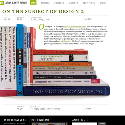
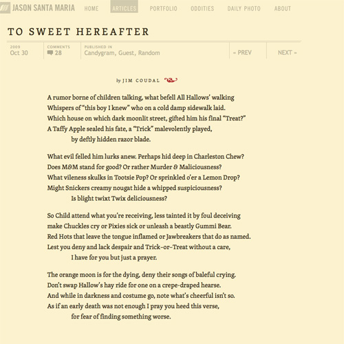
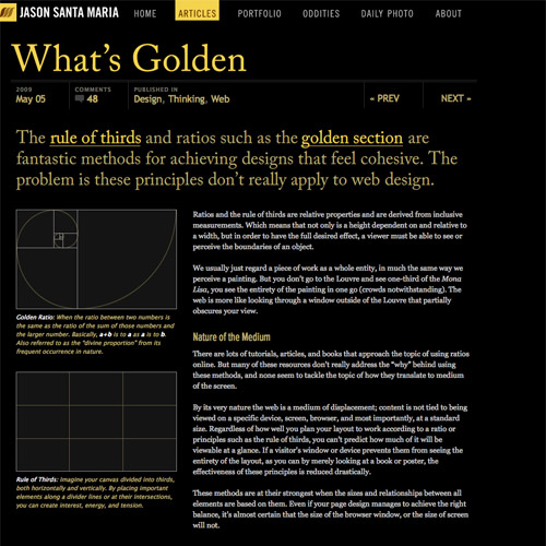
Consistency can help make your visitors feel at home on your site right away. This makes them more likely to look around and spend more time there. Comfort is a good thing. Most of the time. But there are two problems with this rule. First, some designers interpret it to mean that every page should be virtually identical. They use the same basic template for every page on your site, regardless of the content present. This almost always results in a site that's boring and no fun to look at. The other problem is that different content often calls for different design treatment. Removing most of the consistency on your site can make for a much more interesting user experience. Note that I said "most" of the consistency, though. You'll want to choose one or two anchor points to keep your visitor from feeling like they're visiting a different site entirely every time they go to a different page. Consider keeping either a design element like your header or color scheme or something as simple as your logo the same on every page on your site.Case in Point: Jason Santa Maria
Jason Santa Maria's website uses a different page design for a large number of his articles. It's refreshing and shows just how much thought he puts into the content he provides. At the same time, it's worth clicking through to multiple posts just for the designs alone. Always a good thing if you're looking for deep engagement from your visitors. The unifying element that keeps you feeling like you're on the same site is the top navigation.


Don't Put Important Information Below the "Fold"
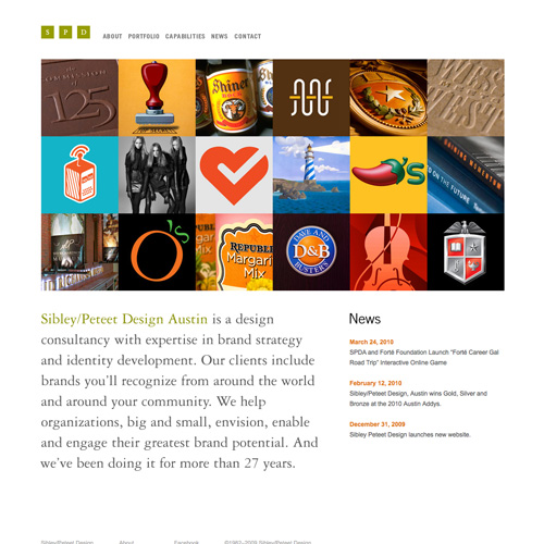
The "Fold" is a holdover term from the world of newspaper design. In newspapers, it referred to the area in the top half of the front page. This was the area of the paper that was visible if it was sitting at the newsstand. The most important news and headlines for the day were located there to entice people to buy the paper. But here's the thing: websites don't really have a "fold". It's often touted that the area visible on the home page without scrolling is above the fold, but that's not an accurate translation. With a newspaper, that above-the-fold area was important because it enticed people to purchase the newspaper. With a website, there's no decision like that necessary. Visitors are already on your site and scrolling isn't the same kind of psychological decision as handing over money to purchase something.Case in Point: Sibley/Peteet Design
Most of the space "above the fold" is taken up by the header image. You have to either scroll down or click to see more.
Avoid Using Too Many Different Fonts
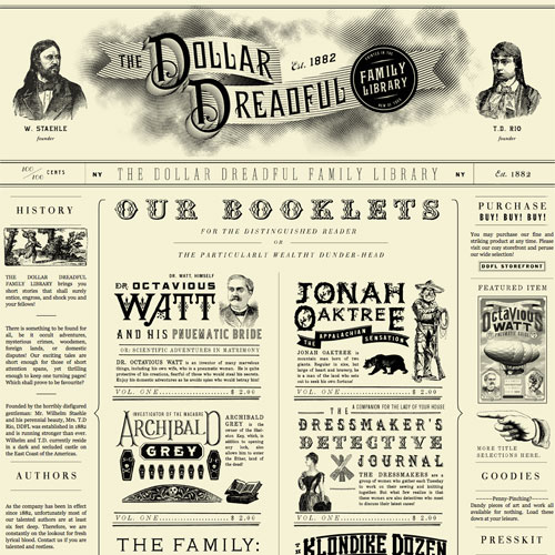
The theory behind this rule is that too many fonts make a page look cluttered and unorganized. And the improper use of too many fonts can result in an amteurish page at best, and a nearly unreadable one at worst. But there are plenty of ways to use multiple fonts and create a gorgeous and usable website. The keys are to pay careful attention to the fonts you're using and the sizes and weights you're using them at. Use fonts that have similar weights, x-heights, and other related characteristics. Be careful about mixing too many colors or styles. If you're not comfortable using multiple fonts, you can always cheat and use mutliple weights and styles of a single font. This is an easier technique that results in a very similar look, especially if you use a font that has a wide variety of variants (like Georgia or Times New Roman). Mixing italics, bold, small caps, all caps, and different sizes can result in a varied look that's still unified.Case in Point: The Dollar Dreadful
The Dollar Dreadful site uses tons of fonts. There are well over twenty just on the home page. But the overall effect is impressive and works well within the theme of the site. It definitely wouldn't be as striking if limited to only one or two fonts.
Keep Everything Simple
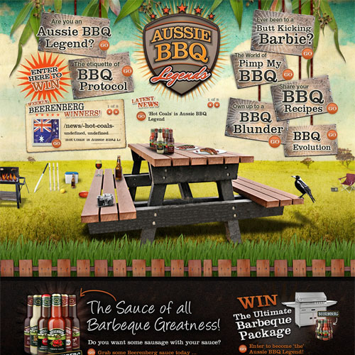
Simplicity is overrated. I'm sure that single statement already has half of you up in arms and ready to stop reading. Simplicity has its place. But there are times when you want something to be complex. To be multi-layered. And there's nothing wrong with that. Chances are, your visitors are intelligent enough to figure things out if you still design with them in mind. There's nothing wrong with keeping a website simple if that's what you (or your client) wants. But don't hold simplicity up as some kind of holy grail of web design. There are plenty of instances where a more complicated solution is better, and ultimately more usable, than a simple solution would be.Case in Point: Aussie BBQ Legends
The home page for Aussie BBQ Legends is anything but simple. With plenty of content, animation, and a disorganized by easy to use navigation system, combined with a large background image, it creates a multi-layered and complex impression while still being easy and fun to use.
Put Navigation in Expected Places
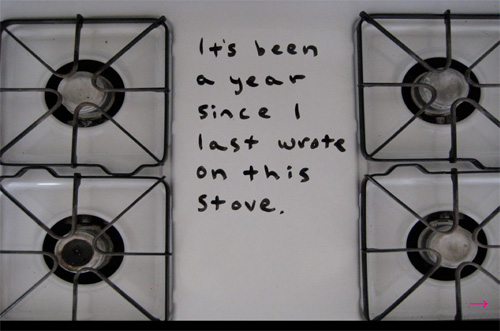
Tradition tells us that navigation should be placed either in the header or the (left) sidebar of a website. Secondary navigation is often placed in the footer, but never primary navigation. Why? People only look to those places because they've been trained to do so. But there's a lot more space available on a web page that could be used. And if done well, those places can be just as easy to use as navigation in the header or sidebar.Case in Point: No One Belongs Here More than You
This site not only doesn't put navigation in the expected places (it's in the lower right-hand corner of the page), it also uses linear navigation. You can only go where the site's creator wants you to go.
Avoid Bright Background Colors
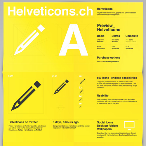
The idea here is that bright background colors make it difficult to read text placed over them. But with appropriate contrast and font size, text can be nearly as readable on a bright background as it is on a white or other neutral background. It all comes down to making appropriate choices for the design.Case in Point: Helveticons
The Helveticons site has a very bright yellow background, but the use of a dark gray font makes everyone on the page easy to read.Limit the Information on Each Page
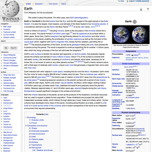
The theory behind this one is that people don't like to read long articles. They want bite-sized information when they're online. Breaking up your content over multiple pages will supposedly help satisfy this desire. But that's not always the case. Sometimes a visitor is seeking more detailed information. Clicking through to half a dozen different pages to find information that could have just as easily been placed on a single page is just a waste of time. Instead, break content up with headers or similar elements to make it easy for those who are just looking for one piece of information to find it without making things more difficult for those who want to read the entire thing.Case in Point: Wikipedia
Okay, so Wikipedia might not be raking in the design awards, but it does have a huge amount of traffic and excellent user engagement. Some articles are short, but others might run a few thousand words (or longer). Wikipedia combines on-page navigation to major sections and headers, subheaders, and lists to create an excellent user experience that still puts a ton of information in a single page.
Focus on Lower Page Weight
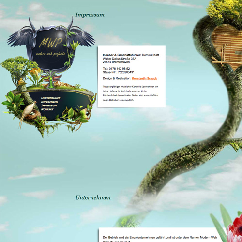
This rule comes from the days when a large number of Internet users were connecting over a dial-up connection. Nowadays, you're going to find a lot more visitors are coming to your page over a broadband connection. And even those still using dial-up are probably used to have sites take ages to load. Lower page weight is still important, though, to an extent. You still want your content to load in a matter of a few seconds for the majority of your users. But this can be achieved just as easily through good coding as purely by page size. Simple steps like specifying the size of images within a post or page can help make the page more usable even before it's fully loaded.Case in Point: MWP
The Modern Web Projects (MWP) site has lots of big images, mostly in the background. But it pushes the page size well over a meg. And yet the page still loads just fine on a broadband connection and the size is well worth the effect.
Don't Use Big Background Patterns or images
This one ties closely to the previous rule about page weight. I've seen sites that advocate that your background pattern should be less than 60 pixels square. But with high-speed internet, that's not really necessary anymore. Another argument against big patterns is that they can be distracting. That can be true of small patterns, too. Instead, just make sure the pattern you've chosen to use complements the rest of your site and doesn't detract from your content. Sometimes giving the background a bit less contrast or making it lighter or darker can help in this without changing the overall look too much.Case in Point: McClanahan Studios
The background image for McClanahan Studios is huge. There's literally one image for the entire background of the home page. The same is true for each page on the site. And yet the background not only doesn't slow down the loading of the site, but also contributes a ton to the feel of the design.
Don't Use Splash Pages
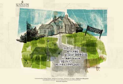
Splash pages and intros are often created for absolutely no reason other than to show off the designer's Flash abilities. These types of splash pages should be avoided at all costs. But that doesn't mean there's never a place for splash pages. Sometimes a splash page that's intended for a particular type of visitor is in order. Let's say you're a charity trying to get donations for a very specific project. Instead of changing your entire home page and site design, why not throw up a splash page that invites people to donate? It's simpler than changing your home page and often times it's more effective. This rule might have been more accurate if they'd said not to use splash pages without a very good, very specific reason. (And, "because I want to" isn't a good enough reason.)Case in Point: Kutztown University Communication Design Department
This splash page serves to simplify navigation for new visitors. Since education websites traditionally have a ton of content for many types of visitors (current students, prospective students, parents, alumni, etc.), simplifying the visitor's first experience is helpful and an appropriate use of a splash page.
Always Incorporate Social Media
This is another rule that a lot of you are probably ready to defend to the death. But the truth is, not every site is going to benefit from incorporating social media functions. Let's say, for instance, that you're designing a site for a product that treats an embarrassing personal problem. Do you really think anyone is going to share a link or an article on Twitter? Are they going to post a link to a site like that on their Facebook wall? Probably not. So there's really no point in spending the extra time to incorporate social media options.Case in Point: Preparation H
No one's going to share a link to this on Twitter, so why even bother giving them the option?
The Three-Click Rule
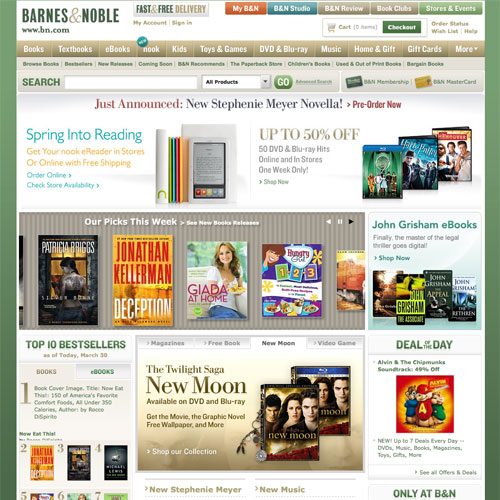
The idea that every page on your site should be accessible from your home page within three clicks is one of the most pervasive rules out there. In extreme versions, it's not even from the home page, it's from every other page on your site. This rule was invented to make designers more carefully consider their information architecture. Which is a good thing. But that doesn't mean that visitors are never going to see a page just because it would take them five clicks to get there. The key is to use links and navigation to direct users in a way that makes them want to keep clicking. Information should be easy to find. But that doesn't mean it needs to be instantly accessible. One tip, though, if you're going to use deeper navigation: include a prominent search box for those people who are too impatient to use your regular navigation options.Case in Point: Barnes & Noble
Large online retailers are a great example of where the 3-click rule falls apart. If you go to the Barnes & Noble site to browse, it's virtually impossible to get to any specific category within three clicks. And unless the book you're looking for happens to be featured on one of their main pages, it's unlikely you'll get to a book within three clicks either. But B&N has excellent search funcionality, which means you can find whatever you're looking for if you're in a hurry, without sacrificing the ability to browse categories in a very intuitive and user-friendly way.
The Unbreakable Rule
Your user should always come first. Whatever rules you're thinking of following or breaking, always ask yourself if it's going to help or hinder your user. If you keep their needs and preferences in mind, no matter what rule you break, your site will still likely be successful within your target demographic.Sources and Resources
- 5 Basic Rules of Web Design by Grantastic Designs A simple set of rules for website design, most of which are entirely accurate.
- 10 Web Design Rules That You Can Break A great post from Webdesigner Depot that offers up examples of effective rule-breakers.
- Ten Rules of Web Site Design A list of rules from Sharpened Productions.
- Web Sites that Work A list of rules from Roger Black on what makes a well-designed and usable website.
- Four Crucial Web Design Rules A post from NichePhile on four important rules for good site design.
- 15 Websites That Break The Rules A great gallery of sites that break at least some of the so-called rules.

Awesome article, thank you. Here there’s really some fresh things to learn. I think the best “rule” is: avoiding too much rule breaking in the same design. If you already broke one rule, whichever rule, your design must be consistent with your choice. Thanks for sharing.
I have learnt since starting my job there is no such thing as an absolute rule ever in design, only what is appropriate for the task at hand.
It’s very liberating.
Thanks Cameron for another great article.
Hey Lewis i agree with you
Nice post. I really like that you outlined each part of a site, or most of them, and said that those “rules” can be broken. And I’m very glad that you put the very last unbreakable rule because that is the one people tend to forget. Design for your market, not for peers. We all understand design and how it works but sometimes our market won’t so we have to put them first.
I like this post very much. I’ll talk about it on my blog, linking on you :)
Really great article…having great things to learn…thanks for this wonderful post…
This is such a great post! I was trying to find the line between, big background images. But I like that you can now days, break that rule.
Great article!
I think the “rule” that most annoys me is the concept of the “fold”. This is an issue where I butt heads with my boss. He always wants as much of the content above the fold as possible. Even if it means cramping everything together with only 5px spacing. It makes me want to shoot myself, lol.
A good article on the fold is “Life Below 600px” http://iampaddy.com/lifebelow600/
according to this study, there is a fold:
http://www.useit.com/alertbox/scrolling-attention.html
I think the one that gets me the most is the fold. I’ve never subscribed to that one. In fact there is evidence that cramming everything at the top reduces the chance of people even sticking around.
The problem with these rules is not the fact that we can’t break them, it’s convincing our clients and business people that they can be broken. The fold is a classic example of this. Sometimes I will ask someone asking me to keep xyz above the fold where the actual fold is. Sometimes you will get a blank stare.
Yes yes yes! Maybe innovation will happen!!
Very good article?I Love
Welcome return visit?
Excellent article – I definitely agree about the navigation – a good design should push the user to knowing how to interact with the page, not rely on current trends.
I try to apply as much as i can. Trust me, Design is playground, the more one plays, the more one explores.
This is a dangerous article. All designers believe that they are good enough to break guidelines (there are no “rules”), but in real life, many can’t even use the “rules” let alone break them. In those cases, an article like this makes those designers say “Yeah, see? I was right all along!”
You have ignored context in this article and that is what makes it dangerous. Jason Santa Maria’s site is fun and interesting, but if he changed the main nav too, it would be hard to use. And if Amazon did what he did, the effect on their sales would be bad. Real bad.
The Dollar Dreadful uses many fonts with a very common time period and theme, and they do it intelligently by assigning purposes to each font or group of fonts. If they had randomly used 20 fonts the site would be a mess.
That Aussie BBQ site is a f***ing catastrophe and you should be ashamed of yourself for using it as an example of anything.
Just because you and your boss want different things regarding the fold doesn’t require that either of you has the right answer. It is true that everything above the fold gets more “visibility” and it is true that most users will scroll a screen length or two. And? At which point did that mean everything or nothing has to be above or below the fold?
Wikipedia limits the information on one page to one, narrow topic and provides good navigation within that information. I think you misunderstood that guideline.
Unexpected navigation gets you high bounce rates and short time-on-site. Sorry, but it’s true. And it always has been. People don’t explore, they just leave.
Anyway…
In my experience the designer that scoffs guidelines is the one who doesn’t know how (or why) to apply them, and you have not convinced me of anything different. You have merely joined that group with confidence.
You are boring and should be ashamed of this comment. Rules must broken in order for our industry and the web as a whole to advance. If they weren’t broken, all anchors would still be blue and underlined!
This is the only thing worth reading on this page.
Thanks for saving me the time to write the same thing.
I’m talking about J. Marsh, not the nub above me.
Thanks for the write up on different style rules that should be adheared to.
Brilliant article. Some surperb examples. Nice work
This Article Looks Awesome~
Just Tweeted :D
Some great points and some great designs. I have to disagree with the “Focus on Lower Page Weight” though. This is just flawed logic. Sure, many people these days have broadband connections and can load huge pages quickly, but what you and many designers I have dealt with seem to conveniently forget is that you have to pay for your sites bandwidth too. Having a 1Mb homepage is all well and good if you get few visitors but on high traffic sites, this would just end up costing you or the owner of the site money.
Good Article ! Excellent
Great stuff and I like the examples you picked. Especially the “No one should be here more than you,” I absolutely laughed crazy at that site.
This is awesome, some great links!
I LOVE TJ Maxx it’s one of my fave stores!
I have been having a really hard time getting over my ex, i really appreciate all your tips
This can be only just what exactly I was trying to find. Thanks, C.S