Adobe Illustrator Tutorial: Create a Cute Halloween Ghost
Use of the Mesh Tool is one of the best techniques for achieving a semi-realistic look for an illustration. Today we will demonstrate how to use this great Adobe Illustrator feature for creating a cute little ghost. The only colors we are going to use are white and different shades of gray. So, It might be little tricky to transform this floating bedding into the cute little ghost. We will have to find a way to create the illusion of the wrinkled sheet. The Mesh Tool will help us a lot to achieve that.
Our final result should look like this:
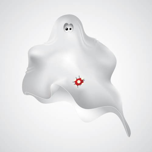 So, let’s get down to business!
 We will need to divide this shape. This will actually create the inner side of the floating bedding. With the Pen Tool (
 Select the path and the blue shape and under the Pathfinder Panel hit the Divide button.
 Ungroup (
 At this moment we are pretty much done with the shape of the ghost.
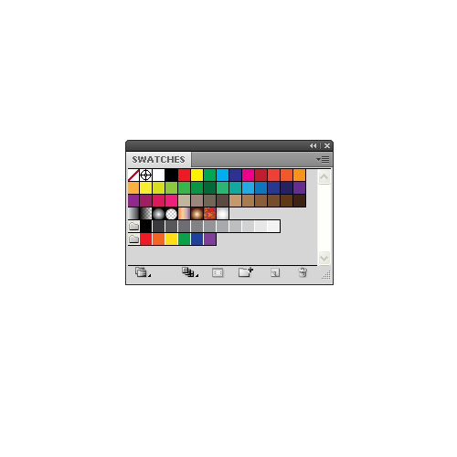
When it comes to coloring we will try to keep it simple, by using gray colors from the Swatch Panel.
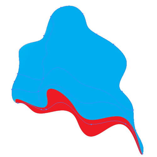 On the following pictures you can keep track of creating the new anchor points.
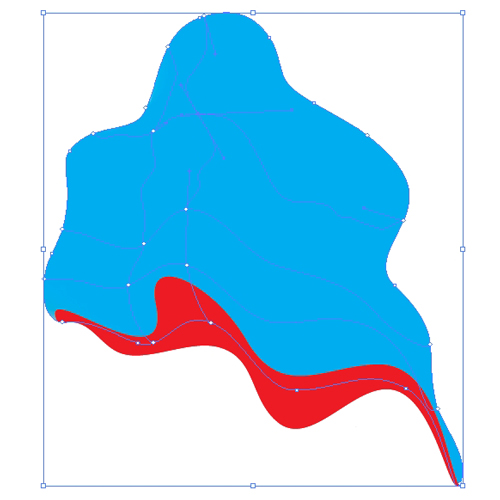

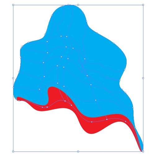

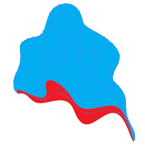 These are some of the possible anchor points. Later on we will create some more. First, we will apply some colors in order to monitor our creating process, just to make sure that we are going to right direction.
To assign the colors to the anchor points grab the Direct Selection Tool (
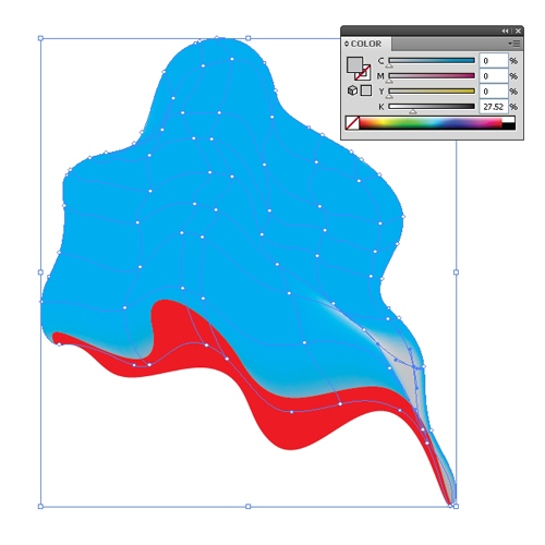
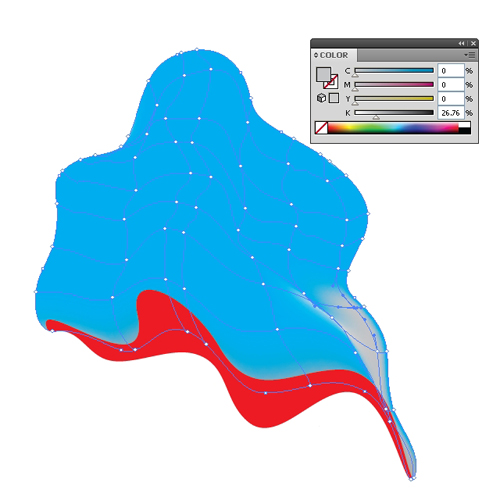
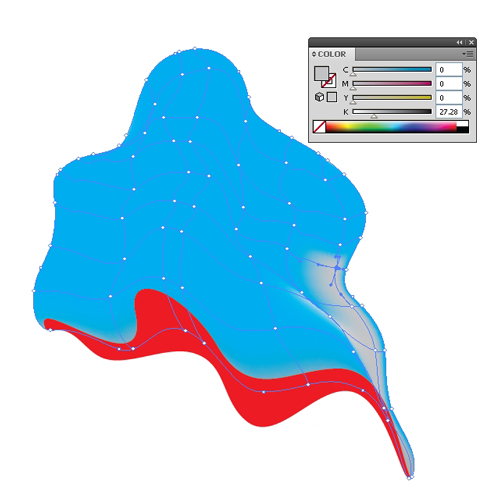
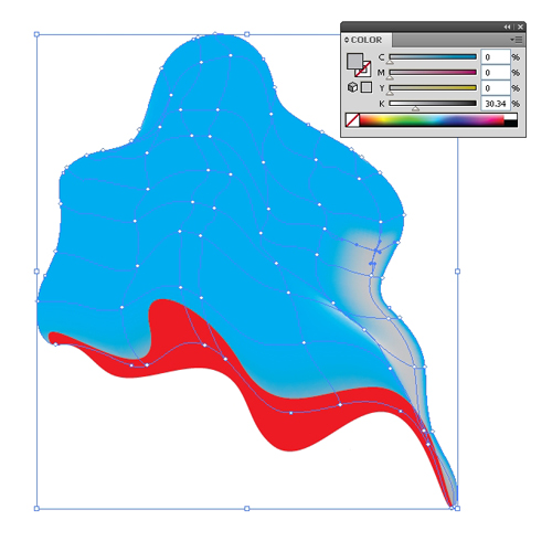
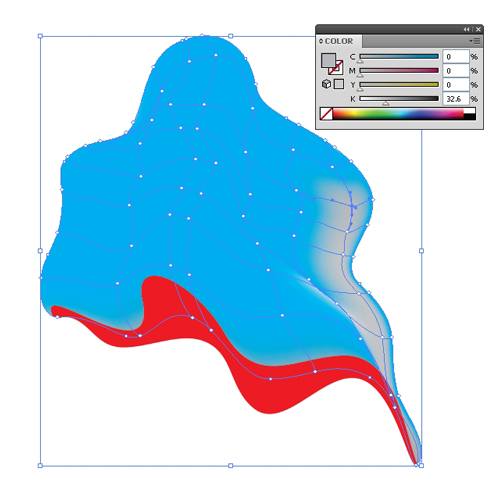
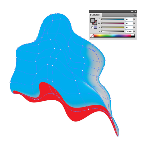
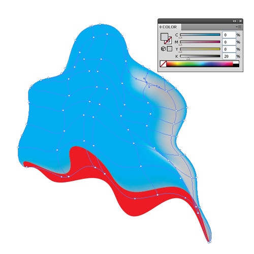
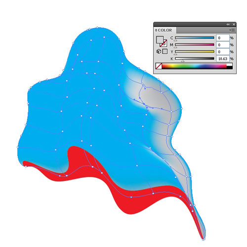

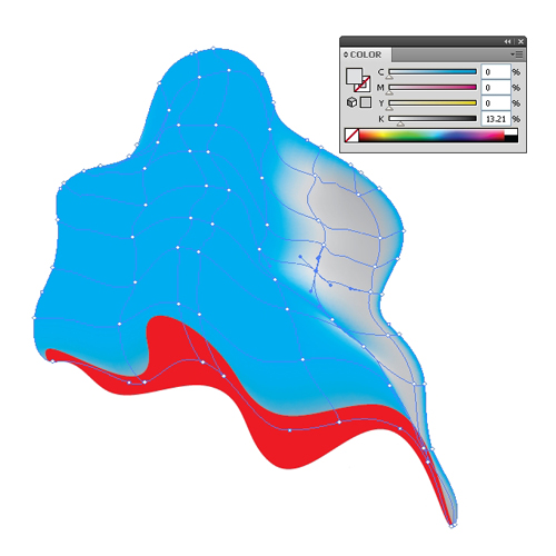
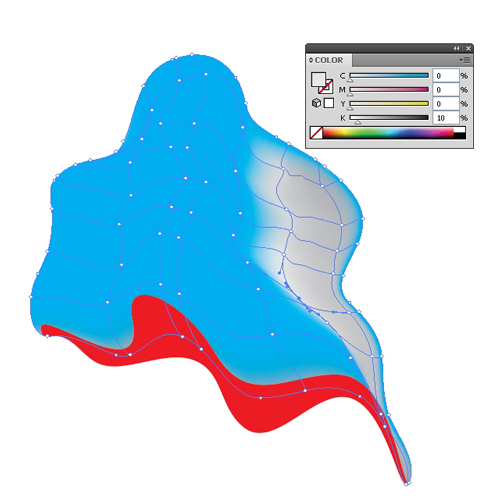 Continue applying colors. Feel free to experiment and to try out different combinations.
Larger Preview
You should end up with something like this (or maybe with something even better):
 You may notice that we have a shadow on the right side of the sheet. Left side is slightly highlighted (like the light is coming from upper left corner). Besides that, there is some roughness caused by the light source. We have managed to represent all of that by using the Mesh Tool (
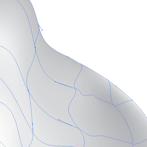 After
After
 Do the same for the left lower part of the linen.
Before
 After
After
 You should end up with something like this.
 As you can see on the previous picture, our wrinkles don't quite give the illusion that there is something going on, yet. We have to find a way to avoid a flat look for the illustration and to create an illusion of 3D. The Mesh Tool (
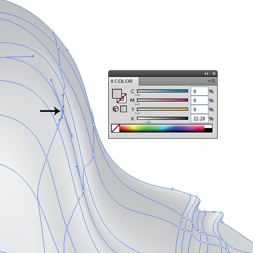
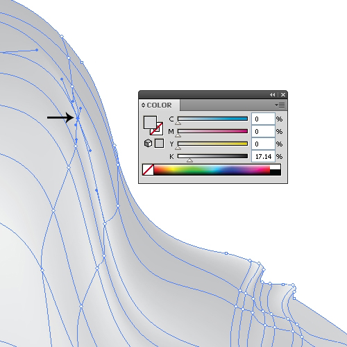
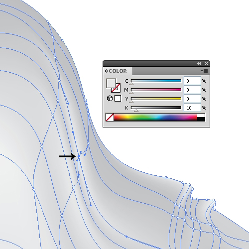
 In order to create a realistic wrinkle we will assign light gray colors to some of the anchor points.
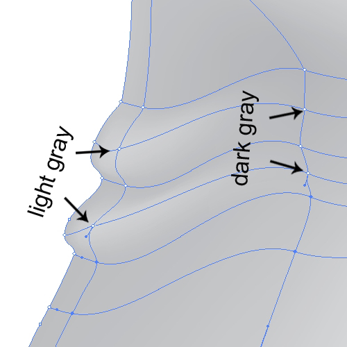 On the pictures below you can see the information about color applying.
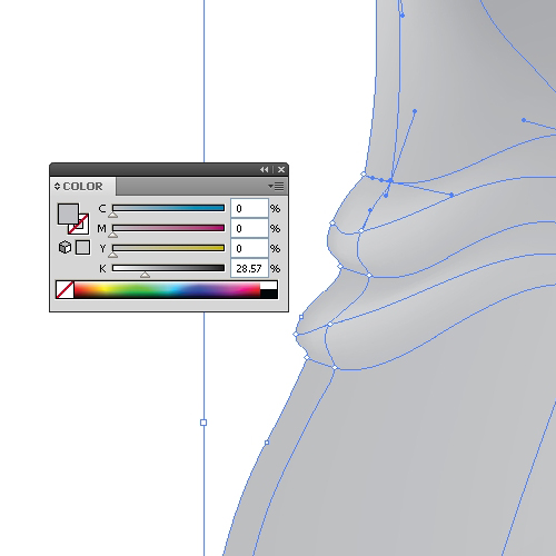
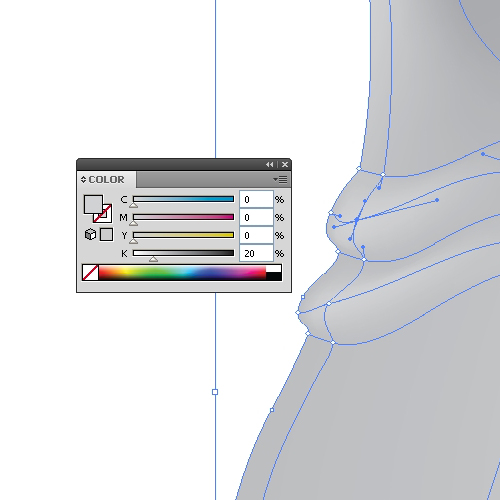
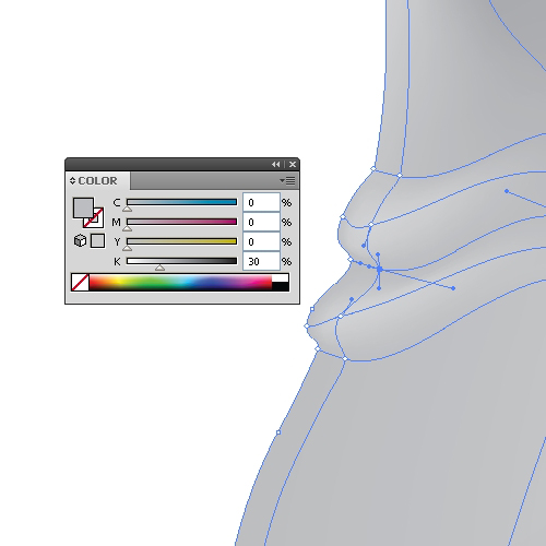
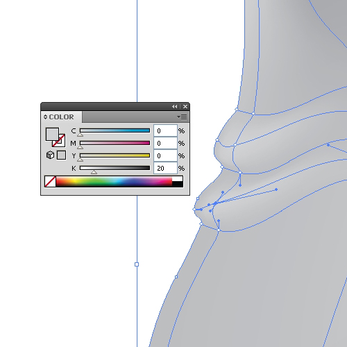
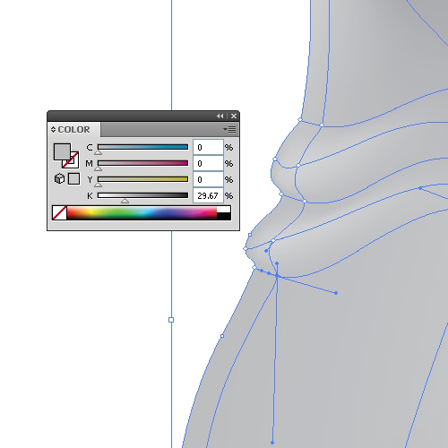 We will do the same thing for the right shoulder. Just make sure to add important anchor points. Each wrinkle has a highlighted part and a shadow. We will try to represent the influence of the light, which will allow us to create an illusion of a 3D look.
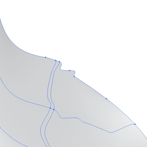
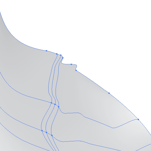
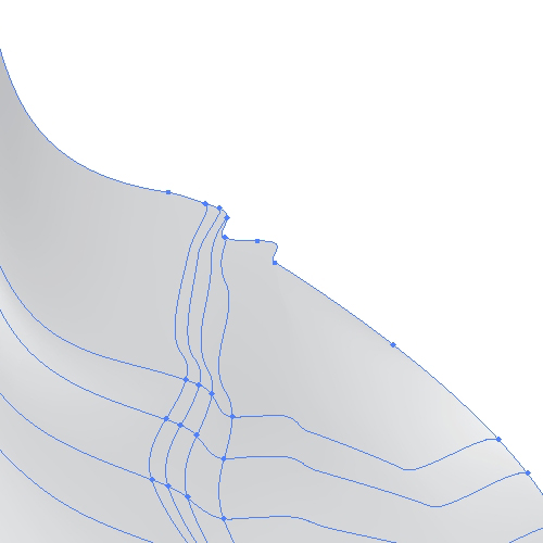
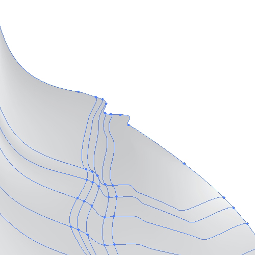
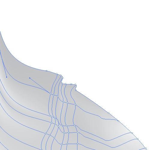
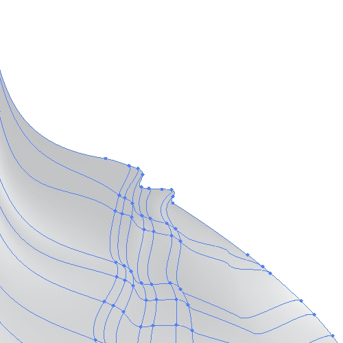 Let's apply some colors, like we did in previous steps.
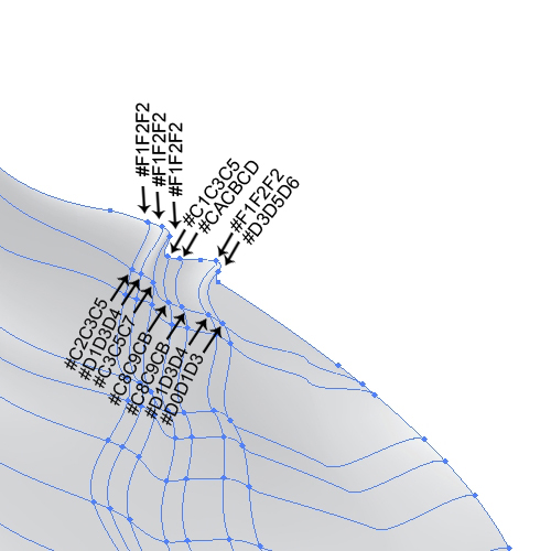 During our creation process we've created a few anchor points and paths we didn't need at first, but now we can use them.
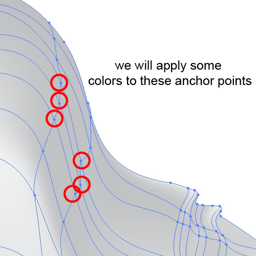 With alternate combinations of light gray and dark gray colors we are achieving the impression of a wrinkled sheet.
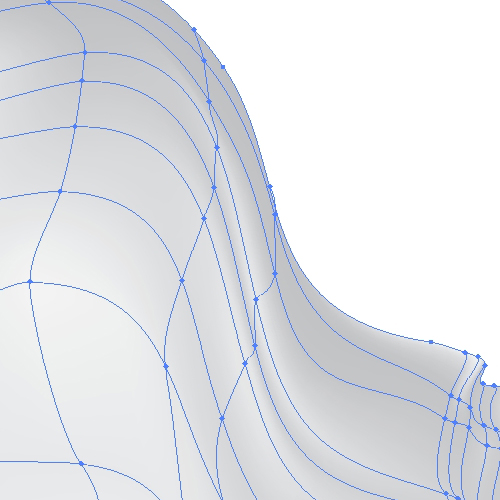 On the pictures below you can find more information about color details.

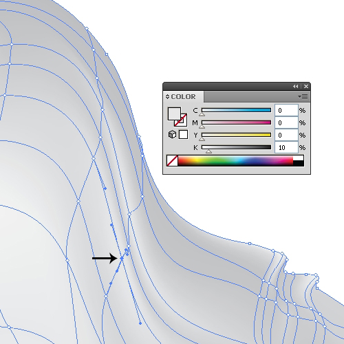

 This is how our ghost looks right now.
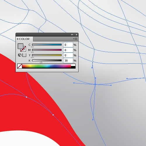
 Let's improve our ghost a little bit more. We have some curves in the lower area, but it doesn't look realistic. To make it properly we'll have to highlight some parts.
If we take a look, the network of the paths and the anchor points in that field looks like this.
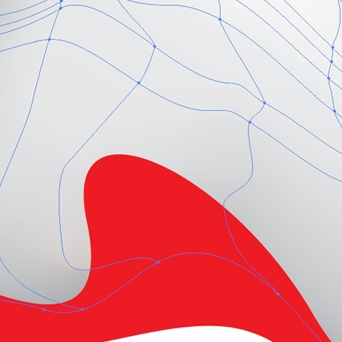 Let's make some minor changes. Just grab the Mesh Tool (
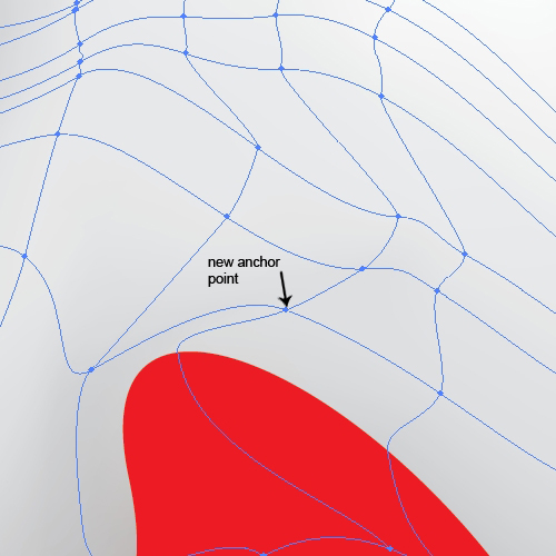
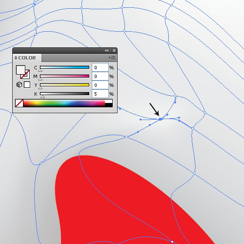
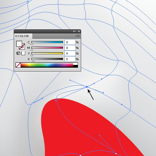 This has created a highlight for the raised part of the sheet. But we will need some shadows as well. Apply a slightly darker gray color, as is shown on the pictures below.
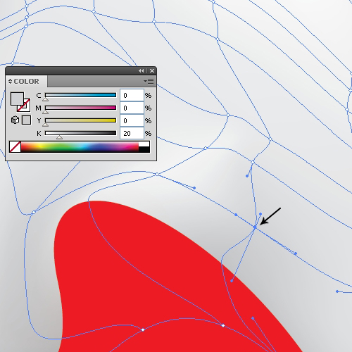
 There is one more thing we can do. Let's focus one the raised part of the bedding. We could add a small part of the inner side of the sheet and make it visible.
Grab the Pen Tool (
 Make sure to match the lower side of the new shape and the lower edge of the sheet. It's supposed to be lined up.
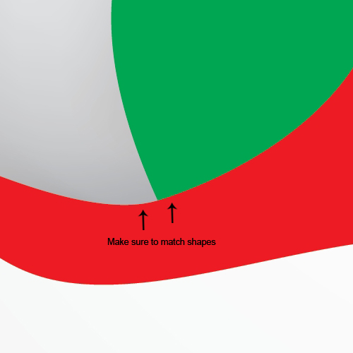 Duplicate (Ctrl / Cmd + C, Ctrl / Cmd + F) the red shape of the ghost. Select both shapes, green and the copy we have just created and under the Pathfinder Panel hit the Intersect button. It will create a shape like this.
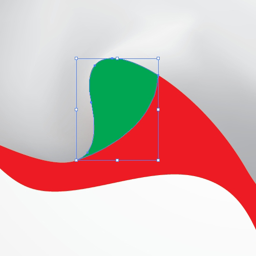 Let's make it fit into the illustration. Apply the radial gradient as you can see on the picture below.
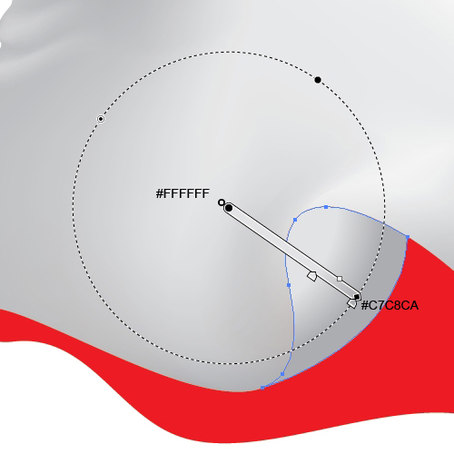 Select the lower part of the illustration (the part that actually represents the inside of the sheet) and set the Fill color to
 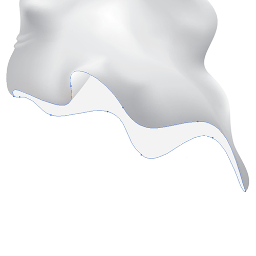 Under the Object select Path > Offset Path. Set the value for Offset to
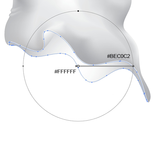
 Select both ellipses and under the Pathfinder Panel hit the Unite button. It will turn our ellipses into one shape. Under the Object select Path > Offset Path. Set the value for Offset to
 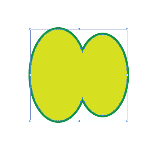 Let's apply some colors. Set the Fill color of the larger shape to
 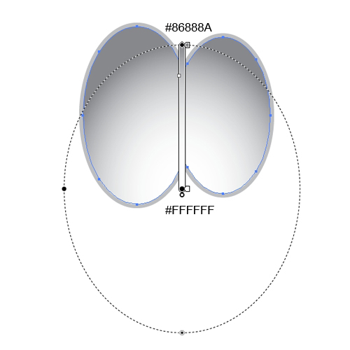 With the Ellipse Tool (
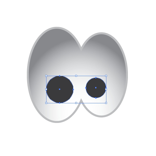 Select both of them and under Object select Path > Offset. Set the value for Offset to
  We need just two white ellipses for the reflection. Select all eye elements and Group them (
 With minor adjustments and some polishing our cute ghost is done!

 So, let’s get down to business!
Creating the Ghost's Body
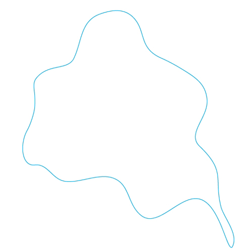
First, we will create the shape of the ghost. There are two methods to do that. If you have a tablet you can draw it very easily. If not, the Pen Tool (P) is always available. Select it from the Tool Panel and draw the curvy path, something similar to this:
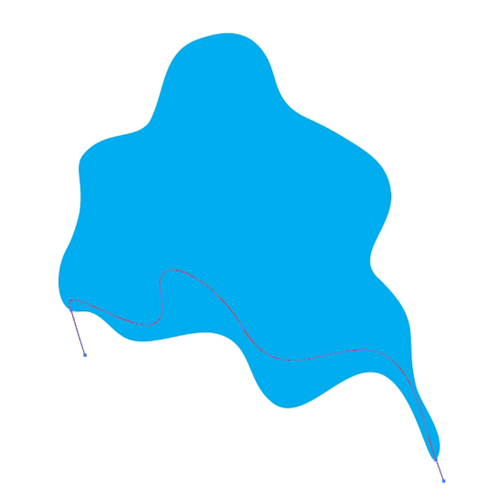
 We will need to divide this shape. This will actually create the inner side of the floating bedding. With the Pen Tool (
P) create a curve which we’ll use to divide the large shape.
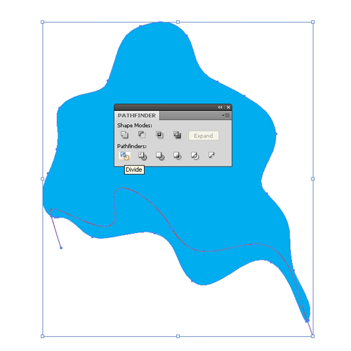
 Select the path and the blue shape and under the Pathfinder Panel hit the Divide button.
 Ungroup (
Shift + Ctrl / Cmd + G) the shape we have just created and change the Fill color of the lower part. This way we have the idea what our ghost should look like.
 At this moment we are pretty much done with the shape of the ghost.
When it comes to coloring we will try to keep it simple, by using gray colors from the Swatch Panel.

Time for the Mesh Tool
We have to realize that creating gradients for irregular shapes is not that simple. The Mesh Tool (U) will help us to do that. We will have to “divide” the blue shape in order to define some highlights and shadows. During the dividing process we will create new anchor points and paths. For each anchor point we will have to define the Fill color. This will create nice transitions between colors. Some transitions will be smooth and some very sharp, depending on what we are trying to achieve.
Grab the Mesh Tool (U) and click on the blue shape. It will create paths with anchor points as is shown on the picture below.
 On the following pictures you can keep track of creating the new anchor points.


 These are some of the possible anchor points. Later on we will create some more. First, we will apply some colors in order to monitor our creating process, just to make sure that we are going to right direction.
To assign the colors to the anchor points grab the Direct Selection Tool (
These are some of the possible anchor points. Later on we will create some more. First, we will apply some colors in order to monitor our creating process, just to make sure that we are going to right direction.
To assign the colors to the anchor points grab the Direct Selection Tool (A) from the Tool Panel, select each individual anchor point and select the color from the Swatch Panel. You may think that this is a lot of work, but at the end it will pay off.
Continue with applying colors.


 Continue applying colors. Feel free to experiment and to try out different combinations.
Larger Preview
You should end up with something like this (or maybe with something even better):
 You may notice that we have a shadow on the right side of the sheet. Left side is slightly highlighted (like the light is coming from upper left corner). Besides that, there is some roughness caused by the light source. We have managed to represent all of that by using the Mesh Tool (
U).
Creating the Fabric Wrinkles
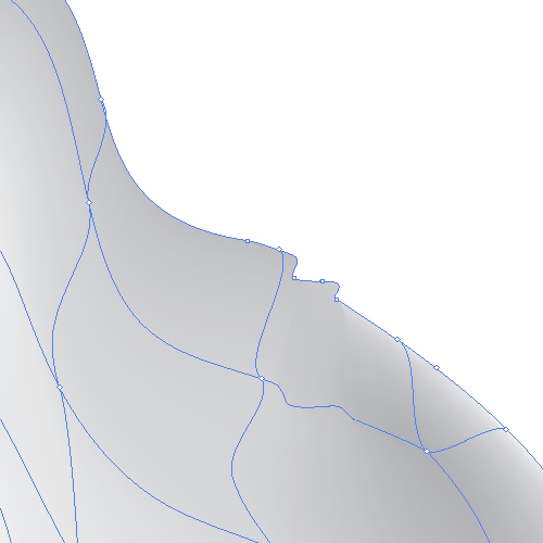
Now, we have to create some fabric wrinkles. Fabric wrinkles tell us a lot about the position of the body. Gravity is something we should keep in mind as well. It dictates how our bed sheet will behave. Grab the Add Anchor Point Tool (+) from the Tool Panel and add few anchor points on the right 'shoulder' of our ghost. With the Direct Selection Tool (A) try to raise new anchor points and to adjust the handlers in order to form a smooth corner.
Before
 After
After
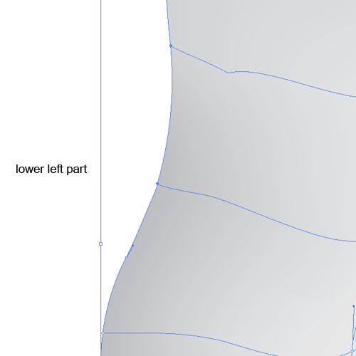
 Do the same for the left lower part of the linen.
Before
 After
After
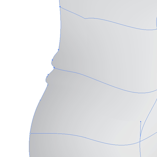
 You should end up with something like this.
 As you can see on the previous picture, our wrinkles don't quite give the illusion that there is something going on, yet. We have to find a way to avoid a flat look for the illustration and to create an illusion of 3D. The Mesh Tool (
U) will help us again. There is just one thing you should keep in mind. With the Mesh Tool (U) we are defining gradients between two anchor points. It's up to us to make the color transition as smooth as possible.
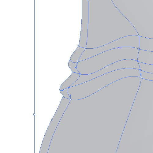
Grab the Mesh Tool (U) from the Tool Panel and apply a few more anchor points. Add anchor points like you can see on the picture below.
 In order to create a realistic wrinkle we will assign light gray colors to some of the anchor points.
 On the pictures below you can see the information about color applying.


 We will do the same thing for the right shoulder. Just make sure to add important anchor points. Each wrinkle has a highlighted part and a shadow. We will try to represent the influence of the light, which will allow us to create an illusion of a 3D look.


 Let's apply some colors, like we did in previous steps.
 During our creation process we've created a few anchor points and paths we didn't need at first, but now we can use them.
 With alternate combinations of light gray and dark gray colors we are achieving the impression of a wrinkled sheet.
 On the pictures below you can find more information about color details.


 This is how our ghost looks right now.
 Let's improve our ghost a little bit more. We have some curves in the lower area, but it doesn't look realistic. To make it properly we'll have to highlight some parts.
If we take a look, the network of the paths and the anchor points in that field looks like this.
 Let's make some minor changes. Just grab the Mesh Tool (
U) and add a new anchor point. We will apply a nice light gray color in order to create a highlight.


 This has created a highlight for the raised part of the sheet. But we will need some shadows as well. Apply a slightly darker gray color, as is shown on the pictures below.

 There is one more thing we can do. Let's focus one the raised part of the bedding. We could add a small part of the inner side of the sheet and make it visible.
Grab the Pen Tool (
There is one more thing we can do. Let's focus one the raised part of the bedding. We could add a small part of the inner side of the sheet and make it visible.
Grab the Pen Tool (P) from the Tool Panel and draw the shape as you can see on the picture below.
 Make sure to match the lower side of the new shape and the lower edge of the sheet. It's supposed to be lined up.
 Duplicate (Ctrl / Cmd + C, Ctrl / Cmd + F) the red shape of the ghost. Select both shapes, green and the copy we have just created and under the Pathfinder Panel hit the Intersect button. It will create a shape like this.
 Let's make it fit into the illustration. Apply the radial gradient as you can see on the picture below.
 Select the lower part of the illustration (the part that actually represents the inside of the sheet) and set the Fill color to
 #F1F2F2.
 Under the Object select Path > Offset Path. Set the value for Offset to
 -2. Apply the radial gradient as is shown on the picture below.

Creating the Eyes
Since we are creating a cute ghost we will create big confused eyes to make it more interesting. Grab the Ellipse Tool (L) from the Tool Panel and create the ellipse. Duplicate it (Ctrl / Cmd + C, Ctrl / Cmd + F) and holding a Shift key on the keyboard move it to the right side. Make sure to scale down the copy.
 Select both ellipses and under the Pathfinder Panel hit the Unite button. It will turn our ellipses into one shape. Under the Object select Path > Offset Path. Set the value for Offset to
 -2.
 Let's apply some colors. Set the Fill color of the larger shape to
 #BCBEC0 and apply the radial gradient to the smaller shape. This way we are creating an illusion that someone is really under the sheet.
 With the Ellipse Tool (
L) create two circles, one bigger and one smaller. Set the Fill color to #414042.
 Select both of them and under Object select Path > Offset. Set the value for Offset to
 -3. Change the Fill color to black (#000000).
 We need just two white ellipses for the reflection. Select all eye elements and Group them (
Ctrl / Cmd + G).
 With minor adjustments and some polishing our cute ghost is done!


It looks so cute, great tutorial! Thank you for sharing!
Thx for sharing this tut.
Thanks for a great tutorial. Looks like its time consuming to apply those shadows. How much time does a illustration like this take for you to do?
/will
great tutorial, thanks for sharing…
I’m really glad you like this one. Thank you!
@William: I’ve spent about 2hrs on this little fellow. This is mostly because I am trying different kind of techniques until I achieve a desired look. There is one more thing I usually do. I like to take a good look at the illustration on the next day. A long break allows me to see my artwork clearly.
beautiful post, I will be useful for Halloween
The new design of the blog is amazing: D
Nice tutorial, Thank you for sharing! it will be useful……
Nice tutorial
:)
Nice tutorial…. keep it up! i wen to school for this but forgot alot. I’ll have to share this with my friend for sure
Really very nice tutorial.Thanx for sharing.keep on sharing like this.
I am really glad you like this tutorial. Thank you!
Very Nice tutorial, Thank you, it will be useful……
This is an amazing tutorial. I tried. Well, Don’t do it if you’ve never done it before :p
But it’s really good tutorial! :D
This is truly awesome tutorial .. great share author !!!
Its very great tutorial the newbie to Illustrator like me. Thanks for sharing.
Thanks very good Adobe Illustrator tutorial , I added my archive.